
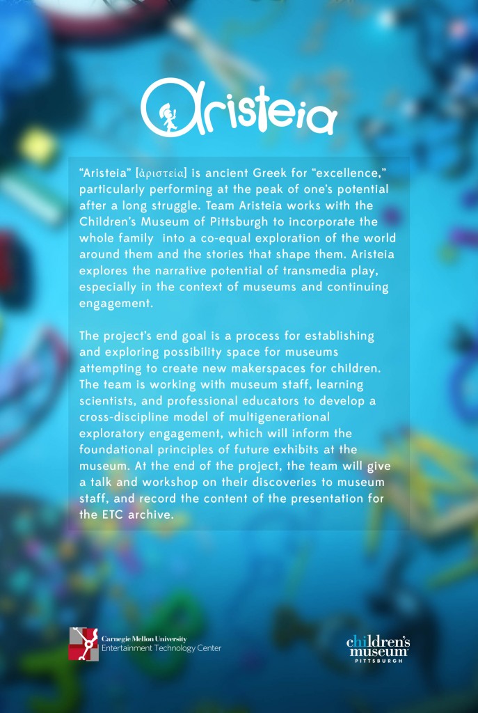
This week wraps 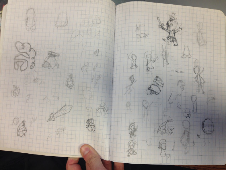 up the branding process for our day. The process started with several days of considering possible names, and given our relative uncertainty about the nature of the project, we ended up using the Greek word for excellence, “aristeia,” as our project name. The term can also mean “a dramatic climax,” which for the Greeks was frequently a warrior fighting at his very best. We aren’t dealing with warriors in this project, but we liked the idea that our work was helping kids develop to reach their peak potential, like a flow state.
Once we had the name, artists Dave and Ashley brainstormed some adjectives that they felt would describe the experiences we hoped to facilitate (like “playful” and “brave”). From those words, they began associative sketching, Ashley focusing on the text and Dave on the thumbnail sketch.
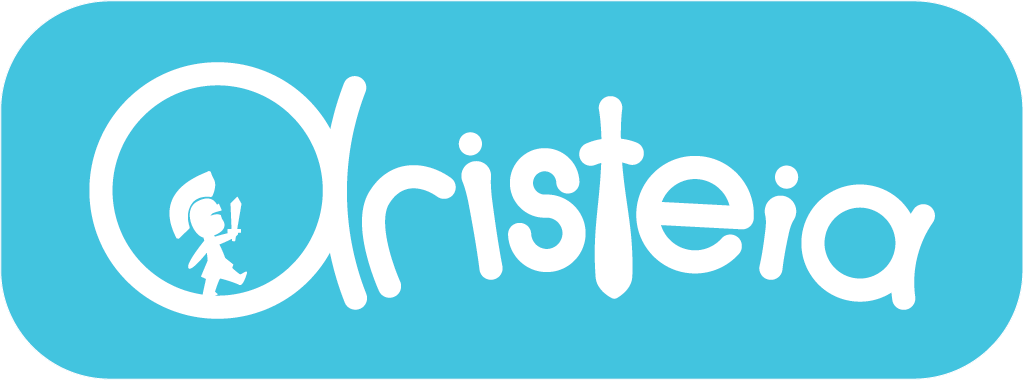
A few iterations later, and the team landed on the rough concept for the wordmark, which was an amalgam of several of Ashley’s fonts and Dave’s toddler. Light blue was settled on as a main color both for its relation to ancient Athens and for its joyful, friendly mood.
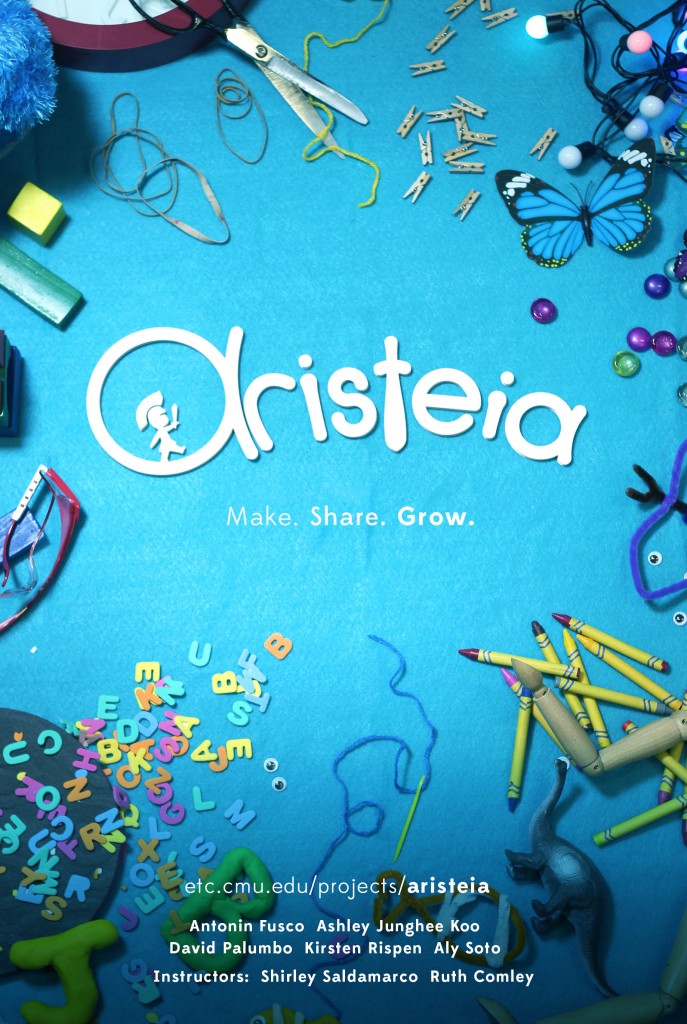
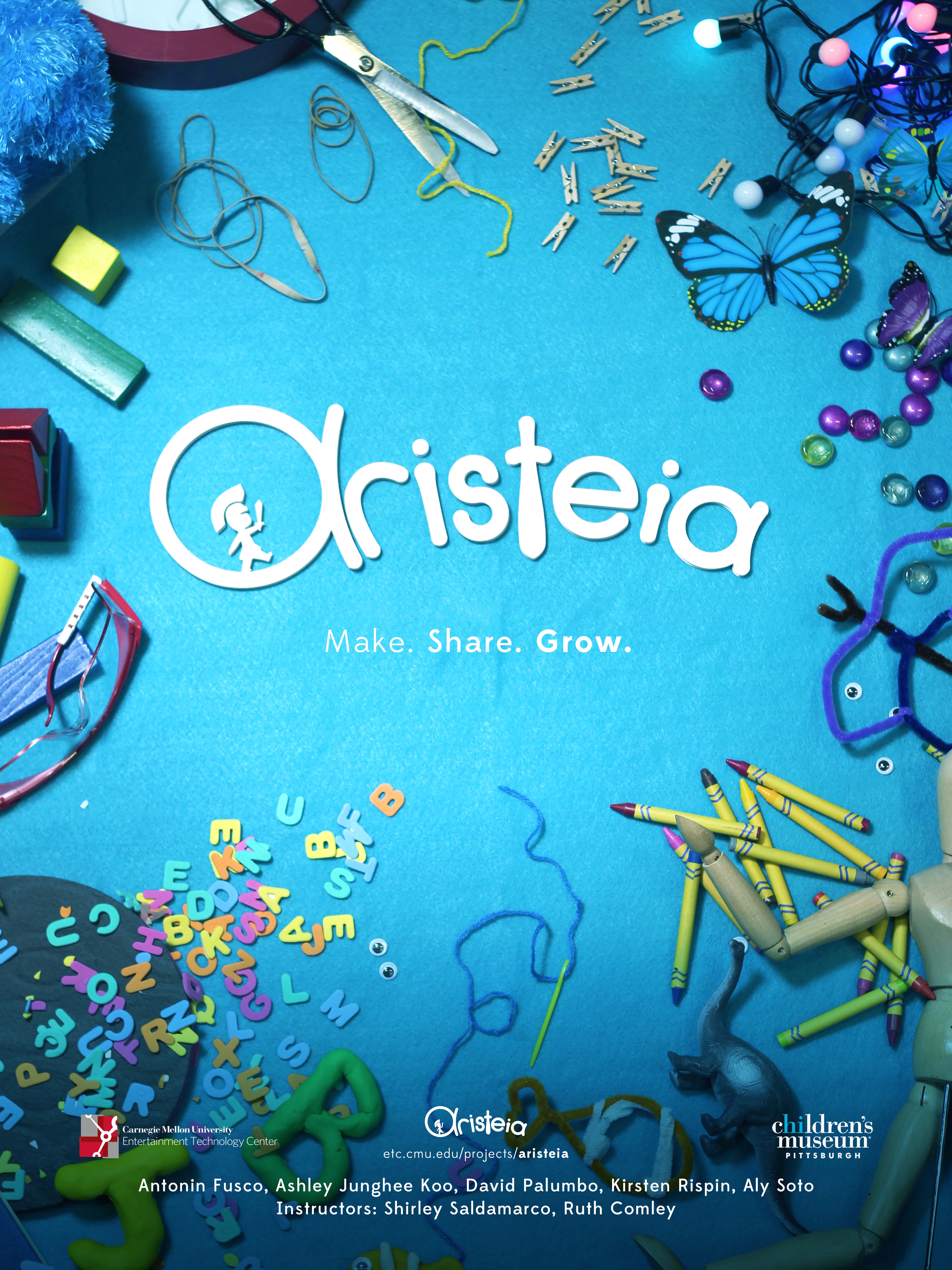
Finally the team had to tackle posters and half-sheets. 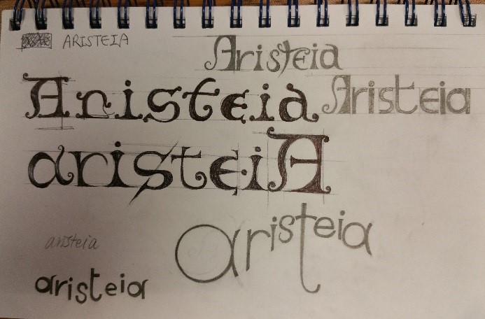 Dave laser-cut the wordmark and arranged it on a blue felt sheet, then the team scattered toys and building materials around the perimeter. Several elements, like the fish, alphabet characters, and butterfly, were repeated across several media as a nod to the role of transmedia in the project. Since the team is partnered with the MakeShop at the Children’s Museum, it seemed especially appropriate that we physically produce what would eventually become the poster.
- Written by Antonin Fusco