Month February
-
Week 7
February 23-27
At this point in the semester, we’re comfortably in the production phase. Pre-production’s over – design rules have been decided, and we’re all focused on making content. The story is close to done, with only revisions on 4-6 left to apply before a content lock. As for last week’s goals, we didn’t manage to complete chapter 3.
Hannah’s been making illustrations. Allen made a cool Unity plugin for Laura to add content to the project. I applied the most recent batch of Jane’s edits for 1-3, and am finishing 5-6 to hand off to her again. Will set up a meeting with researchers at HCI on main campus, who pointed us to lots of relevant research. For example, Richard Mayer and his five principles for reducing extraneous processing (keeping all the media coherent).
Today, we’re going to meet with Jane and give her a Kindle loaded with the most recent build. Next week, only Laura will continue working on Chapter 3, the rest of the team will be at GDC.
We’re bringing these.
continue reading -
Week 6
February 16 -20
Chapter One is on the Kindle.
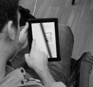
Chapter One
For the upcoming sprint: Chapter Two and Chapter Three. It’s a stretch goal, especially with the amount of illustration slated to finish (10+ images), but we’re trying to push before the time sink of GDC + Spring Break are upon us.
We’ve absorbed a lot of feedback. At this point, our goals can be broken down into three categories: Entertainment, Usability, and Art. This came up when we were talking to Heather Kelly last week. We mentioned that during Quarters, some of the faculty asked about features of standard e-books – the ability to move between landscape and portrait views, or to change the size of text. Instinctively, the team hesitated to say we’d make that happen. This hesitation brought to light the priorities of this project. Usability is one of them, but prioritized after the other two. The next most important is Entertainment – we want to produce a complete story that’s enjoyable. First, however, is Artistic Vision – for the digital content to break new ground in the language of digital media.
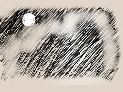
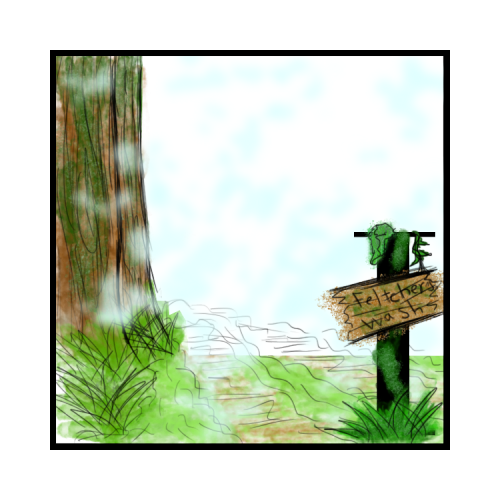
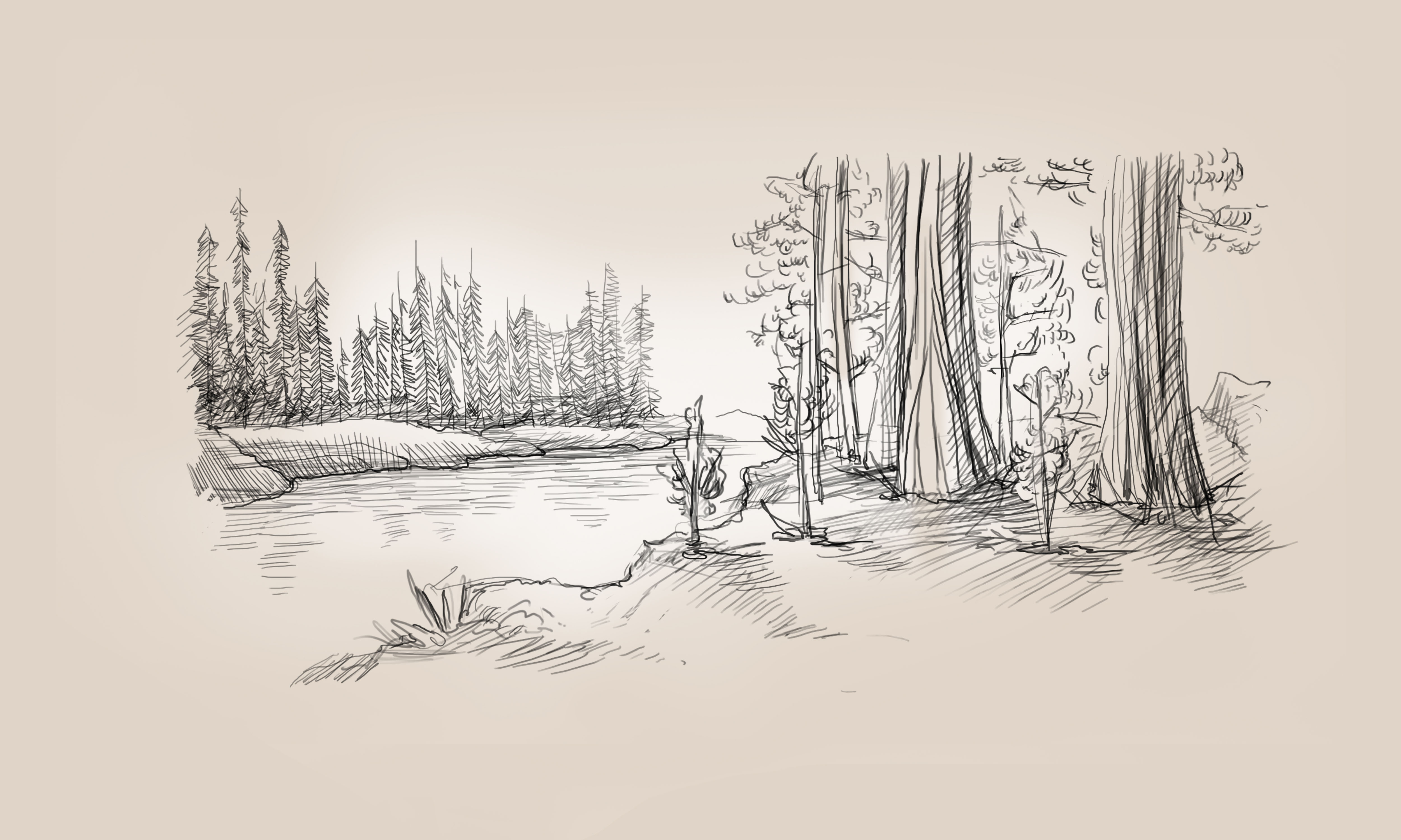
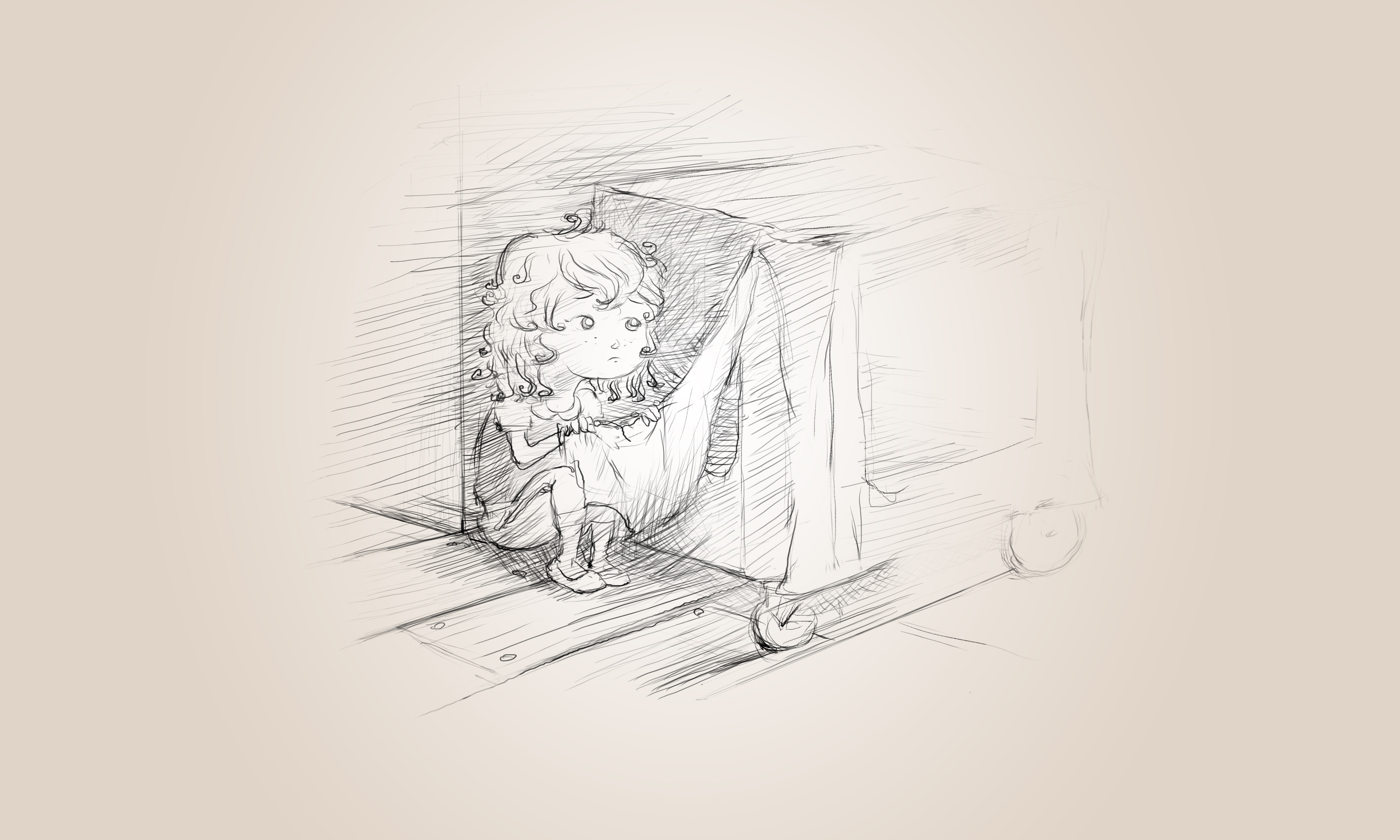
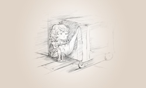
For example, we added a parallax image to the first chapter – an illustration of Summer looking back over her father’s shoulder at her mother and sister. She’s angry and hurt at this point, and we hoped that portraying the physical distance between her and her mother and sister would help relate the emotional distance she’s feeling.
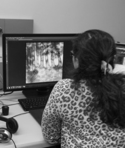
Laura made this browser-version of the parallax image test. She’s also been curating sounds. Will’s been setting up playtests with local schools. He also reached out to some psychology/HCI researchers on main campus who have studied the intersection between illustrations and reading comprehension. I’ve been editing the story, and working with Laura to layout the pages in InDesign. Allyn’s polishing some of the features from Chapter One, as well as developing a sound manager system. Hannah has been making lots of illustrations.
Working on Illuminated Letters
On Monday, Hannah, Laura, and I learned how to use the laser cutter. Laura made a vector based version of our logo so we can potentially make promotional material with the laser cutter. Many options.
continue reading -
Parallax Tests
-
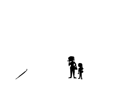
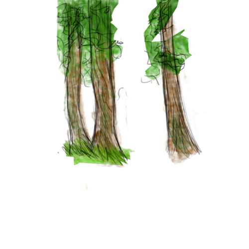
Concept Art and Quotes
-
Week 5
February 9 – 13
Monday was Quarters. The team met with all of the faculty round by round, and pitched our project. There were some recurring comments. One was a concern about how we are going to test our ideas. Remember, the driving hypothesis here is that we can use features specific to a digital format to enhance a story – but how do we test whether a story is enhanced? What does “enhanced” mean? What questions do we ask our playtesters to prove this?
We talked about it: to enhance, for our purposes, is to create more immersion within the world of the story. So, our digital features will be building on the characterizations, setting or plot advancements of the tale. One way to test their effect would be to ask playtesters about the content of the story. This establishes whether story elements are communicated better when accompanied with extra features or a normal e-book presentation.
On Tuesday, Jane Bernstein, our client at the English Department and story editor, delivered her first round of edits of the first full draft of the story. It’s been great to get an extra pair of eyes on the story.
Laura finished a piece of ActionScript that takes a sequence of pngs and automatically applies a fading transition and cuts it down to a choppier frame count, achieving a flip-book quality animation. We think animation presented this way is more in theme with the experience of a book we’re trying to create.
For the upcoming sprint, we want to implement Chapter 1 – having it on the Fire, enhancements and all, for Thursday.
continue reading -
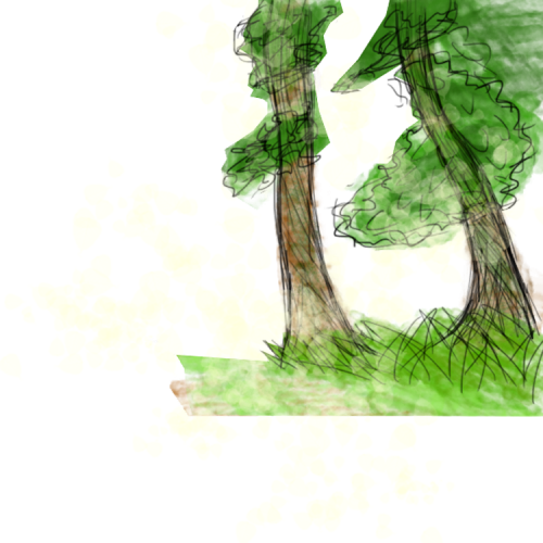
Concept Art and Quotes
“Her mother spoke up: ‘Sometimes when we feel embarrassed, we can act in ways we normally wouldn’t.’ “
continue reading -
Week 4
February 2 – 6
The week before quarters: our team has an e-reader prototype running on the Fire, implemented design features from last week’s meeting, finished our branding, and have a working draft of the story, chapters 1-6.
We had a visit from ETC alum Emmanuel Eytan on Monday. He had a lot of great advice and was a wealth of resources about interactive stories. He specifically held Monkey Island up as one of the best uses of interactivity moving a story forward, crediting storyteller Ron Gilbert.
As a team, we struggled with how to communicate the design challenge of our story effectively – it’s really all about reading. Anything extra (sound effect, animations, etc.) are built on top of the existing structural breaks of a book (page turns, chapter beginnings). Dave Culyba helped us refine that idea later in the week, see below. We decided to try and use the phrase “reactive” instead of “interactive” as a way of explaining the mechanics of the digital experience. Epiphany for us, but this immediately caused problems:
On Wednesday, the whole team attended the playtest refine workshop. We had put “reactive, not interactive” on our composoition box, and the first comments we received from our peers on that particular part were “what?” and “this doesn’t make sense”. Fair. We knew we had to come up with a better way to communicate, especially with Quarter* reviews on the following Monday.
The workshop also gave us a great opportunity to think about what role playtesting will take on in our project and what we want to get out of our playtesting questions. It helped refine the Major Design Question (MDQ) about the tension between the experience of reading and the extra ways we want to enhance the story. We also took our team photo!
Ears by Hannah, Editing by Laura
We had a meeting with Dave Culyba on Friday that was very enlightening for the whole team. We told him about our primary decision to incorporate page breaks into the book, and how we only wanted to build reactive features around those natural stops in the story. “I would really think about ways to incorporate your own breakpoints into the book,” he said, “Have you thought about breaking up the pages into paragraphs that become visible as you tap?” He also pointed us to other mediums like radio dramas, stage performances and audio books as an inspiration. The performers here need to know the intent behind the written word, and often use music, sound effects and timing to enhance the message.”This is an interesting design space, and I’ll be really angry if I see you making easy decisions.” Roger!
Cocos2D is out, and we’re back on good old Unity! Allyn has both taps and long-presses working as a method to turn pages on our virtual book, and a beautiful shaded animation accompanying it. Feels really good to turn the pages. Reminded me of past ETC-project, the Ben Franklin Synthetic Interview on display on the first floor of our building.
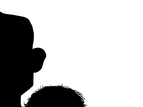
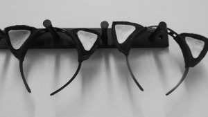
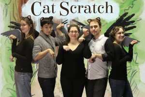
Hannah has invested a lot of time in getting the characters to look cohesive, and to decide on a style. We’re using water colors and pencil, and opting for a more realistic feel, taking inspiration from Beatrix Potter, Jan Brett, and our stand-by: E.H. Shepard’s Winnie the Pooh. My personal favorite Hannah-creation of the week is this rendering of Willow (custom cat-ears a close second):
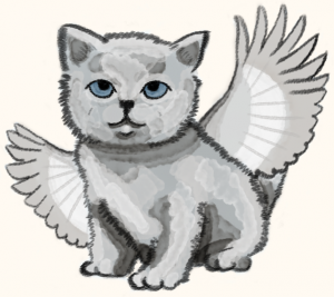
Heart of Gold, Wings of Chickadee
And finally, Cat Scratch is on Pinterest! If you’re interested in the character and style inspirations, follow our board.
*For non-ETC’ers, Quarters mark a quarter of the way through our production timeline. At this point, the whole faculty goes on rotation around all the ETC projects to learn about what we’re doing and to give advice. It’s a project’s first impression to most of the faculty.
continue reading