No interface gets good without playtesting and one of Code Blue’s goals this semester was to make sure the UI for our decision aid could be easily used by both senior citizens and their caretakers. All of the people who playtested for us fit in either category. Our decision aid consists of:
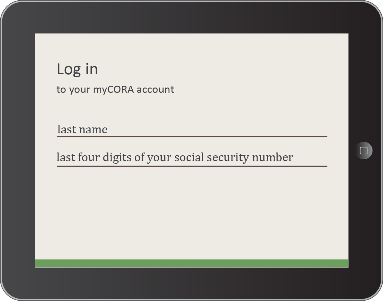
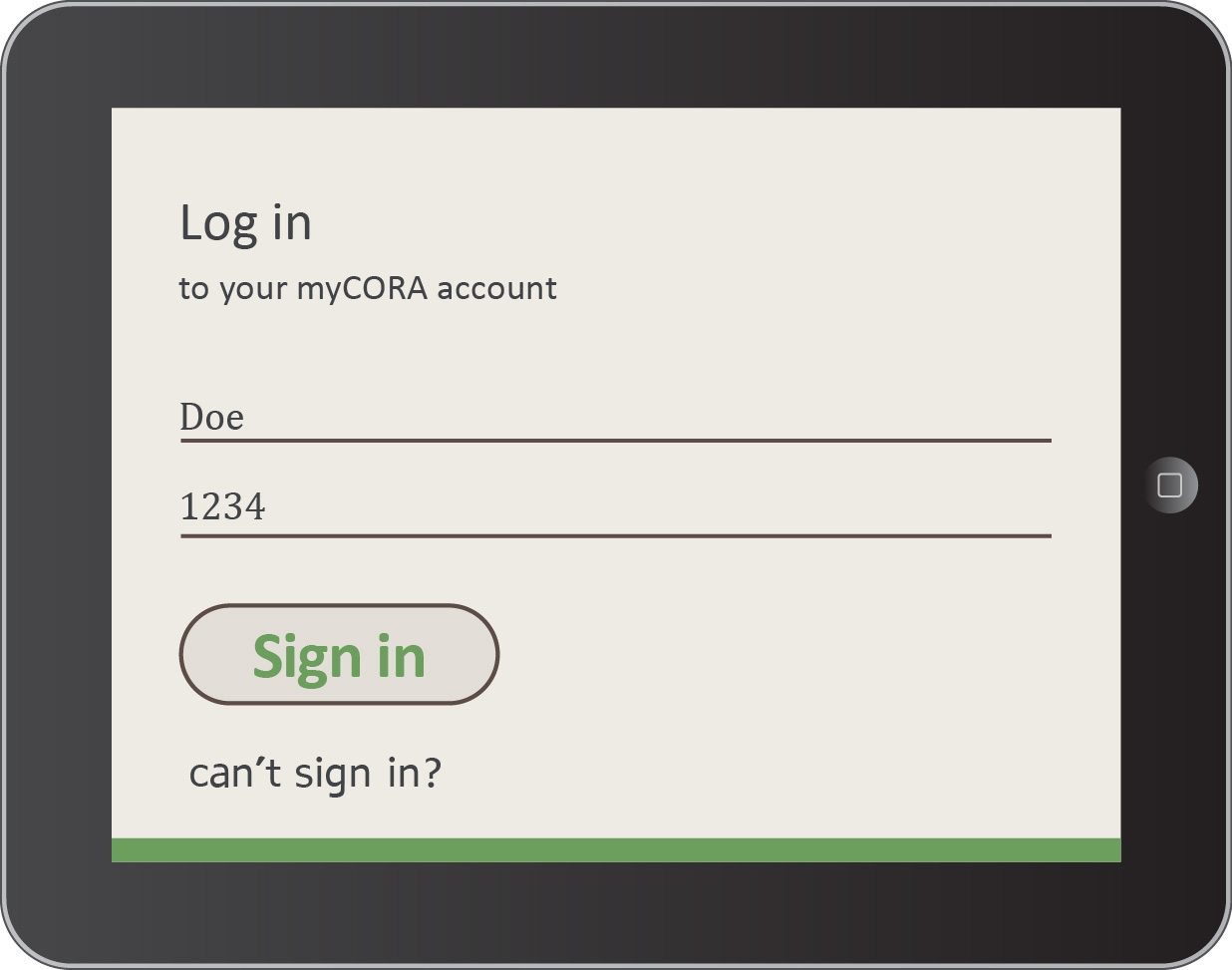
Log In: Log in to their decision aid (this is for security reasons as this decision aid would incorporate personal and sensitive information)
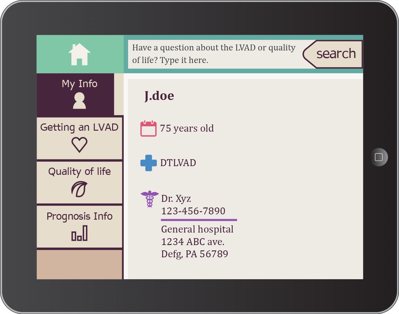
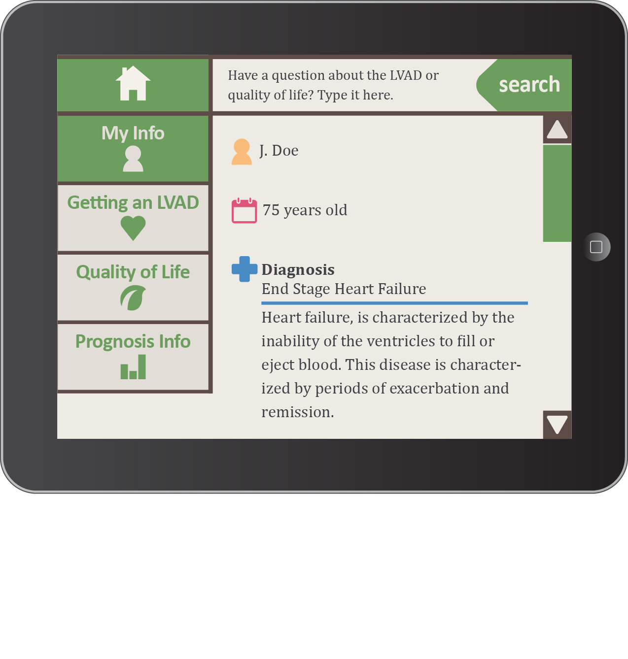
Personal Info: Review name, age, and diagnosis
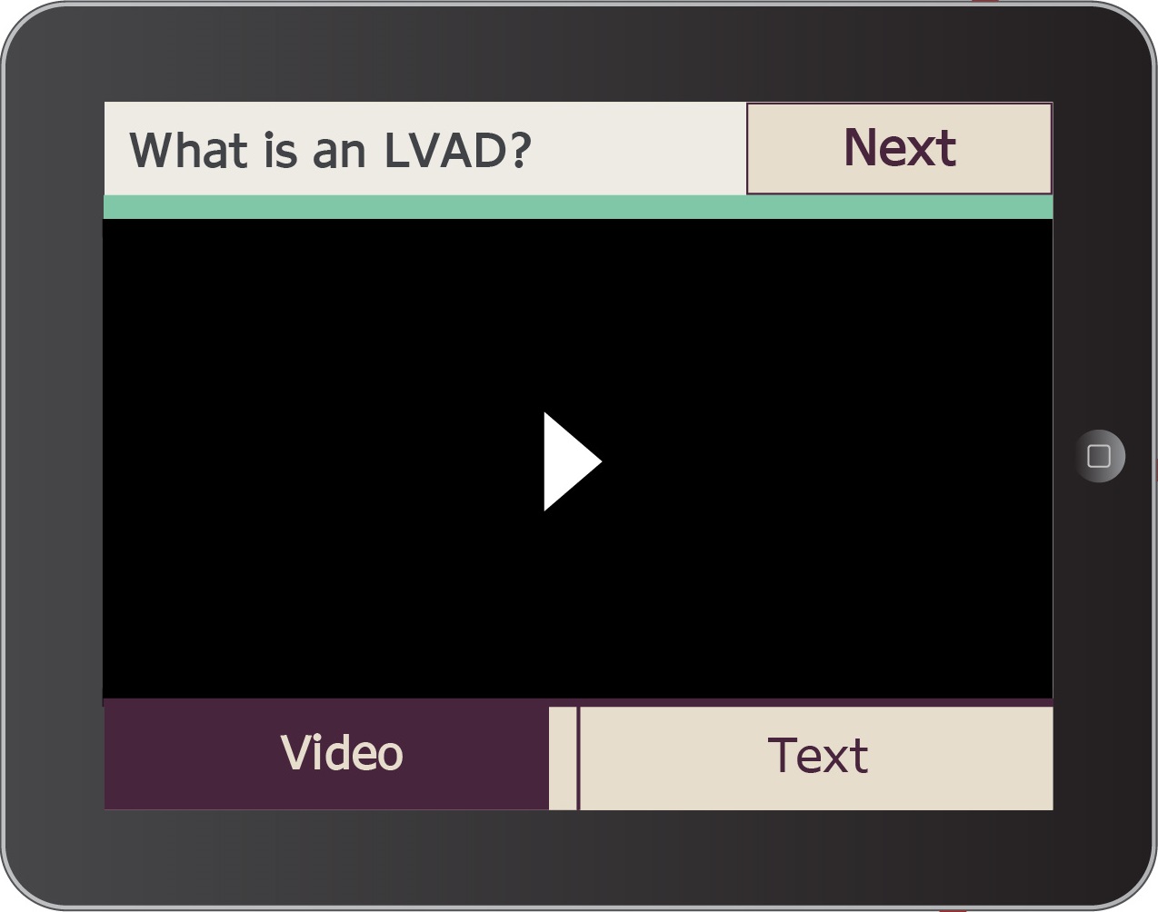
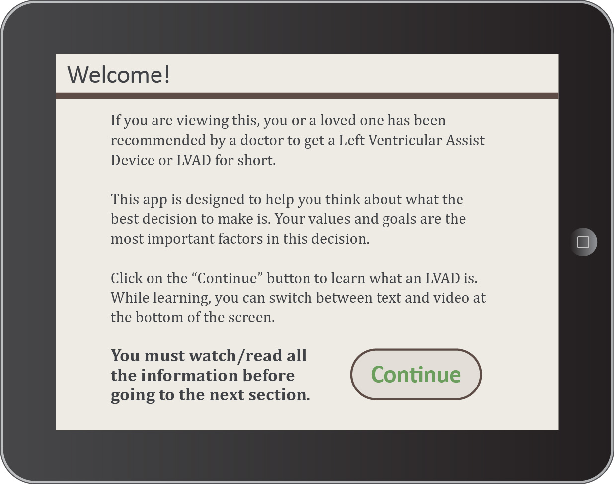
Orientation: Learn about what an LVAD is
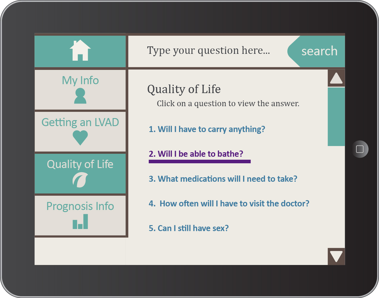
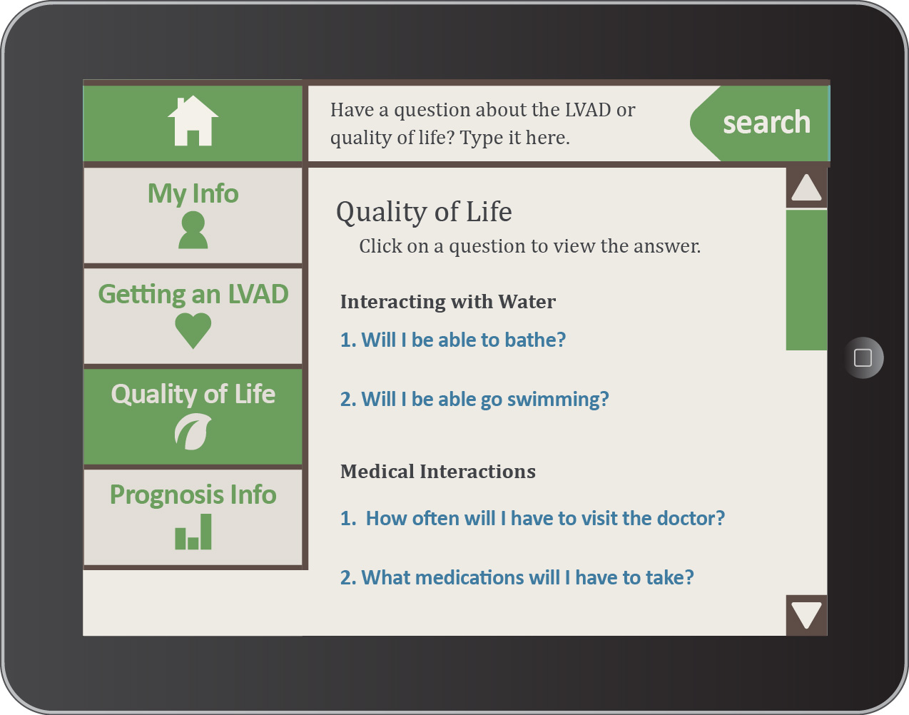
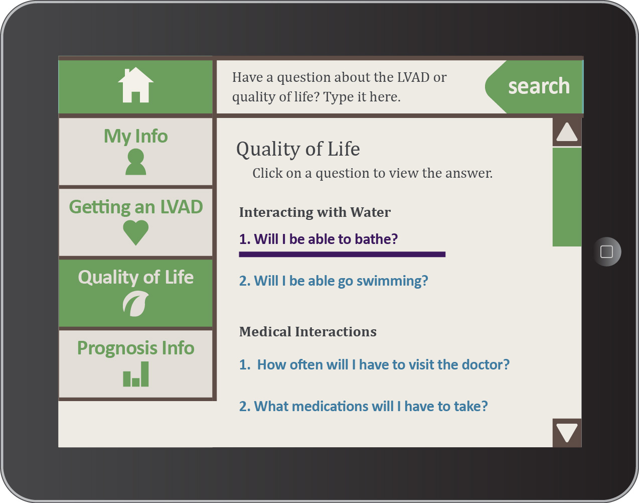
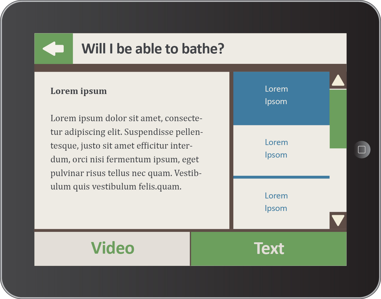
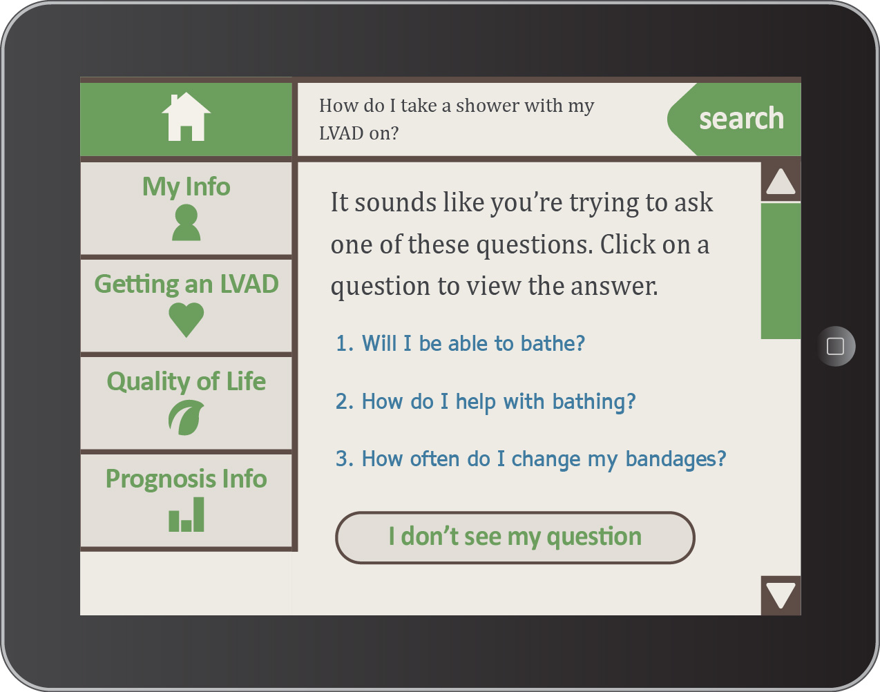
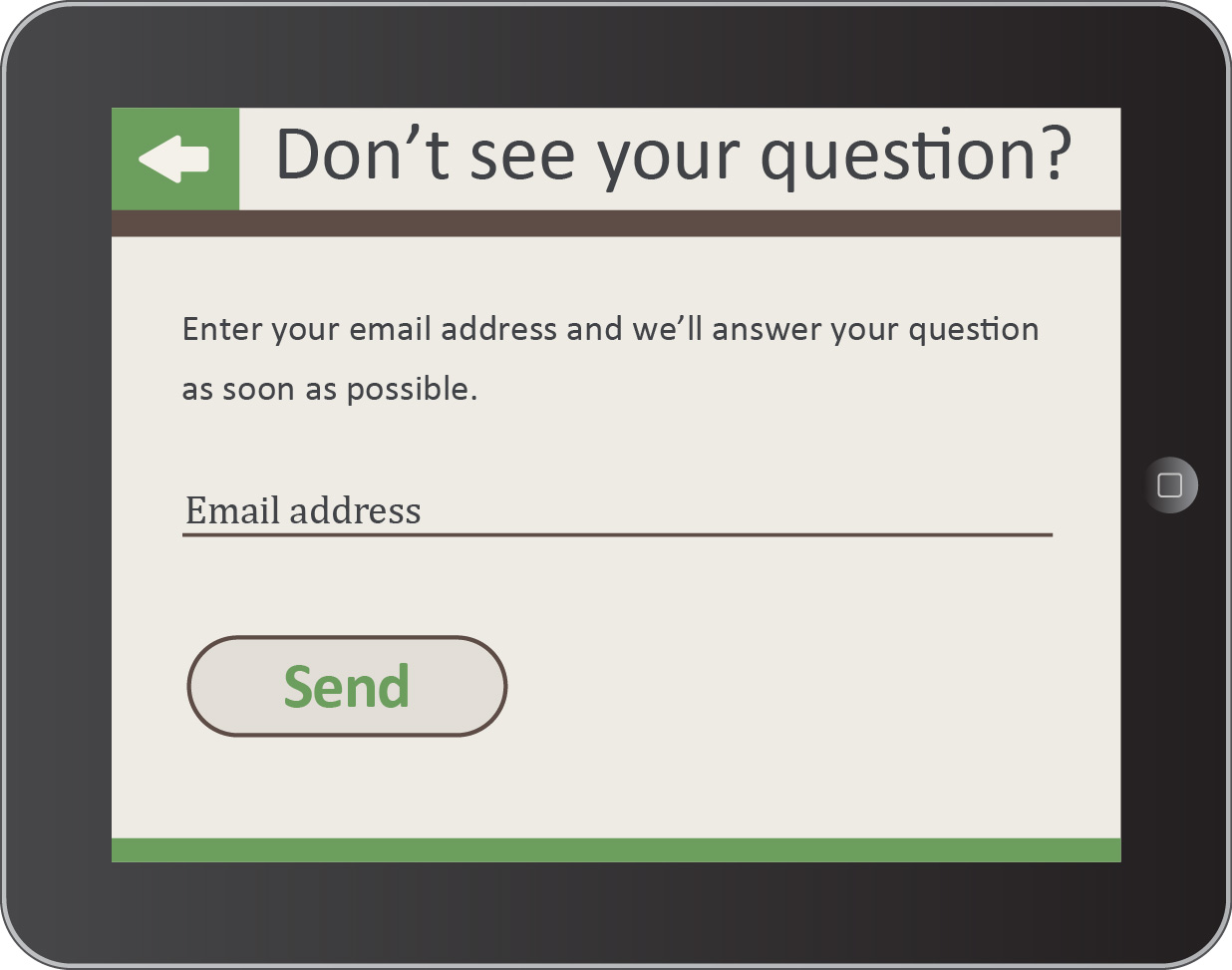
FAQ/Search: Find answers to questions about the LVAD and about quality of life
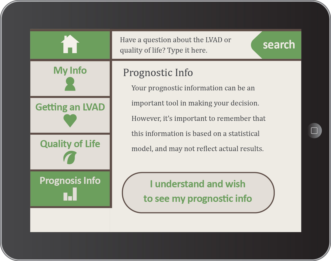
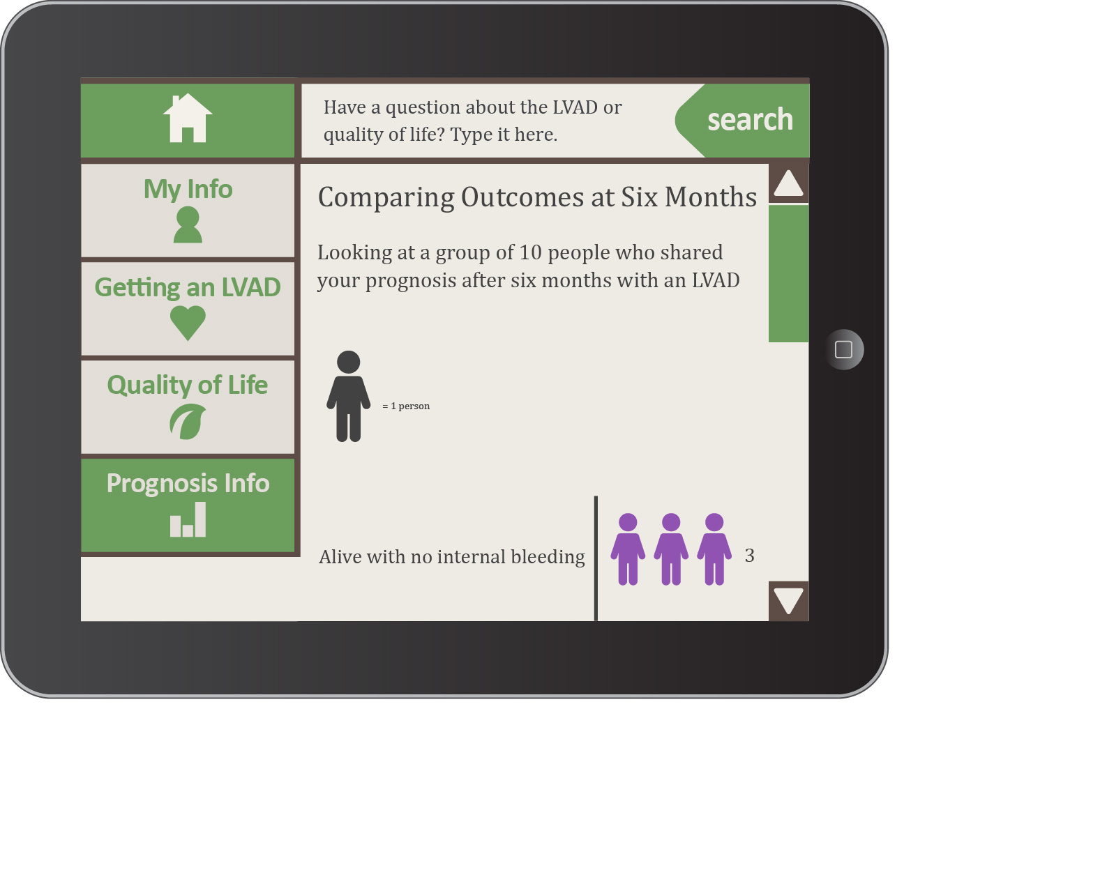
Prognostic Info: Review prognostic information pertaining to their case
Here are some of the main problems we discovered from each major iteration of the UI.
Major iteration 1
Problem: Color scheme was bad. The purple wasn’t warm enough, and it could afford more color.
Solution: Change the color scheme.
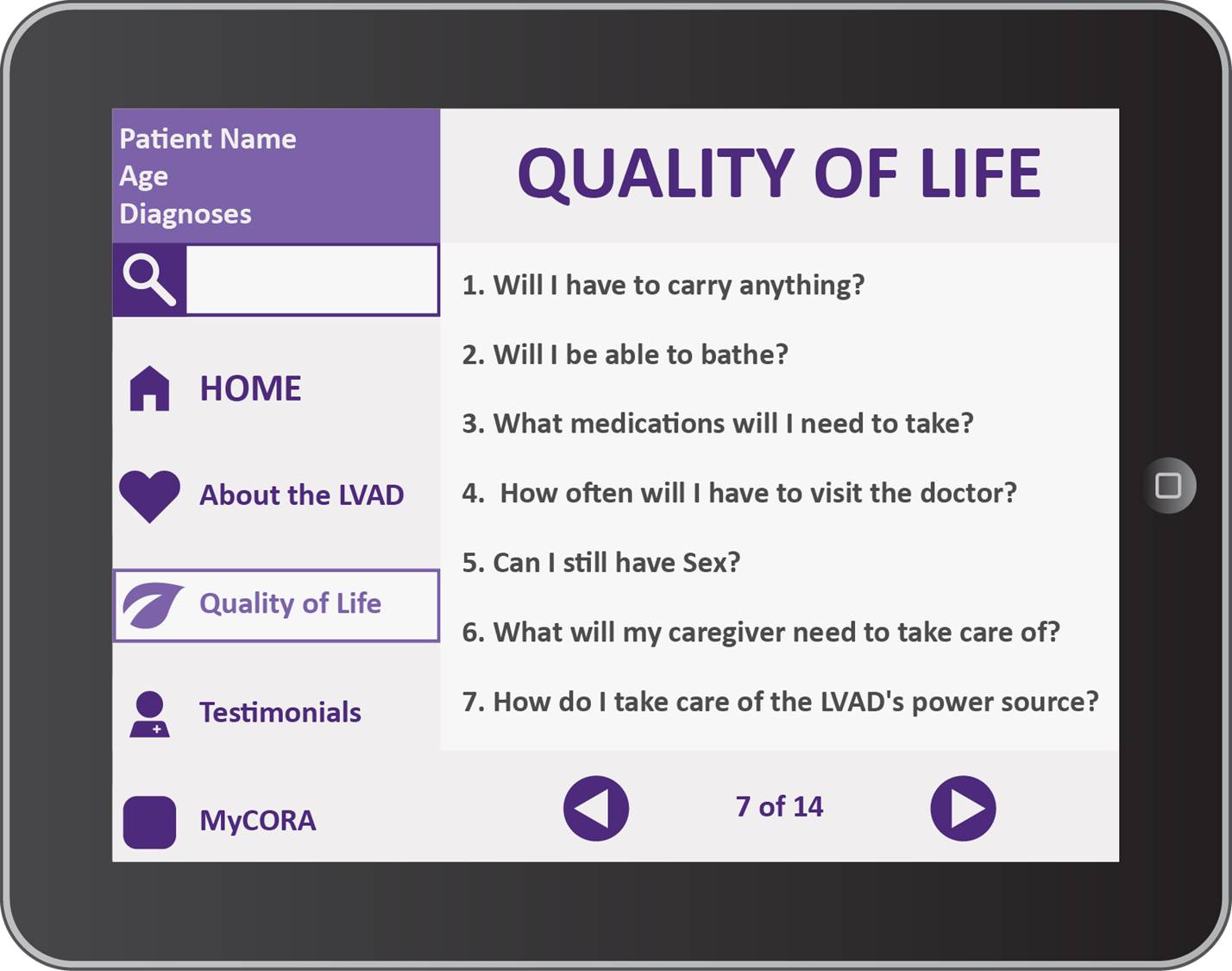
Problem: Confusion over whether the count at the bottom of a list, e.g. “7 of 14” on the first image, meant 7 videos of out 14 videos, or page 7 out of 14 pages.
Solution: Remove it.
Problem: There was crucial information which our client wanted every user to watch/read through, and this FAQ/search style could not guarantee that.
Solution: Add a non-skippable orientation page would the users would have to go through first before they could proceed to the next section.
Major iteration 2
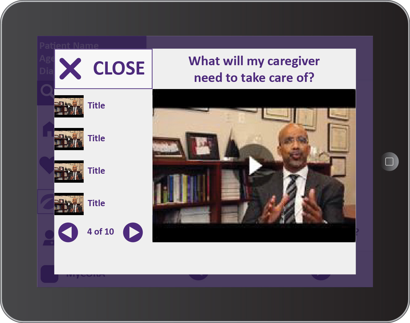
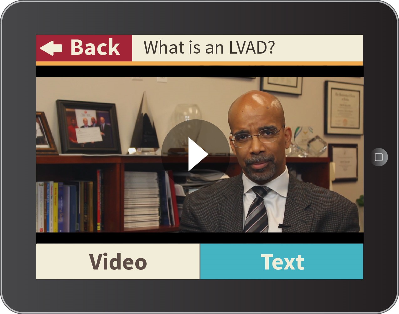
Problem: Confusion about whether the “What is an LVAD” and “About the LVAD” buttons in the orientation page and the Hypertext/Search page did the same things. Many people didn’t click on the “About the LVAD” button and missed out important info because of that.
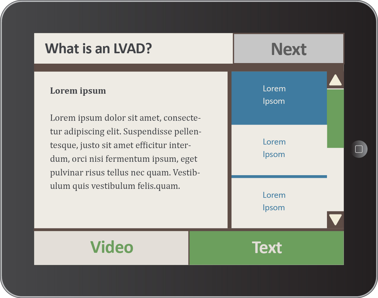
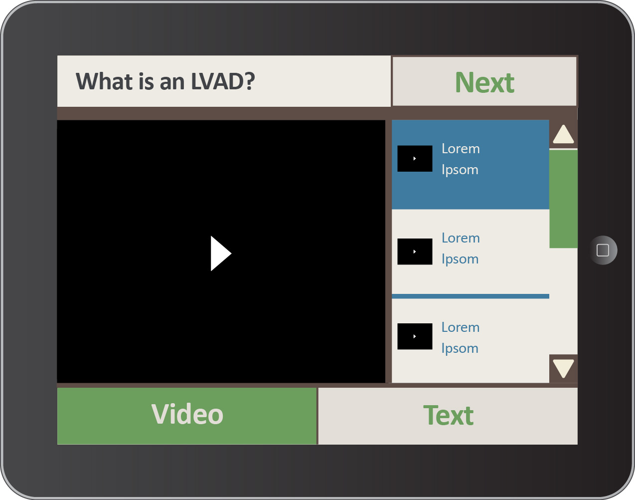
Solution: We removed the orientation page side bar menu and made the whole thing text. We placed a button “What is an LVAD?” at the bottom of the page to take people to the video/text teaching them about what an LVAD is.
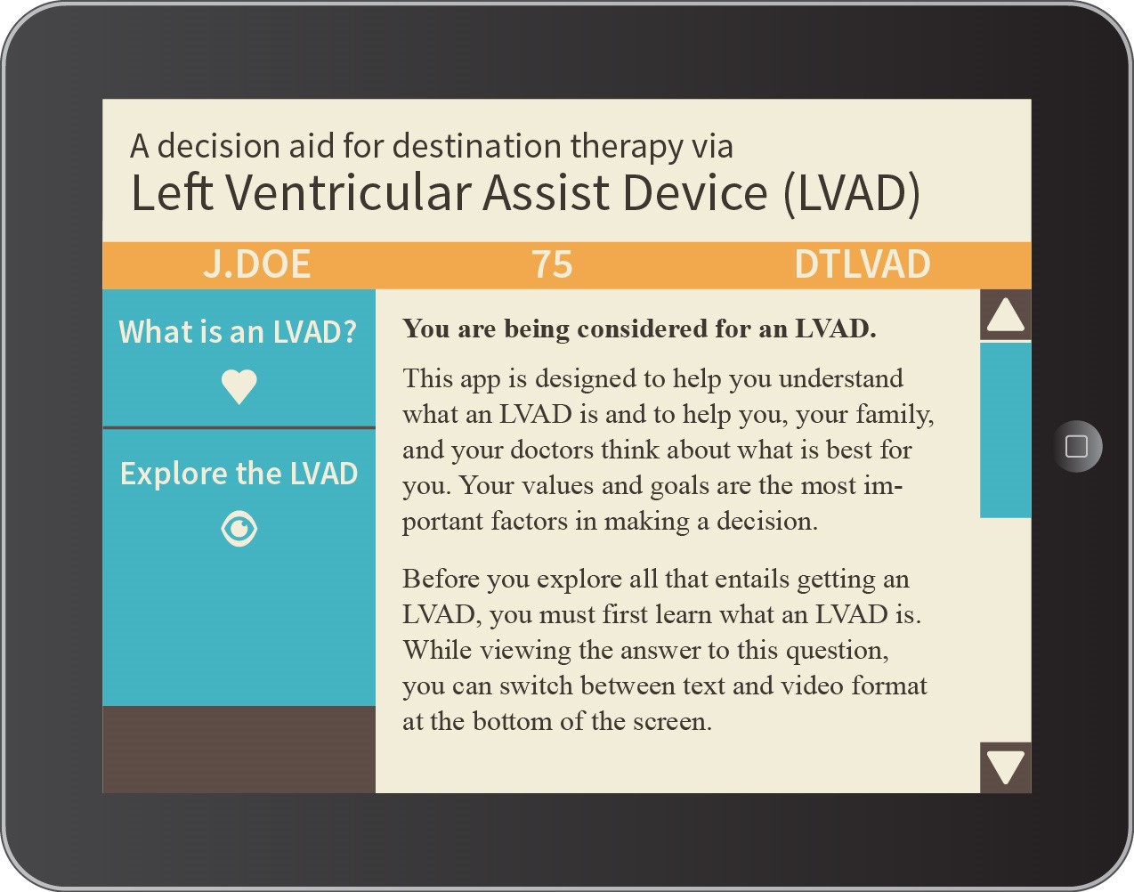
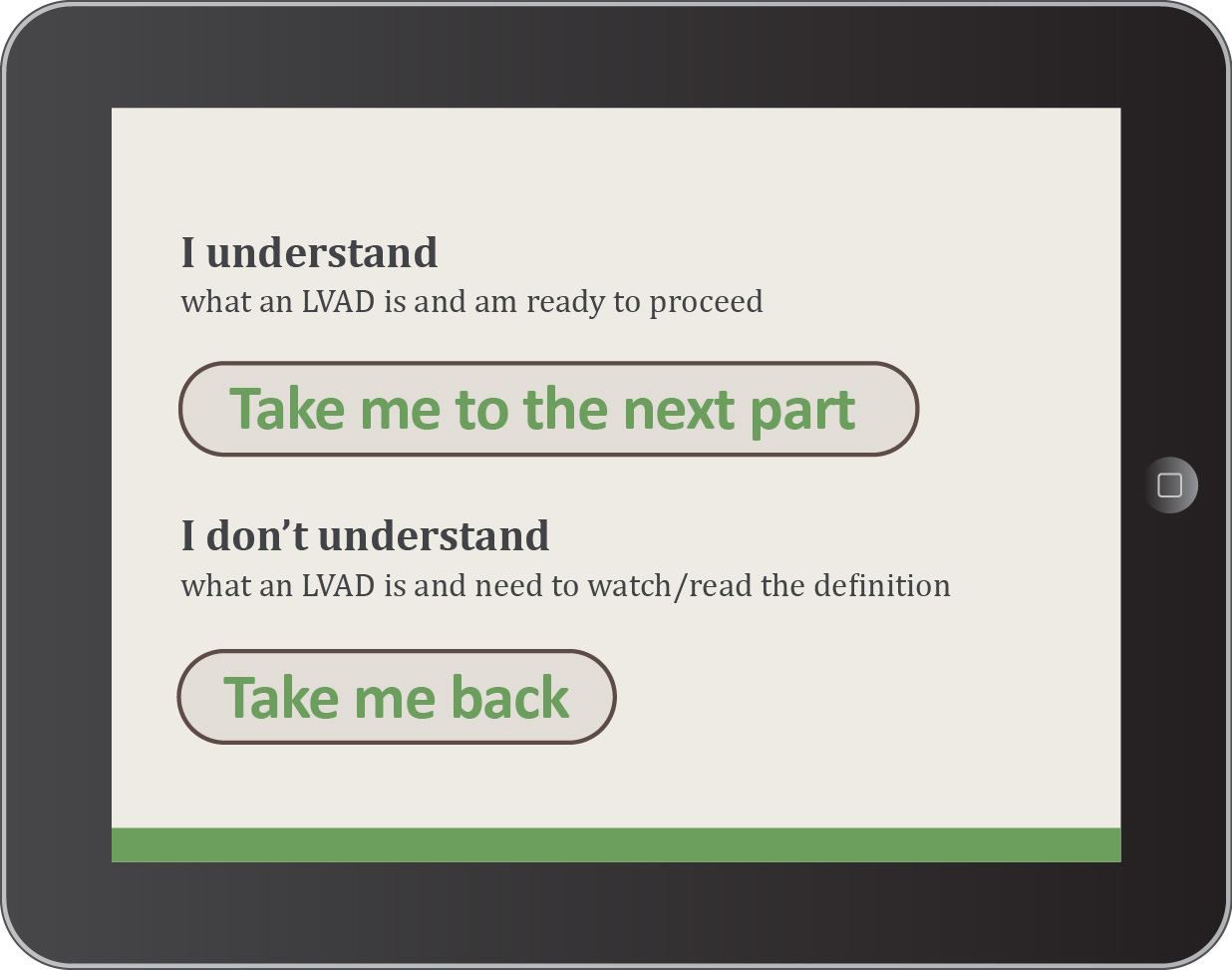
Problem: People didn’t want to click on the “Back” button, because they rightly assumed it would take them back to the orientation home page. What they didn’t realize was that a new button “Explore the LVAD” would appear below the “What is an LVAD” button on the side bar menu, which would take them forward to the Hypertext/Search section. Some people also didn’t notice the new button and got stuck at the orientation section, thinking that was the end.
Solution: We created a red “Next” button which brought the users to a new page. On this new page, they were asked whether or not they were ready to proceed to the next section.
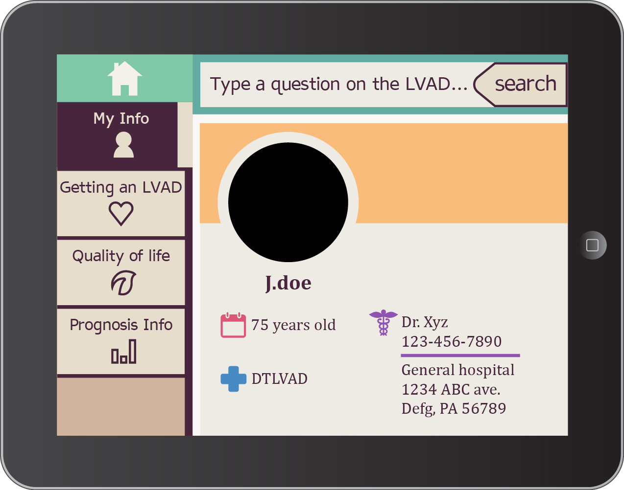
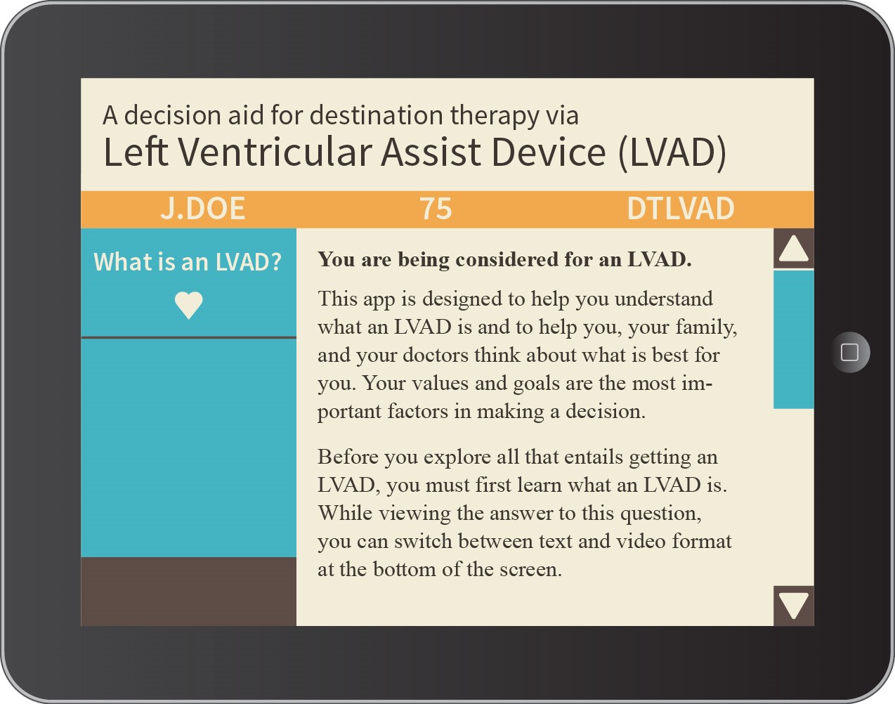
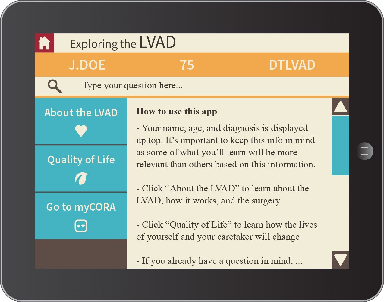
Problem: People liked that their details were on the gold bar, but felt it was too brief and clinical. A lot of other information, like the name of their doctor and the hospital’s contact info, would be appreciated.
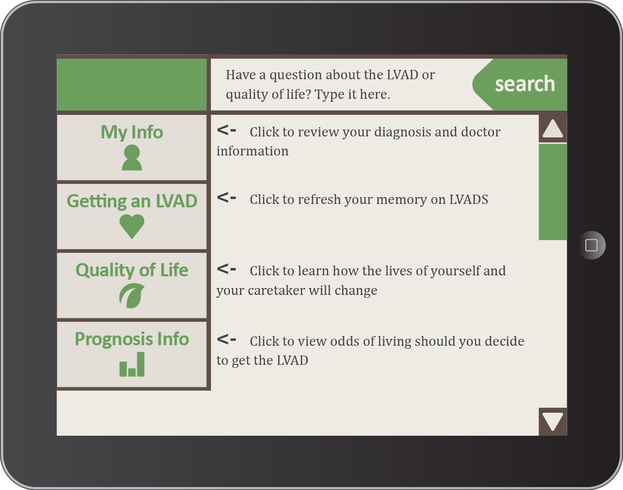
Solution: Create a new page with the patient’s personal information, to be accessed via a “My Info” button on the side menu bar.
Other feedback:
- “Home” button does not have to be labelled; our target audience is already used to recognizing that icon.
- Color scheme wasn’t calming enough. Green was suggested to replace the yellow, red was to be thrown out, and blue was to be turned a different shade.
Major iteration 3
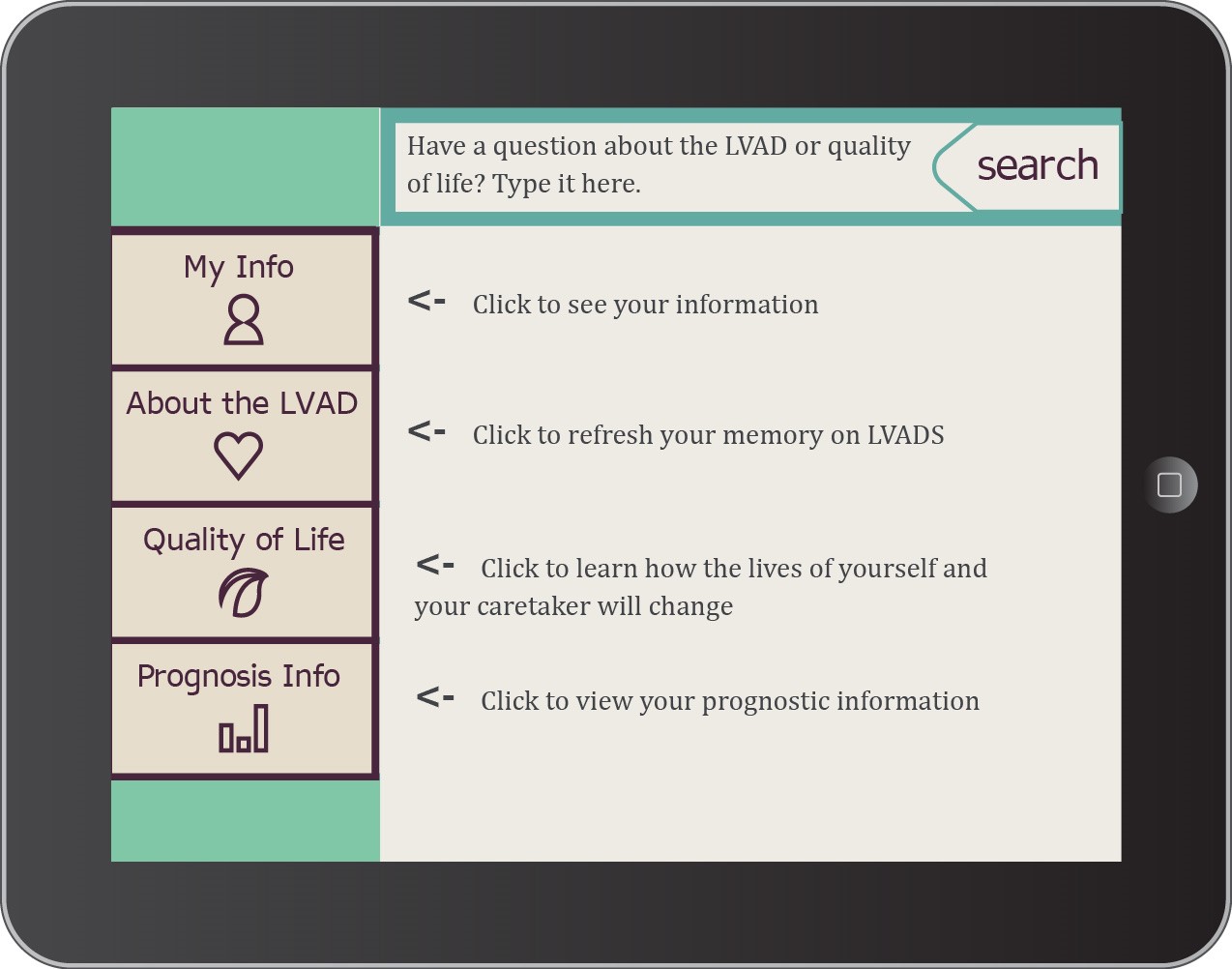
Problem: People had no idea what the “Go to myCORA” button did.
Solution: Rename it “Prognosis information”.
Problem: The “What is an LVAD” and “About the LVAD” buttons on the orientation page and home page respectively were still confusing users.
Solution: Replace the “What is an LVAD” with “Continue”, and “About the LVAD” with “Getting an LVAD”.
Problem: The display of personal information is messy. Also, how do we get the patient’s picture on the app, and do we really want to remind the patient of how sickly they look?
Solution: Redesign the personal info into one column and remove the image.

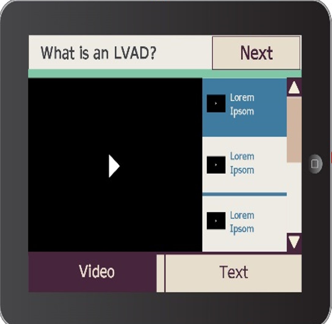
Problem: The required information our client wanted us to show was a lot more than just telling the users what an LVAD is.
Solution: Create a playlist of videos in the orientation section. The “Next” button for proceeding to the FAQ/search section will only appear once the user has gone through all of the videos.
Problem: The beige and brown color scheme was badly received by everybody, and clashed with the green. We also got an interesting comment about how the beige could potentially remind people of the pallor of their own skin.
Solution: Just stick to green and remove all the browns.
Problem: The green used was very calming and neutral, yet extremely clinical because the green was the color of typical hospital scrubs.
Solution: Use a warmer green.
Major iteration 4
Problem: People didn’t notice the “Next” button appearing after they were done with the orientation videos, and thought that was the end of it.
Solution: Have the “Next” button constantly be there, but grayed out.
Problem: People were confusing the term “prognosis” with “diagnosis”.
Solution: Add the diagnostic info to the personal info page, and explain what prognosis means (e.g. your personal chances of survival) in the home page.
Problem: The prognosis is based off a statistical model and may not reflect actual results, and the client wants to make sure the users are aware of it.
Solution: Add a disclaimer “gate” to that page and have the users click an “I understand and wish to see my prognosis” button to proceed.
Problem: People forgot which questions they had already clicked on the the FAQ.
Solution: Add text decoration to visited links, i.e. change their color, bold/underline them, etc.
UI as of Softs:

Recent Comments