Introduction
The art making process in our project has been based on research-exploration-feedback loops. We wandered to several different places, before we began to see clarity in our direction. The pivotal point in our journey was when we realized we needed to inject a distinct feeling, a palpable personality into the aesthetic choices. We transitioned from approaching art in terms of styles and techniques, to thinking in terms of visions.
Why are visions important? Because having a vision means our artistic choices are united by a common goal. A vision also means a clear message or an emotion our art wants to communicate. Ideas and emotions are what will ultimately connect with the audience.
Our original approach might give us a pretty appearance, but it is just an appearance. Even in an iPad game about recycling, there is room for using art as a tool to communicate, to resonate, and not simply to decorate.
But of course, this lesson didn’t come to us at the beginning.
Phase 1 – Art as Content Supporter
It was a blank sheet of paper initially. I was not sure where the art is heading. The subject matter of our experience, recycling, did not demand a certain aesthetic. It was also not a storytelling or world-building game. I thought this implied that art was situated as a supportive role to the content.
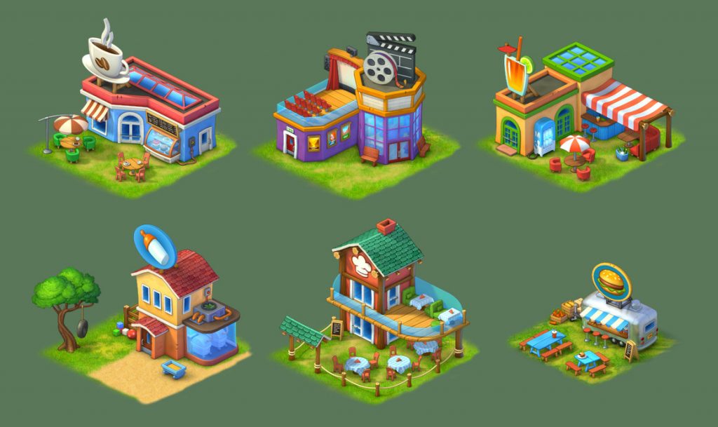
The first iteration of art was created within this framework. It was designed to accompany the paper and digital prototypes and to visualize future possibilities. It was functional, supportive, and kid-friendly with vibrant, complimentary colors.
![]()
The kids responded warmly to the crude, whimsical drawing style. The visual clearly helped them to grasp the game mechanism. That put this style as a potential candidate. However, it soon became apparent that it was difficult to grow on this prototype. The supportive placement of the art did not create much room for excitement.
Phase 2 – Art as Cost-Efficient Solution
So we needed to let art breathe on its own for a bit, by exploring possibilities largely regardless of the content. We explored a wide range of game art styles, in both 3D and 2D, to see what would catch our eyes. From that, we compiled a detailed art analysis, breaking down and comparing the appeal and complexity of each style in relation to potential game ideas. As the artist, I provided the team with my own recommendations from a cost-efficient perspective. What would be the most beautiful art we could achieve with the most reasonable amount of cost?
Naturally, we could not make the calls ourselves. We selected the top five art samples and brought them in front of our clients.
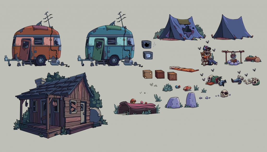
The kids showed a clear preference to richer, more organic art styles, with beautiful colors and textures, over the “digital-clean” looks. Their top choices (last two images from above) actually aligned with our internal favorites.
This confirmation informed us that we would probably do a painting-like 2D environment. Our projection was still through the lens of cost-efficiency. The time constraint was perhaps the deciding factor in what our art would look like.
Phase 3 – Art as Ambitious Visuals
Before we produced any prototype during Phase 2 (it coincided with the branding material production and game design exploration phase), the result of our branding material gave instructors and team confidence that we had the capacity to push for more ambitious visuals. Phase 3 was defined by that raw passion for aesthetics.
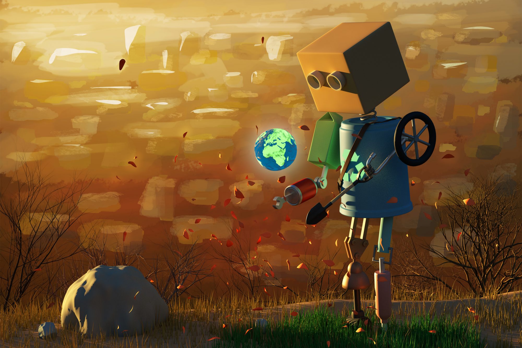
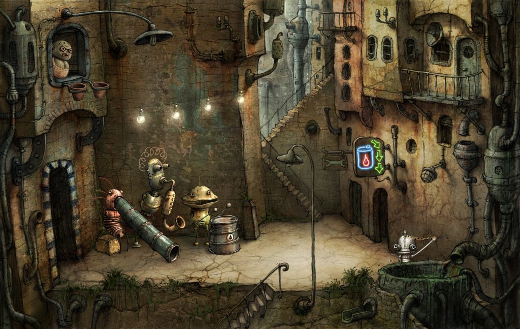
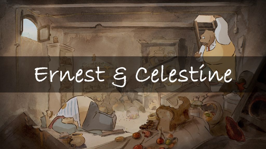
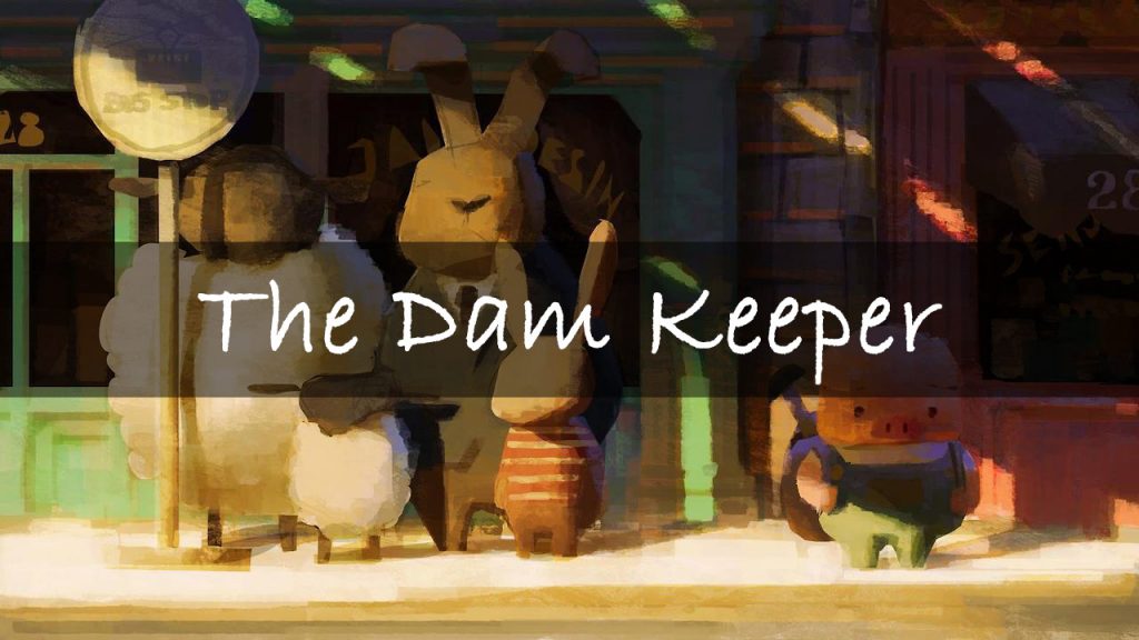
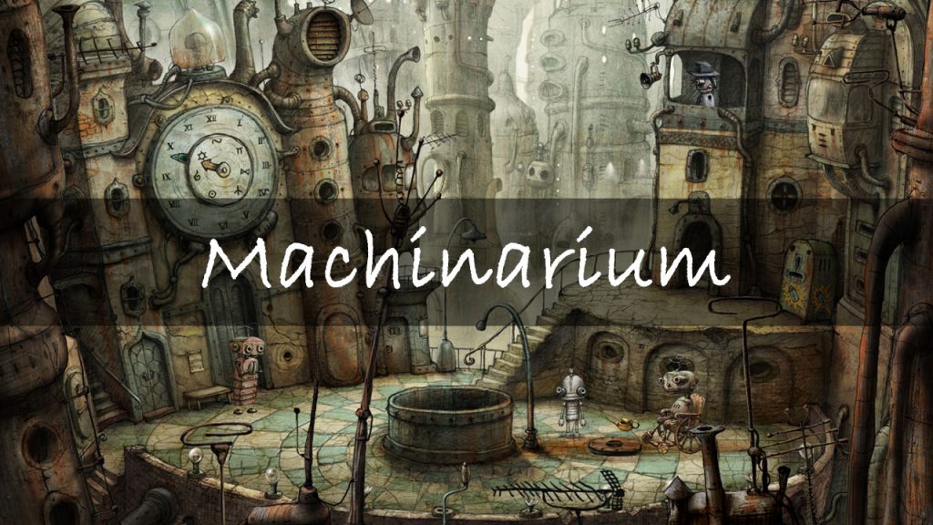
I would be attempting something slightly beyond my existing skills. I did many hours of research and tutorials in order to define the styles we wanted, and to learn the painting techniques needed. Our technical references narrowed down to two Oscar-nominated animations, The Dam Keeper, Ernest and Celestine, as well as a multiple-award-winning game Machinarium.
I found and deconstructed the making process of these works and created two art prototypes of our own. One of them featured loose outlines and paint brush textures, the other pencil stretches and repainted photo textures.
Both of these prototypes received positive feedback. They informed us that we could do this, and how much time it would cost to do it. However, it was not clear what the rest of the game should look like.
There was an increasingly tangible sense of urgency that we were still missing the bigger picture.
Phase 4 – Art as Vision
We started to conduct a sweeping research on both art direction and UI/UX design. We looked at between 15-20 different AAA and indie titles’ GDC talks, iOS’s design recommendations, and more. The research gave us pages of valuable notes, from which, we then extracted the principles most applicable to us. For the first time in our art, we started to apply industry-tested guideline to our thought process. It illuminated our path forward.
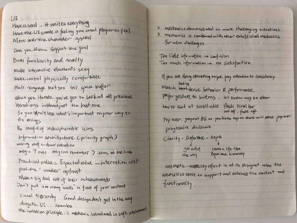
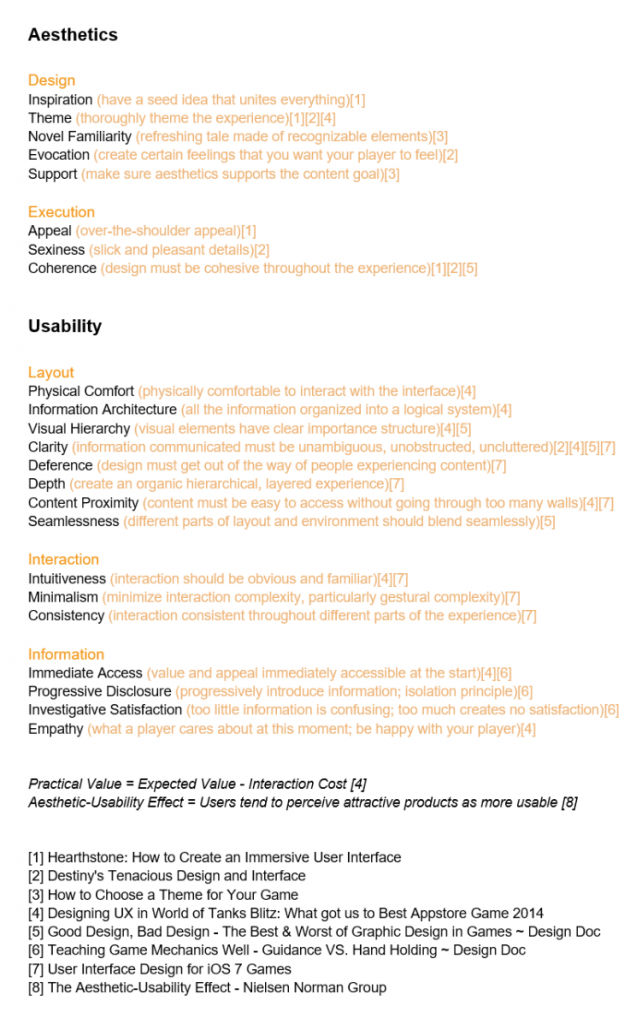
Notable lessons:
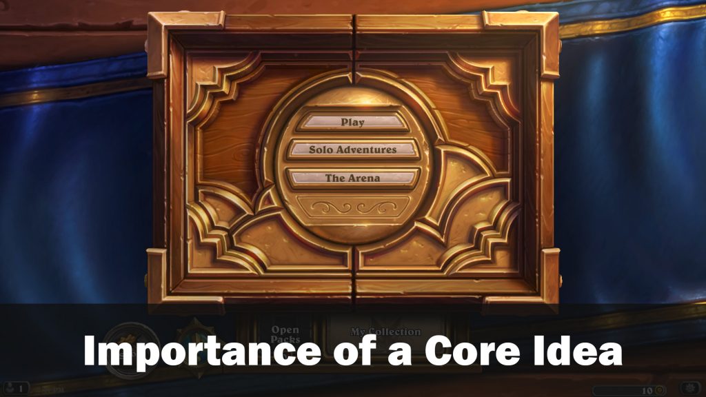
Hearthstone developers belabored on the transformational effect of having a seed idea (a.k.a. core idea, vision). Before they came up with the “Box”, their prototypes were all over the place. Once the “Box” became the seed, suddenly everything from art to UI fell into the right place, and the design leaped forward.
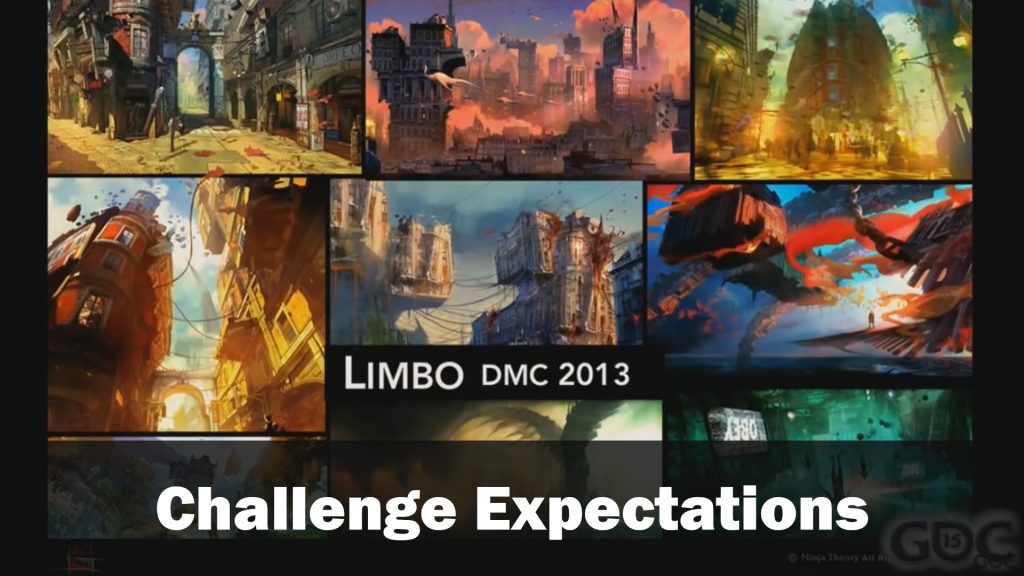
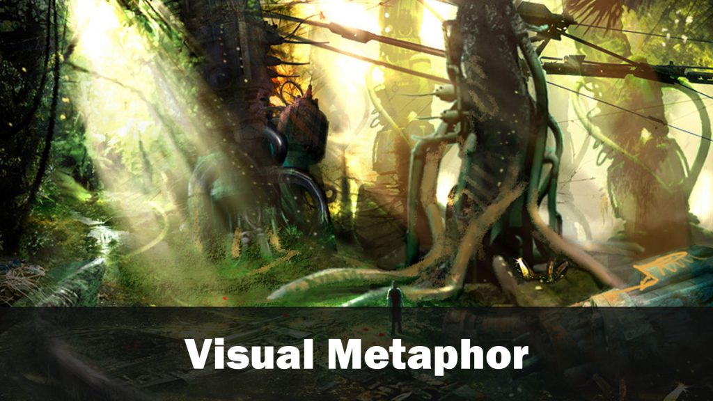
The art director of Ninja Theory (Devil May Cry, Hellblade) used a whole talk to demonstrate why being different makes all the difference. He strongly encouraged artist to not follow the mass, to bring themselves into the art, and to seek references from unexpected places. He also highlighted the power of visual association/metaphors, meaning using imageries that resonate with our memory and subconscious to evoke a desired feeling.
Our shortlist principles for aesthetics:
Dare to be different; Visually striking; Rooted somewhere.
Our shortlist principles for usability:
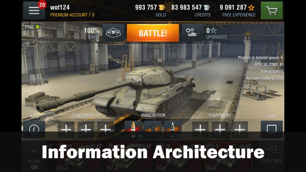
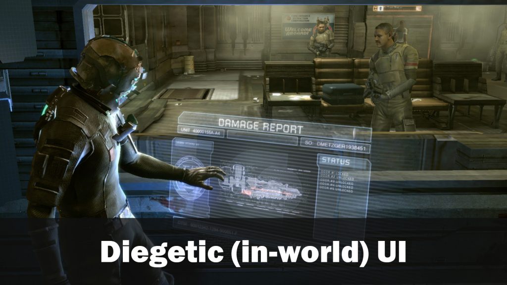
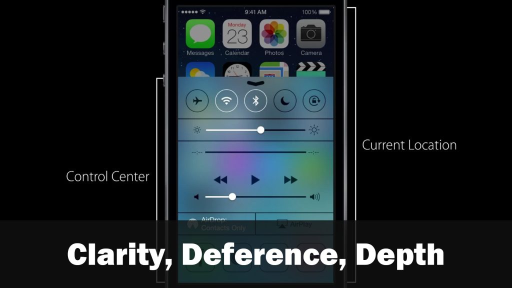
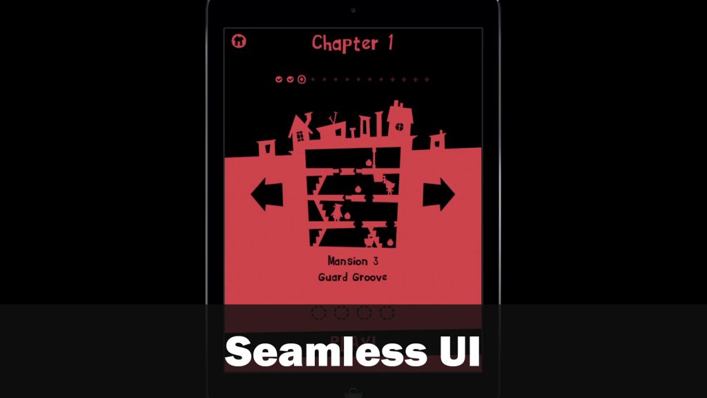
Clear structure; Seamlessness; Deference.
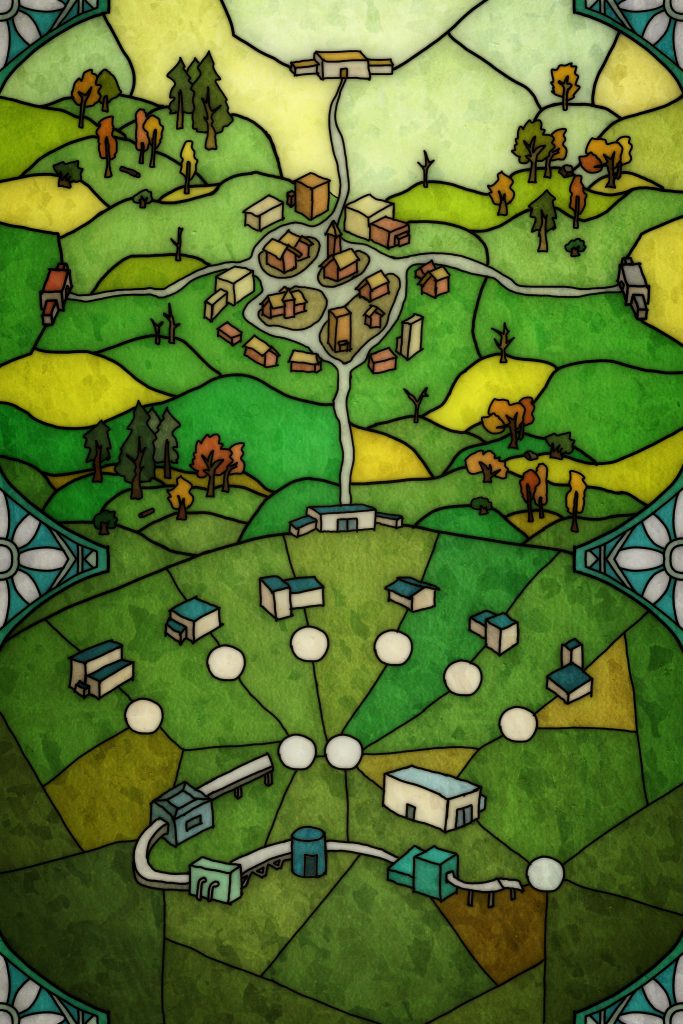
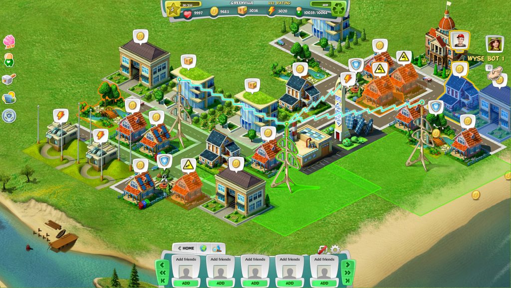
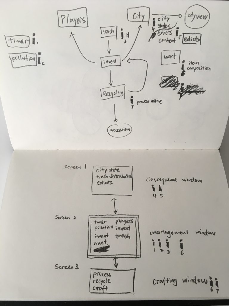
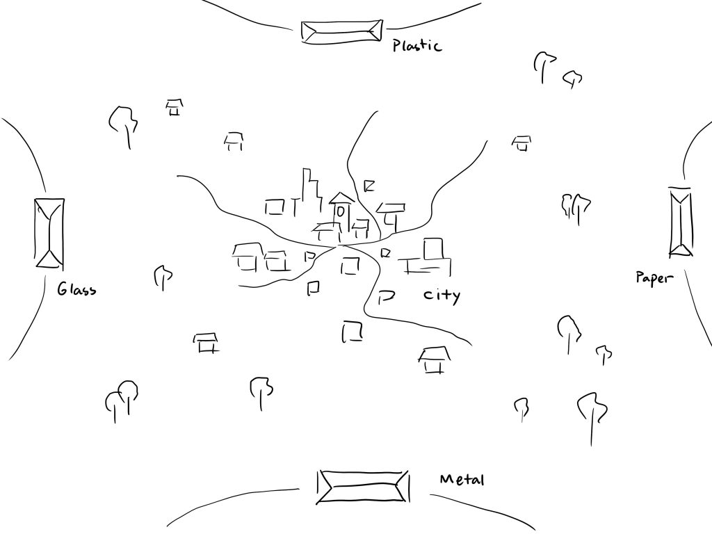
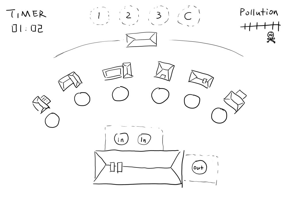
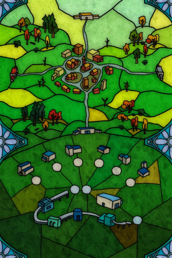
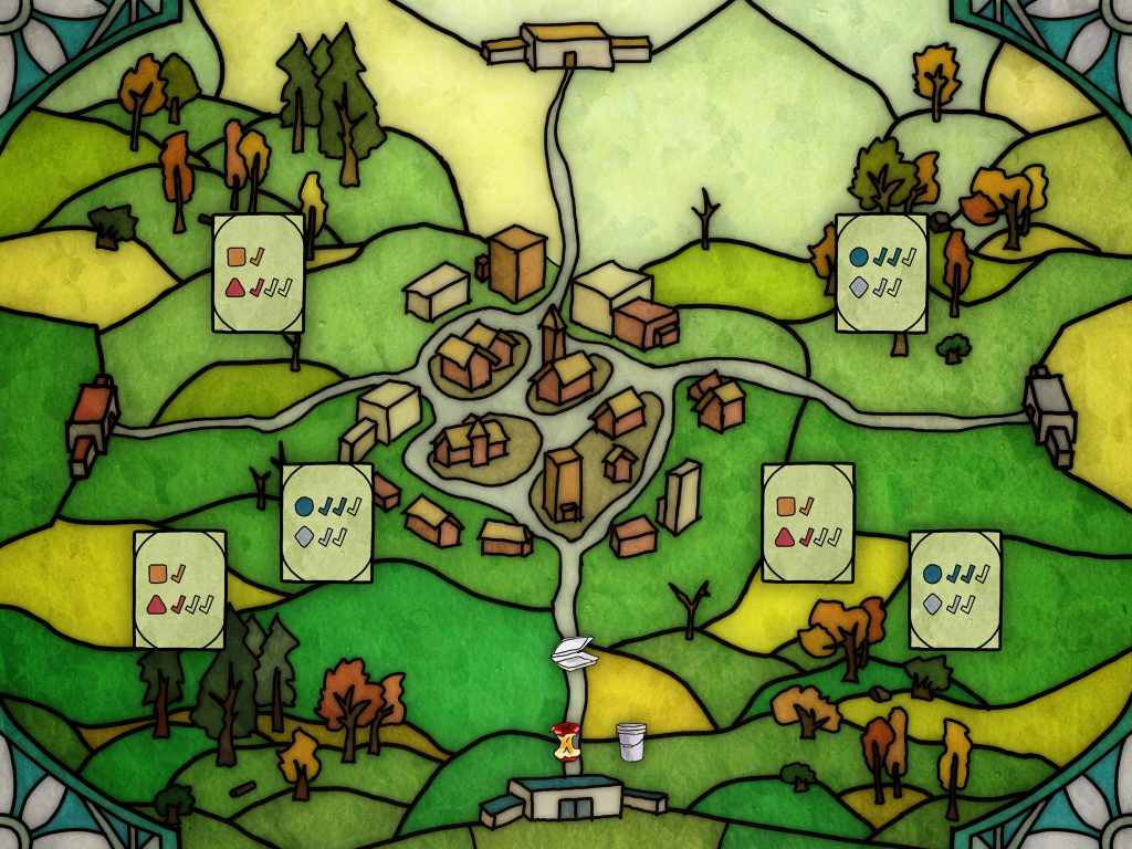
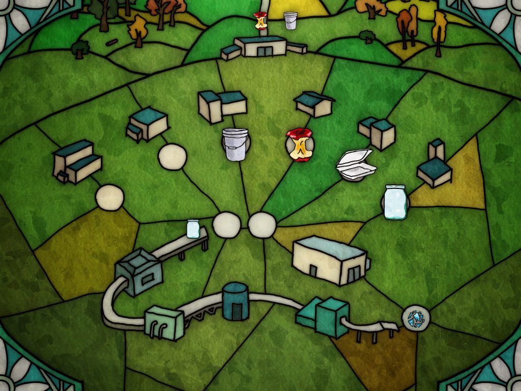
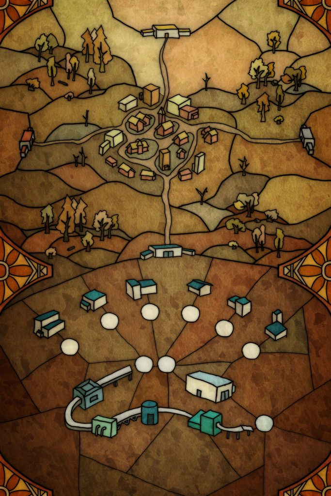
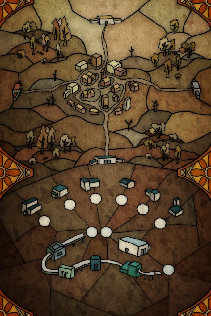
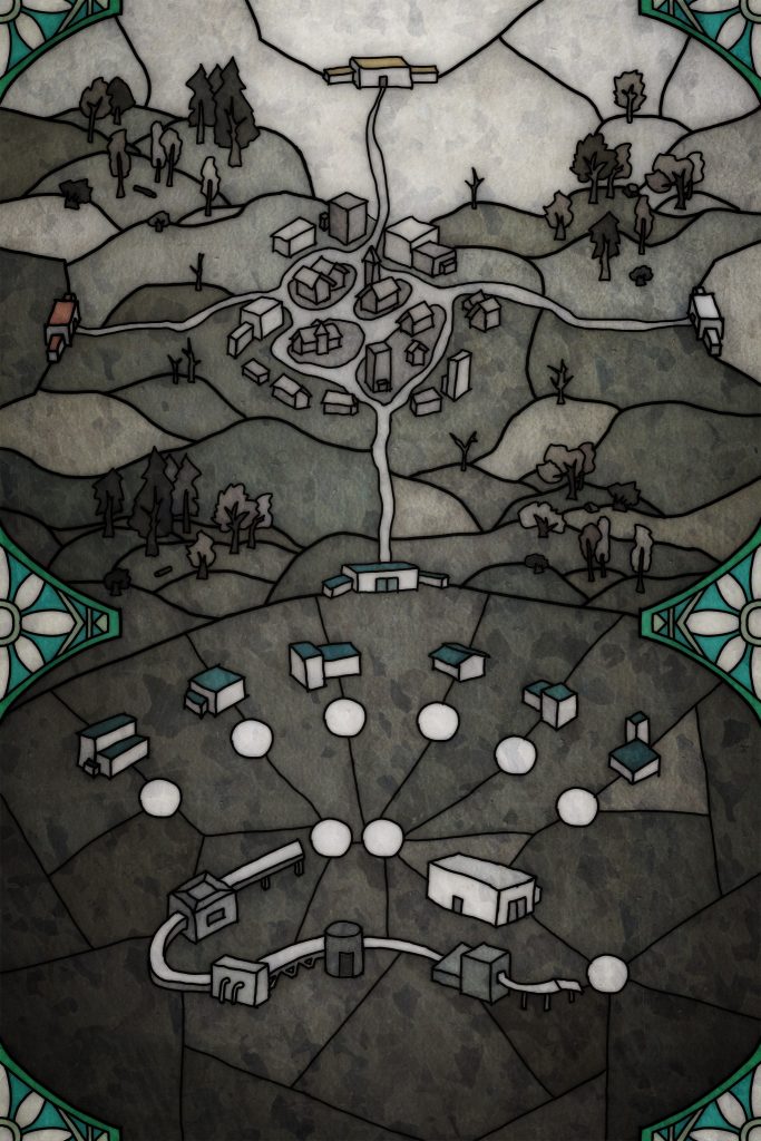
We worked out the basic UI layout based on our principles. A city was connected to four recycling centers on four sides in an open continuous environment. Each player had two basic views: the city view and the recycling view. The UI placement was aligned with the information structure, to establish proper hierarchy and avoid clutter. The city view contained all the information and events associated with the city. We called it the consequence window. The recycling center contained everything related to recycling. We called it the management window. We wanted our four players to feel connected with each other and with the city. That was why we used camera pan over continuous landscape, instead of separate screens.
We began to really think about how we wanted the art to make players feel in our game. One of our game designers mentioned the word “renewal”, which depicted the feeling at a successful end-game state. I quite liked that word. It implied an upward emotional curve, which matched the design of the experience. We had thought about using color and light transitions to denote changes in the environment. So I basically needed visual references of two opposing moods: one renewed and hopeful, one dirty and depressing.
Because we also wanted our vision to be rooted somewhere in people’s visual memory, I was digging through various styles of old paintings. Despite some of them containing the emotional quality that we were looking for, it was not easy to picture how to turn them into a game. The potential vision was elusive.
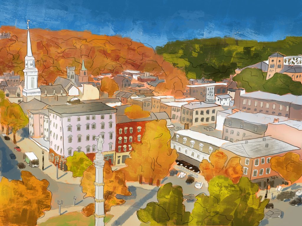
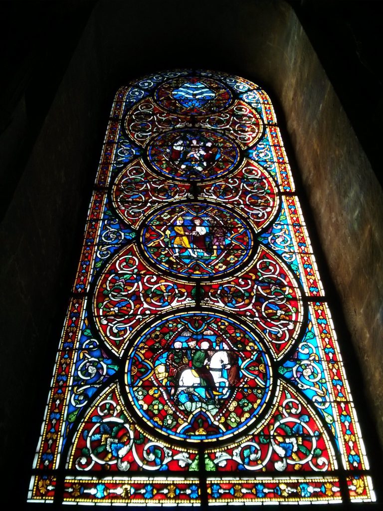
Finally, the inspiration struck when I was going through Walt Disney Animation Studio’s Archives Series, and I came across a stained glass art for Beauty and Beast. There was something enchanting about the medieval narrative composition: its zonal scenes, shallow depth, hierarchical proportions, and the way it compresses time and space into a single frame.
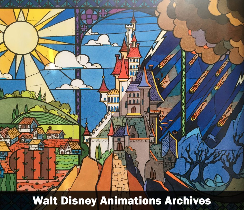
It brought back memories of the large collection of stained glass windows in Canterbury Cathedral which I visited in England:
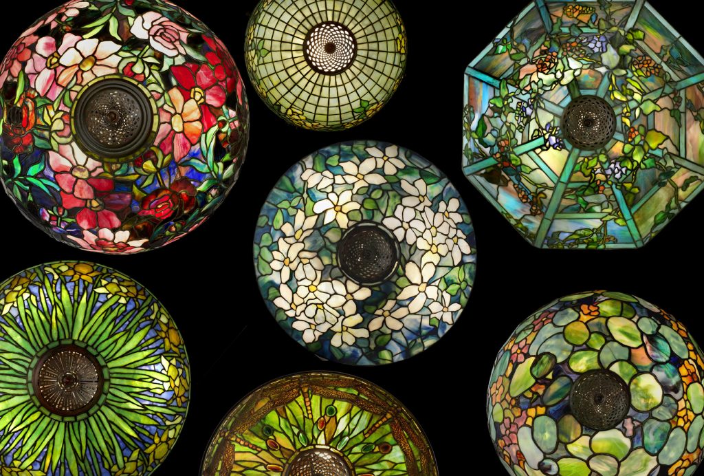
America’s famous artist Louis Comfort Tiffany’s stained glass exhibition that came to my college:
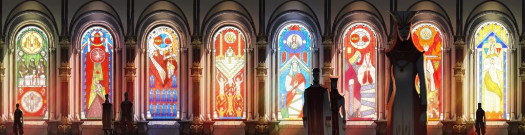
Concept artists Nick Thornborrow and Matt Rhodes’ ITP2013 winning stained glass artwork from my favorite game Dragon Age:
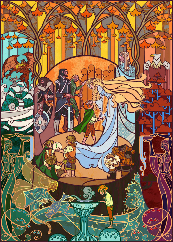
DeviantART artist Jian Guo’s Lord of the Rings stained glass fan-art that went viral on the internet:
Stained glass has such a marvelous tradition in visual storytelling. It differs from other graphical narratives due to its strong association with allegories, epics, and religious matters. It carries an air of gravity, timelessness, and romanticism, making it potentially empowering to our educational goal about saving the environment. Stained glass is also visually stimulating, possessing a very unique personality. It matched all our core aesthetic principles, and it even allowed me to bring a bit of myself into its creation.
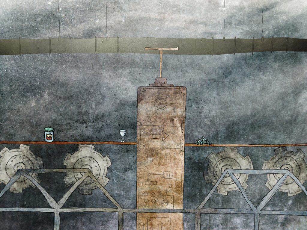
Nevertheless, we recognized the challenge with this style even before we started to develop a prototype. It is a luminescent, back-lit medium with plenty black contours. That poses inherent difficulties to separation of environment and the interactable pieces. The feedback to our first round of prototypes are consistent with this worry, while people responded enthusiastically to the art itself.
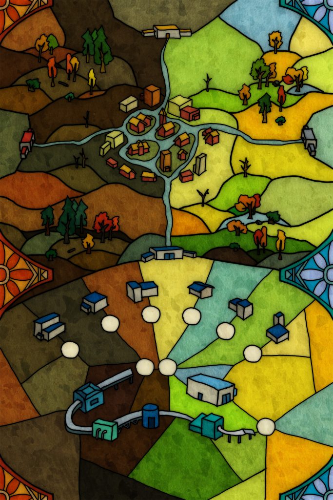
So we dedicated a lot of efforts on readability issues. We de-saturated and darkened the background while bringing up the vibrancy of the interactables. We employed different line weights, and tested both outer glows and drop shadows to separate foreground objects. We also realized the pieces were much easier to identify when they were in motion or shifting scales.
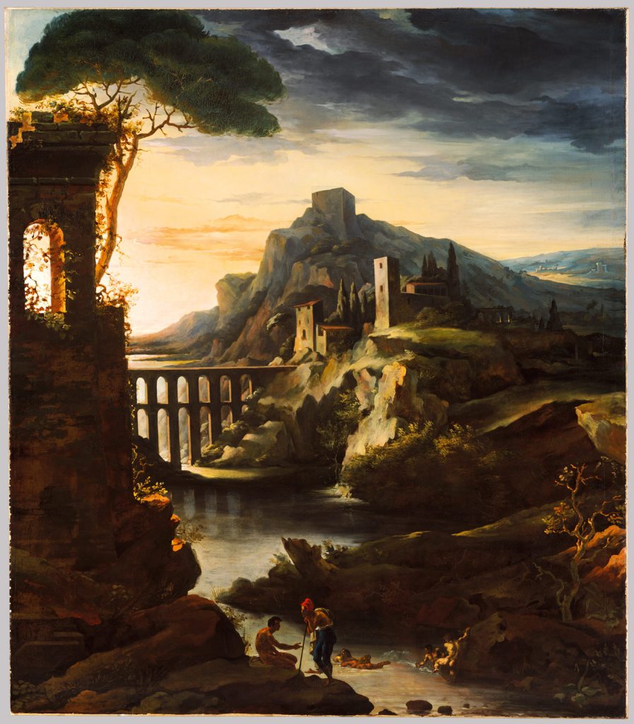
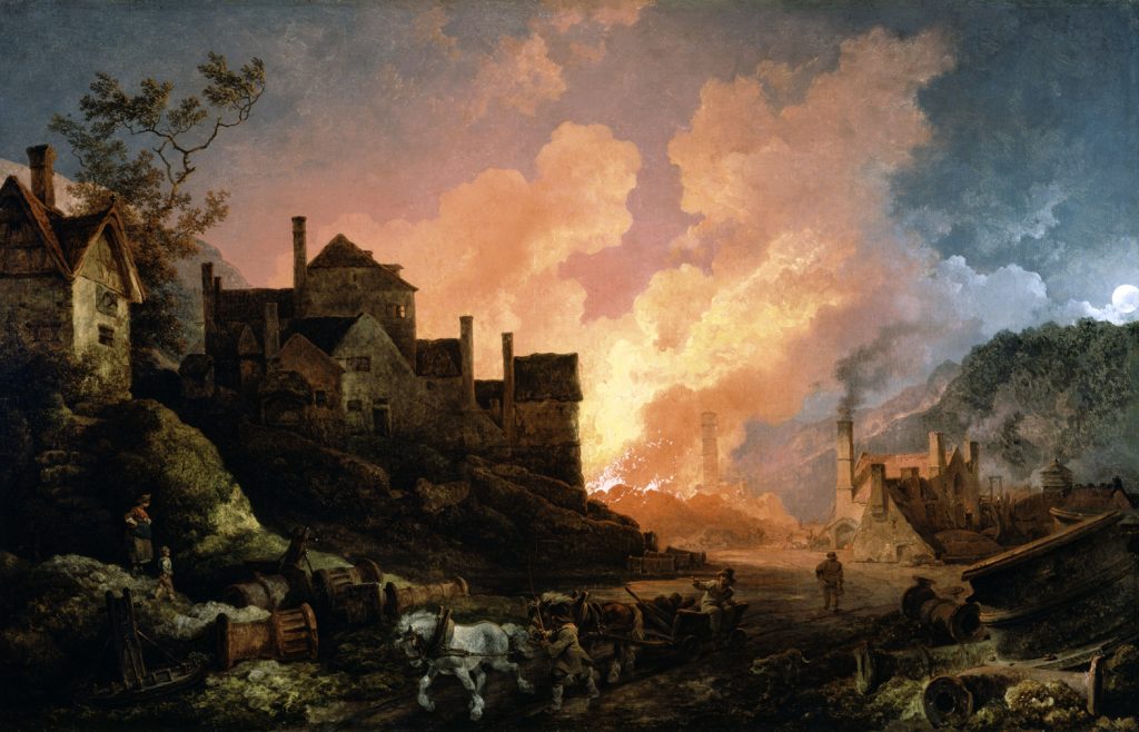
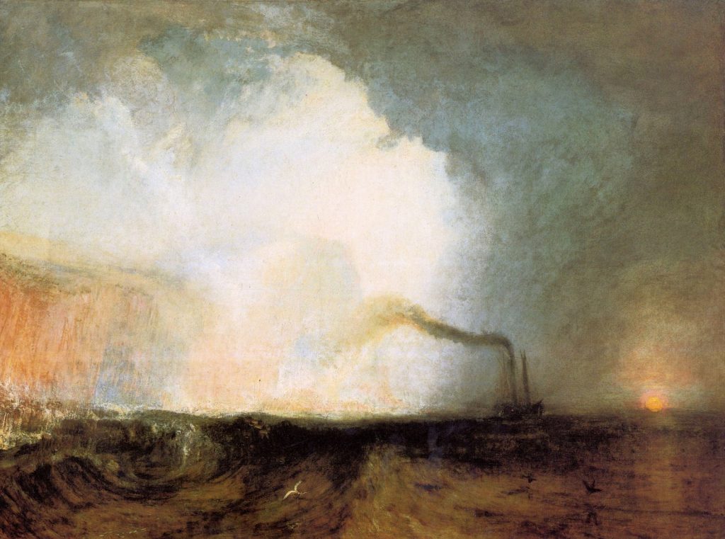
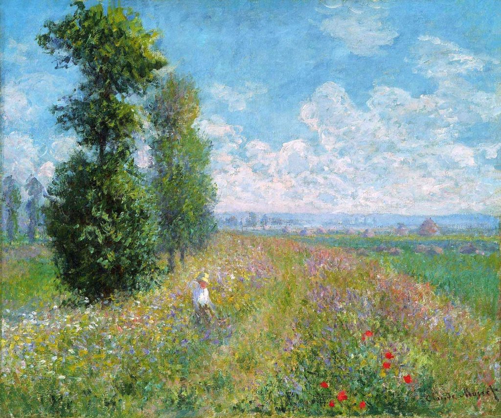
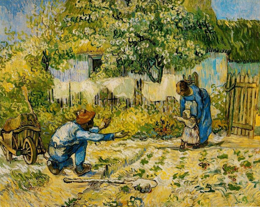
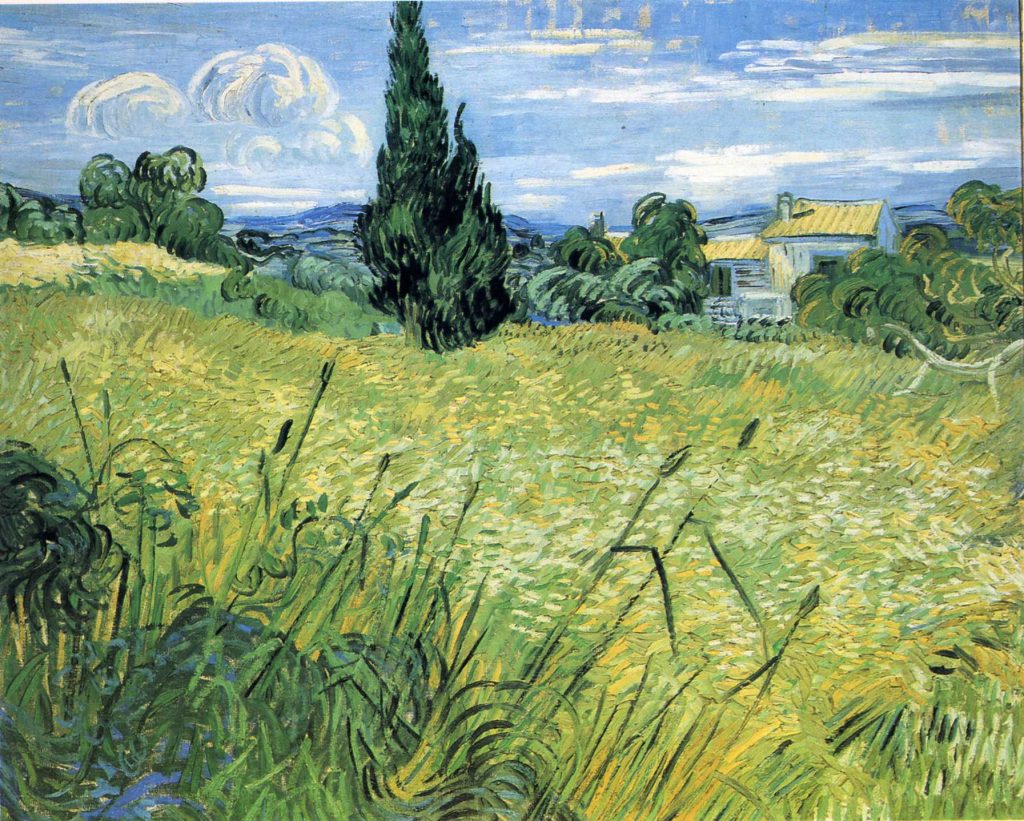
We needed a color transition to accompany the emotional shift. The palettes again came from the masters. We took the dirty and depressing colors from romanticism paintings, works like Turner, Loutherbourg, Géricault. It was rather appropriate given that romanticism was considered a response to Industrial Revolution. As for the renewed and hopeful feeling, we found it in abundance in the works of Van Gogh and Monet.
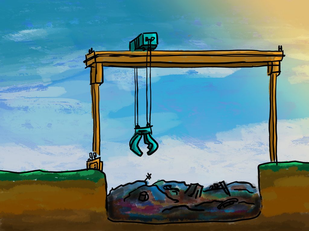
In order to determine the most ideal representation of the dirty environment, we created three variations and conducted animation tests for accurate comparison. We also performed a series of motion tests on our major mechanisms.
We sought feedback from our clients, faculty, colleagues, friends and family. It was certainly encouraging that they really liked the art. They also confirmed most of our major targets, such as uniqueness, appeal, and visual association with stained glass. Furthermore, our testers provided us with very constructive suggestions on what problems to fix and how to take our design a step further. There is still a lot to do!
Conclusion
We are currently half-way through our project. For the art production, what began as a seemingly bread-and-butter task turned out to be quite a formative journey. It guided me to a deeper and broader understanding of art direction. It made me reconsider boundaries of what a production artist could do. To borrow from Ninja Theory’s art director Alessandro Taini: “Artist” is not just a job title.
Mai Ao
Artist, UI Designer of Project Flower Power