
SE7EN DEMO & PREPARATION FOR SOFT
For these weeks, we were working on the case study of Se7en. We shot half content of the script, around 1 min.In this sequence, we tried our new DOF feature, which works great and smoothly, giving the image a sense of depth and clearly telling the viewers where to focus.
Also, during this case study, we discovered some problems. For example, motion capture is still an involved process – individual animations are still put together sequentially by hand. Automating the entire process would require a larger team and time. Moreover, not being able to play or pause animations in the VR camera system brings difficulties to control the timing. Another problem is the camera shake in our shots that, albeit for artistic purpose, is still at some level distracting for the viewers.
–
VISUAL STYLE EXPLORATION
Shera made a color palette for se7en sequence specifically last week. However, this process requires time in choosing colors for each different script. Thus, in order to be more effective, as this is one of the goal of our product, we seek better color possibilities this week so as to cut down the time in giving colors to each story element.
Therefore, Shera came up with this idea: we divide the colors into three parts according to our key storytelling components: character, scenery element and detail element.
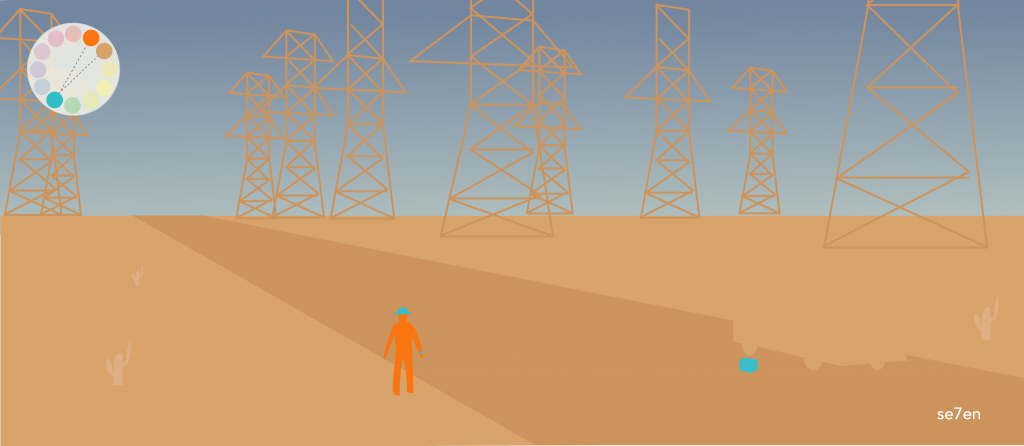
For the character color, we choose orange because it’s more outstanding. As characters(actors) are the core of movies, choosing a color that is striking like orange so that users won’t miss and can always find where their characters are is important. Also, this orange can be the sign for users to recall our tool.
When it comes to scenery element, picking different colors similar to the real world after getting a new script each time is time-consuming. Therefore, we pick up a main color representing the most important scenery component in this sequence. For example, sea is blue; desert is dark yellow; indoor is Light yellow. Like shown in the example pictures (se7en, Life of Pi, The notebook), slightly different saturation of the scene color can distinguish the scenery element from each other. The colors don’t need to be very various due to two reasons in my opinion: First, even the colors are same you can tell the difference because of the light and shadow like the Superhot game. Second, this way can be more effective.

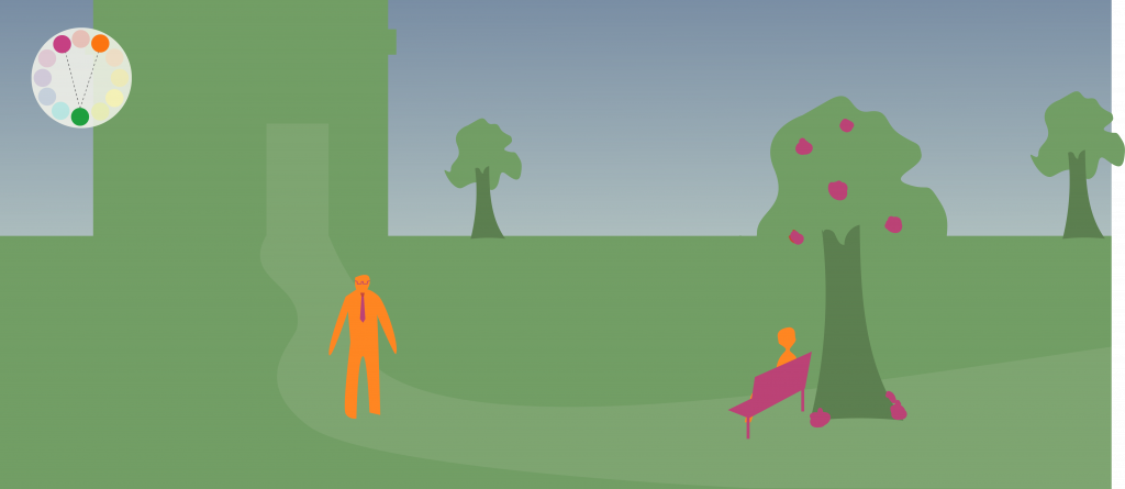
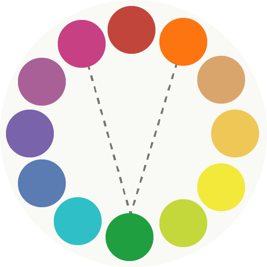
For the detail element, Shera makes it as the complementary color of scenery element. Meanwhile, it is complementing the scenery color and character color which are equidistant from its true complement or adjacent to each other to make a color triad in order to have the colors harmonious. For example, like the color wheels below, as character color is orange, if the scenery color is green, the color of detail element would be pink-purple to make a color triad.
We will test this color palette idea in the next week to see how it works.