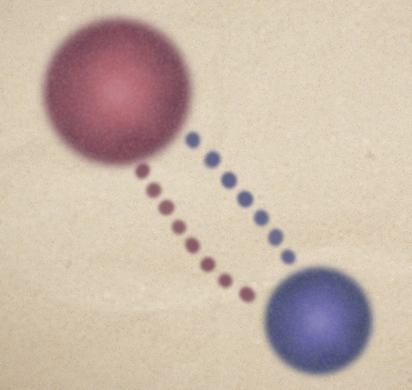
I’ll like to take some time to discuss the visual style of the game so far. When we first developed the concept for the game it could be expressed in just simple shapes like circles or squares. These shapes needed to somehow relate to human connections in between people. In a sense it would be very similar to Rod Humble’s The Marriage. So my problem was to come up with a theme that would match the concept.

I thought the best way to do this would be to think about what feelings I wanted to evoke, so I went for the feeling of nostalgia. With this in mind I thought about the aesthetic of old board games and paper. I also liked how watercolors and ink felt when they bleed into the paper. They left soft fuzzy impressions. Maybe these blots of ink represented someone’s unspoken words that were never written down.

However this look didn’t feel right. When the character moved it didn’t feel it was part of the paper. It just looked like it was floating on top of the paper. Adding noise and vignetting on top of this to simulate the effect also didn’t work well. So I needed to rethink the style. We went over what other games did – Osmos, Eufloria, Pixel Junk Eden, and Everyday Shooter – and how their visual style contributed to the game player. They also had visual styles we didn’t want to copy. Eventually we went with out intuition and scrapped what we thought didn’t work.
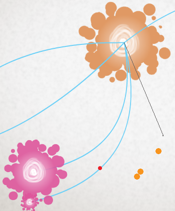
First was the player. Emulating the ink style I decided to have blobs of ink trail off near the bottom. The trail felt closer to what we wanted and Mike suggested to have it all around the circle. So this created a ball of energy that looked interesting and was based off of my original intentions. They still didn’t look like they were part of the paper but they were interesting enough to stand on their own. To strengthen the effect we added a slight glow and a scribble of light to the inside of the ball. Mike at this point also had programmed in the connections. Initially these connection were lines but Mike decided to make them quadratic curves. This way the connections felt more organic.

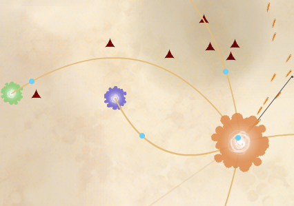
Next was the background and foreground. We wanted something blurry and paper wasn’t working out. We went back with the original idea of the player and made the connection to bokeh. Bokeh are the blurry circles that occur with really low depth-of-field in cameras. We got rid of the noise and changed the vignetting and background to simulate many overlapping bokeh. This also created a slight organic feel and parchment effect that went along with my original intentions. As a bonus Mike added some floating bokeh to scene.

So since then we’ve tweaked some more elements that I haven’t talked about yet like the color of other people, the enemies, and the GUI. I’ll leave that for you to play. (: