Picture Yourself: Week Sixteen

Our final week consisted of three major things: presenting Picture Yourself at Finals Presentations to the ETC Faculty, finalizing the animatic / ad video for our client, and completing our documentation for our client handoff.

Finals Presentations:

In presenting our product to the ETC Faculty, we were very honest with what went right and wrong over the semester.  We talked about how, conceptually, the product is very strong and that people support it, but that our prototype is not functional to the extent that we would like it to be.  We discussed about how Kinect gave us problems in development, as well as the potential alternatives to this software:

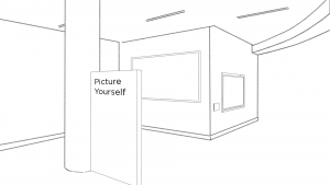
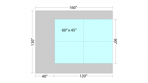
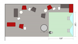
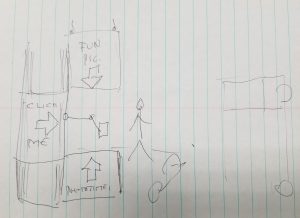
  • Interactive stand (i.e. trackball): A straightforward, yet creative solution would be to have a stand engineered (ideating off of the suggestion we received from Deep Local).  This could be a stand that the iPad sits on, but it also could be placed directly next to the iPad stand (example floorplan below) that guests could interact with immediately after the iPad interaction.

Then, trackballs could be machined into this stand, with electric wiring running from these into the screen.  This allows guests to zoom in and out of the display from this stand, without moving, although the presence of more wire presents its own challenges.

  • Interactive Touch-screen: A simple solution would be to allow users to step up directly to the wall and interact with their photo and the display simply by touch.  We would use projection sensors so that the current technology is still compatible with the interaction.
  • iPad touch: An even simpler solution (on a very base level) would be to allow for guests to move the wall display directly from the iPad screen.  This solution is the least creative, so it would not be our first recommendation, but it can be a fail-safe suggestion if others don’t work.

In further discussions with Dave Culyba and Ricardo Washington, the mistake we made over the course of the semester became crystallized:

It was less about playing it “safe” because we indeed wanted to try creative technology, creative phototaking, and other higher-idea solutions because we felt that that was how we’d get a “wow” factor to get interest from guests.  If we play it “safe”, it becomes ordinary.  Our mistake was that, after finishing the initial concept phase, our focus became: “we need to finish this experience as soon as possible to then able to test the whole thing.”  Instead, what we needed to do was test each individual component – such as platform (testing for Kinect’s limitations), visuals (what gets the most significant “wow” moment), user journey (which we did test), phototaking (what do guests like to do in their photos), etc.

We needed to figure out how to best to design these components before making the whole thing.  Then, we could’ve found pitfalls earlier and (maybe even) found a better way to “save” Kinect through specific motions that work better with the software (we tried to use head-tracking and this made Kinect very unhappy).  At least, we would’ve found alternative solutions to it earlier (and definitely would have planned for alternatives earlier as well).

Final Animatic / Ad Pitch Video for Our Client

Going off of the feedback we received from our client after showing them our video last week, we updated it to make it feel a little more clean and polished:

Final Documentation

Documentation was finalized this week to include design ideation, sketches of our live space ideas, a step-by-step guideline of the process, customizible aspects, and technical details for install, platforms, and troubleshooting.

Going Forward / Postmortem

Our client will be able to use our documents along with the video to showcase our idea to vendors around Pittsburgh, and hopefully “Picture Yourself” will evolve even after our time with it is over.  We didn’t do as much as we wanted to, but we know that this idea, at it’s base, is solid.  We hope that, overtime, “Picture Yourself” could become a permanent exhibition in the CMU community.

Thank you Beth Wiser and Brian James for your support, as well as our faculty advisors and other people that gave us advice throughout the semester.  Until next time:
Picture Yourself: Week Fifteen

The Work This Week:

The work this week consisted of constructing our animatic/ad pitch video for our client.  We also had ETC Festival on Wednesday, where we got to present what we made to many guests in the building.

Animatic Video:

We developed the animatic to be a pitch that our client can use to present to vendors and other people interested in our concept.  Therefore, we developed it thinking of the idea “what will you be able to do with this concept” rather than “here is what we did.”

In presenting the video to our client, they were impressed by how clear and succinct it was.  They just suggested on brushing up a couple of areas to make sure that certain ideas (i.e. displaying user information; how are we going to allow for customizable backdrops) come across visually.

We also presented them a new copy of our documentation, which we will continue to update over the weekend before our final handoff after finals next week.

ETC Festival:

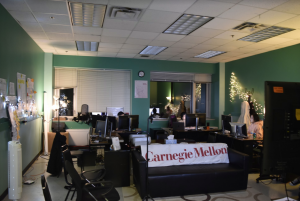
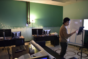
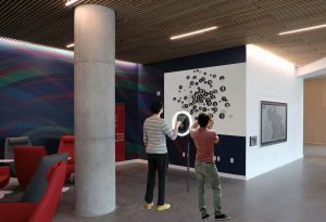
We got to present our work at ETC Festival, which included us decorating our room a little bit:

Guests who participated in the experience were very supportive of the concept.  They understood that prospective students will be very interested in this idea, as it not only gives them something to do while they are waiting for tours to start but will indeed make them more interested in CMU.  Consistent feedback we got was to make the questions more specific, which will be included in our Customization section of the documentation.

Going Forward:

We have our Finals Presentation to the ETC on Tuesday of next week, and we will finish our semester with our final handoff to our client on Thursday.  We’re looking forward to completing everything as strongly as we can.

Picture Yourself: Week Fourteen

The Work This Week:

This week, we received some unfortunate news.  After our Soft Opening, the faculty informed us that, given that we only have two weeks left this semester, it will be impossible for us to finish our software/prototype development to a point that it is truly clean and polished.

Of the many problems that came up at Softs, Kinect might have been the biggest culprit.  It was clear that the platform was oversensitive, and faculty discussed how it made the experience confusing and sometimes even dizzy.  There was also disappointment that the display that we have in place does not have an elegant, clean way of visualizing user information.  Lastly, there was concern that it just wasn’t aesthetically pleasing – especially on the projected screen, the display looked flat with a lack of depth.

Yet, people still generally love the concept of this design, how it can connect members of the CMU community, and how beautiful it can be.  So, the suggestion was that, for the last two weeks of the semester, we develop an animatic to showcase what this idea can be.  This will basically be an ad pitch video that our client will be able to present to vendors and developers in the future.

When we spoke to our client later in the week, they were supportive of this new direction, as well as the work we did.  They agreed that the cleaner it is, the better and that the key is that they need to be able to sell it once our semester is done.

To them, we had two goals when we started this semester.  The first was the proof of concept and to them, that was a success because our ideation gave them a lot to think about as to what is possible in that space.  The higher goal was to have fully functional software ready to take over content management, which could easily be customized.  We didn’t quite reach this goal – we’re in the gap between ideation and functionality.

“This is not ready for the public yet, but the fact that we are at the point where we are tweaking the software and physical setup – this means that we have the concept right,” said Brian.

For our animatic/presentation, our client suggested that the pitch is:

  • Self-explanatory
  • Includes narration
  • Covers future development
  • Features the next step of intention

For the inclusion of backdrops, it was suggested that we switch from using pseudo-postcards that feature them to possibly utilizing a green screen effect, maybe on the wooden board that we’re planning to place next to the pillar.  Either way, our client said that we should find a way to use the actual photos of CMU campus in the backdrop, rather than illustrations.

Lastly, our client wasn’t ready to make a firm commitment to ClearStory just yet, saying that there are more moving parts to that decision than just them, and that they have additional potential vendors they need to speak to as well.

By the end of the week, we had developed a script and structure for our video/animatic.  We’re planning on focusing on the visualization/wall display aspect of the idea first, as that part of the design was the most troublesome.  The video itself will cover some short snippets of the live space, explaining the concept, before showing what a potential user will do on the iPad and that in terms of interacting with the wall.  This video will be 2D, but we are going to use some blur effects to give a feeling for depth for the visualization aspect of the experience.

Going Forward:

Next week will be the development and finalization of this video/animatic.  Additional, we need to prepare our Finals presentation and also finalize our documentation.  We have a draft of it that we presented during Softs and to our client, but additional elements, especially the technical aspects of it, need to be developed.

Picture Yourself: Week Thirteen

The Work This Week:

With a shortened week this week due to Thanksgiving break, Picture Yourself spent our time finalizing our prototype and doing some playtesting in the ETC lobby.

With our prototype, we tested the complete experience, including the “Where are you from?” question and the Share page.  The UI directed towards the Share page didn’t seem intuitive, as guests frequently stopped the experience after viewing their picture on the wall.  Guests either showed some hesitancy towards taking pictures, while some leaned directly into taking wacky ones, so giving guests freedom in this space in both of these directions will be important.

We also got the chance to speak with Mike Christel at the ETC, discussing the best methods in which to write our documentation.  He suggested that we go light on doing a design doc showcasing all our decisions over the semester, and instead lean into the technical and troubleshooting aspects of the documentation.  He also suggested that we have a lot of images to support the text.

With regards to our upcoming handoff, we got the chance to speak with Clear Story, a vendor based in Pittsburgh who designs and installs installations like ours.  They expressed some concern over using edgeblending in our projectors, stating that having them on a table near in the ground is inviting guests and other people to bump into them and mess up the blending.  That being said, they were enthusiastic in talking with us and seem interested in potentially being partners with our installation in the future.  When we meet with our client next week, this will confirm their involvement in our future endeavors.

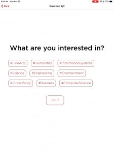
Finally, with regards to our prototype development, we finalized the second question (“What are you interested in?”) to test tomorrow for Softs.

In this design, guests can choose from a selection of interest hashtags and will then be directed to a mosaic of the associative CMU department that specializes in this interest.  There will be a text description overlayed on the mosaic to explain the connection:

For example, if a guest chooses #InformationSystems as their interest, they will be directed to mosaic that reads “Heinz” along with the text “CMU’s Heinz College is an interdisciplinary program for the next generation of leaders, connecting People, Policy, and Technology.”

Going Forward:

Next week is soft opening and our next client meeting.  We are looking forward to all of the feedback.

Picture Yourself: Week Twelve

The Work This Week:

This week saw the team completing the prototype for the interaction, including implementation of the “Where Are You From?” question.  We also met with Deep Local this week, giving us some final notes heading into the last few weeks.

The Prototype:

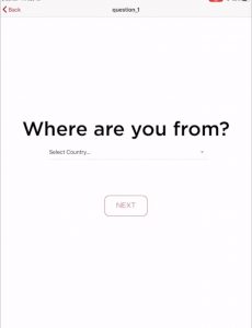
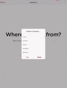
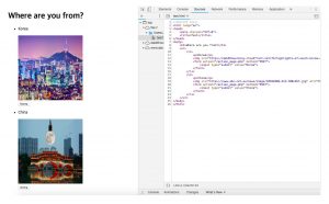
From last week, we added the “Where Are You From?” page to our iPad interaction, which will come up immediately after users submit their taken photos:

From here, users can select from a list of countries where they are from.  Because we’re using the selected country’s typography as the mosaic in the wall display, we chose to have users choose from a preset list rather than inputting their own text.

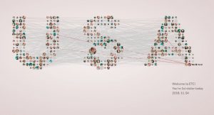
After this interaction, the user is directed to interact with the wall display, which now takes the form of the selected country:

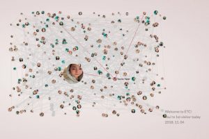
Also, taking feedback from our client as well as from Playtest Day, we added a highlight to pinpoint where the user’s photo is:

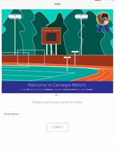
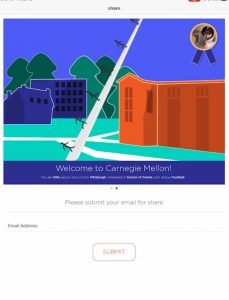
This process can then be repeated for further questions that we add into the design.  Once the user is done, they can then return to the ipad to share their photo with their email address.  We also took pictures of CMU campus that can serve as a backdrop for these shared pictures.

We also updated the Kinect sensor so that it only detects the user closest to it.  Therefore, users in the background will not break the flow.

Meeting with Deep Local:

In meeting with Deep Local, we got very specific advice about how to improve our live space:

-They suggested we use of an actual good camera to take photo as opposed to tablet?
-They suggested that we have a couch or something tangible for visitors to sit on / interact with so they’ll be more comfortable taking the photo.
-They said that even just having a rug/carpet or a short wood stage that signifies the selfie space will add uniqueness

-They suggested we think of potential alternatives to Kinect, because it can be finnicky.  From here, we began thinking that we could possibly have users interact directly with the wall, or have a designed stand that holds the iPad in which users could move the wall display screen by pressing buttons on it that connect electronically to the projection.  This would be a solution that is out of scope for our semester, but could be included in our documentation.

-They suggested we have a wood frame for the projection, so that it stands out.

-They said they’d put us in contact with vendors both for installation and for designing a potential wood frame.

-They said that when users share to their email addresses, the photos should be vertical, for more easy sharing to social media.

-They suggested we have a more “personal step” in the iPad interaction before the large-scale mosaic pops up.

-Lastly, they said that streamline to focus on the aspects that you like, and that the key point is making the selfie experience more fun.

Because we are not directly installing the live space, this feedback will be something that can incorporate in our final technical documentation that we hand off to our client, which we started on this week.

Going Forward:

With our prototype completed, we plan on playtesting in the ETC lobby next week in preparation for Soft Opening the following week.  We also will continue work on designing the sketches for our live space, and we have a meeting with Mike Christel on Monday to discuss how best to design our documentation.

Picture Yourself: Week Eleven

The Work This Week:

The work this week started with a debrief from ETC Playtest Day last Saturday and ended with our client meeting, giving us a direction for the last third of the semester.

Playtest Day Results:

Overall, Playtest Day went well for us.  Guests understood the core interactions and their suggestions for next steps were close to what we’re currently designing.  Overall, the common findings from Playtest Day were:

  • Guests moving too close to the screen
  • Guests wanting feet symbols/line to know where to stand
  • Guests having trouble finding their picture / wanted it to be bigger / highlight user picture
  • The Kinect was too sensitive
  • Guests liked ideas of archiving famous alumni and featuring them
  • Guests wanted to be able to use avatars
    • For those uncomfortable taking the photo but who want to participate in information

From this results, we began work on our core next steps, which include:

  • Adding boundaries for where you can stand
  • Fixing the sensitivity of the Kinect
  • Highlighting the guest picture in some way (so that it’s easier to find)
  • Implementing use of avatars
  • Implementing the “Where are You From?” Question

Of these, the last bullet point is of our top priority, as our prototype will not be complete until the Question is implemented.  The others are additional fixes and polish that are not as significant, yet still needed.

Client Meeting:

Our client meeting reiterated some of these findings.  Feedback from this meeting was that conceptually, the idea is continually solid, but it needs a more concrete, understandable, and visible plan on how it would look like upon completion.

Specifically, they want to see:

  • The guest photos be customizable (complete with different CMU backgrounds or potential filters for each picture)
  • The UI for how guests send the photos to themselves
  • The specifics on how alumni and guest info is shared on the wall.  They need to see these details before they begin the process of contacting the alumni network for their info.
  • A more specific schematic on the layout of our space.  They remain a fan of our pitch to use projectors as our display, but they want to see how we intend to lay these projectors out, how we plan to deal with natural light, and any wiring/electrical means needed for the exhibit.

We also discussed issues of privacy concerns that have come up.  They said that, indeed, they can bring their legal team in on this to implement a fully functional Terms & Conditions page, but, again, they need to see the specifics of what specific information is being asked of the guests, how this information is being shared, etc.

Going Forward:

Going forward, there is much to do.  We need to finish implementing the Questions, as well as the last few pages needed on the iPad (i.e. the page where guests can customize their photos, the page where guests can share their photos to themselves).  We also need to figure out how to visualize guest & featured alumni information, and we need to fix the sensitivity issues on the Kinect.

We also need to begin our documentation work.  The hope is to have a completed prototype, along with the documentation necessary so that our client can take our code, and then be able to customize it and add additional content (i.e. additional questions; additional videos for specific events, etc.).

Therefore, we need to begin detailing and outlining every step in the exhibit, and also develop the schematics of the space.  Plus, as part of the technical aspects of the documentation, we need to make sure that a potential vendor can follow our code easily.

There’s still a lot of work to be done.  Now begins the final sprint to do so.

Picture Yourself: Week Ten

The Work This Week:

Our client meeting was pushed back to next week.  So, this week, our core focus became finishing our base prototype to be able to test it on ETC Playtest Day.  We moved forward slightly in terms of setting up a physical installation in the ETC lobby, but eventually decided to host our prototype in our Project Room, as we could better control the space there.

The Prototype:

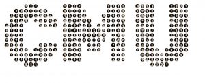
In our prototype, we are testing the base user interface with the iPad interaction followed by the user being able to see his/her photo appear on the forward wall.  We were not able to finish the “Where are you from?” question yet, so this prototype doesn’t ask any of our grouping questions, but merely combines all pictures into one CMU-text mosaic:

Appears on the Wall

In the prototype, users step up to the iPad and, as follows:

  • Accept the Terms & Conditions of the experience
  • Take their photo
  • If they don’t like the photo, they can go back and take it again.
  • Once they like their photo, they can submit it.
  • The iPad then directs users to move closer to the wall.
  • Users can then move back and forth, using the Kinect sensor, to zoom in and out of the CMU mosaic, and try to find their photo.

In hosting our prototype in our room, we used white paper on our wall so that the projection would be bright enough.  We also ordered an iPad stand from Amazon, with adjustable height, for the iPad interaction.

Our playtest plan for Saturday is as follows:

Playtest Day Plan

Going Forward:

Our results from Playtest Day will help us determine what additions to make to the prototype.  We also will be meeting our client next Wednesday to get additional feedback, and hopefully will get to check out the SimpleBooth Technology, which, going forward, we would like to use as part of the iPad interface.

Picture Yourself: Week Nine

The Work This Week:

The most significant aspect of this week was our halves presentation on Monday, which can be viewed here.

Preliminary feedback is that our presentation was strong, but some of our answers to questions asked were vague, which led us to thinking about nailing down our prototype, and scope, as soon as possible.

As part of this process, we are hoping to have a fully completed prototype by next week, which combines the PC + iPad interactions, utilizes the “where are you from?” question, and then displays the associative visualizations.  This is then something that we can test during ETC Playtest Day on Saturday November 3rd, and also show to our client for feedback.

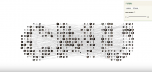
For our prototype, we focused on combining the frontend and backend elements into one (for now, we are testing with using CMU-based typography instead of the map for better efficiency):

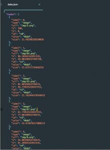
  • Different pixel sizes were tested, as well as how to get the x,y positions (nodes) from each one

  • A JSON file was then written of all the position data

  • Code was run to test if the users have similar information (i.e. where are you from)

  • A new node graph was created based on the nodal information of the similar users

Additionally, we switched to angular because it can support html, which helps us develop more easily with web designers

Going Forward:

Meanwhile, we have also begun the process of installing our prototype into the ETC lobby to test with visitors, especially prospective students coming to the ETC.  We’re hopeful to get this physical space ready around the same time that the prototype is done.

Also, we have reached out to our client to see if we can test with SimpleBooth technology, and it looks like we may be able to test it out in our space in the Tepper Building.

Our next client meeting will be held next week.  Additionally, we are in the process of scheduling meetings with Chris Klug to discuss lighting and Jesse Schell to discuss design; we also are trying to schedule a time to visit Deep Local as well.  Until next week!


Picture Yourself: Week Eight

The Work This Week:

This week was spent preparing for halves presentations.  We also had our third client meeting on Monday, and also got the chance to run our first playtests as well.

Client Meeting:

Presentation

We presented the work we’ve done over the past several weeks to our client,  represented by Beth Wiser and Brian James, along with Associate Vice President Sophie Elias.  We got very productive feedback for where to go going forward.

Firstly, in our presentation, we talked about using high-quality cameras along with the tablet display, and our client advised us that it’s not necessarily critical to have high-quality photos and that we should use the iPad (along with the stand) so that we only have to interact with one device.

This also will help going forward with regards to the fact that we have two different experiences going simultaneously in our current design: (1) the input experience, and (2) the visual interaction with the data.  Our client advised us to look for ways to combine them together, and having only one input device is a step in that direction.

It was also suggested that we try to display our visuals on just one wall instead of two.  This is partly so that there is room for other material in the space, but this will also help with (a) synthesizing the experience, and (b) allowing us to move the display to the side wall, which has dimmer lighting that is more likely to work with projections.

We also talked about curating the questions for the visitors and how to work in the different kinds of audiences who will be using our installation.  Firstly, our client suggested that our third question (after “where are you from?” and “what are you interested in?”) be something social and something related to fun, extracurricular life at CMU and Pittsburgh.

Then, we discussed about whether or not to have a Starting Question based on who is interacting?  Is it a prospective student, a current student, an alumnus, or another kind of guest.  With regards to alumni, we want to be able to see the famous, successful alumni that allows students to imagine what they can see.  From there, we wondered if it’s ok to have the names of these alumni as part of the exhibit, even though for students and other guests, we want to allow them to be anonymous.  This will be a big question moving forward, especially because we will be looking to pre-populate the database with alumni.  What kind of permission do we need to have to do this?  Capturing this information can be discussed through the alumni network.

Lastly, it was suggested to bring the ability of choosing different CMU backdrops back into the exhibit to enhance the visual experience.  Ideas for this might be to allow visitors digitally to choose a background after they take their selfie.  We were informed about the technology of SimpleBooth to look into for ideas on this:

From here, we developed a new floorplan on how to use our space:

Additionally, we created a new mockup of what our installation may look like:

Playtesting and Meeting with Jess Hammer:

We playtested our wireframe (below) on a tablet with several students during the week, testing to make sure that the user flow is followable and understandable, which it was.

General feedback from playtesters was that:

  • It was straightforward.
  • Most of them read the “inappropriate” warning
  • Few would read the terms & conditions.
  • Seeing a map of where everyone was from was cool
  • One playtester said that it “took the right parts of other apps that I knew + I knew how to go about it.”
  • They said they’d move closer to the wall when prompted to.

With regards to questions, playtesters said that anonymity, seeing famous alumni, answering social questions all would work for them, and that they’d be interested in seeing the mosaic grow into a CMU symbol.  They also advised that we keep our questions specific (i.e. we should ask “What discipline are you interested in?” rather than “What are you interested in?”) and impersonal so that they wouldn’t feel uncomfortable with regards to privacy.

At the end of the week, we met with Jess Hammer to discuss playtesting, as well as the question of our experience feeling like two experiences in one.  With the former, she suggested that testing wireframes and prototypes is fine for now, but that going forward we should try to test with groups as close to our target audience as possible.  CMU first year students (who have fresh memories of their college tour experience) and prospective students coming to the ETC would be her suggestions.

With the latter question, we discussed adding transitions between the tablet experience and the display experience (i.e. arrow comes up and points to the wall after you take the picture) to guide the guest’s eye and make this seamless.  We could also think about lighting with regards to guiding the guest (i.e. a part of the display could turn on after the guest is done with the tablet).  Going forward, she said to monitor the use of Kinect closely, because it could get messy with one guest at the kiosk, one at the wall, or with group usage.  Our exhibit must work for the most complicated case.

Halves Presentation Preparation:

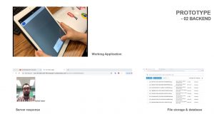
In terms of design, we completed our backend prototype, making sure that the algorithm to sort and store photos into categories worked.

We also continued our work on the visualization of our frontend experience and the nodal animation that goes with it.

Both of these designs are key components of our halves presentation, which will be held Monday of next week.

Going Forward:

In addition to presenting at halves and getting feedback on our current iteration, we will begin playtesting more and also begin combining our frontend and backend experiences together.  Iteration will be key moving forward.


Picture Yourself: Week Seven

The Work This Week:

With our client meeting scheduled for next Monday 10/15, the work this week consisted of continual development on our mosaic prototype.  We also spoke with a handful of SMEs to gain further knowledge moving forward, and conducted some field research in the Tepper Building.

Continual Prototype Development:

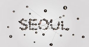
We continued work on the selfie mosaic idea, in which visitors will be able to interact with a map, and then as you zoom in the pictures become interconnected pixels.  The map itself has now been updated so that each pixel is a picture.  The brightness of each pixel from the background image is analyzed, as well as the average brightness of the image, and then array of multiple images is displayed where the brightness is mapped to pixel size.

We are still looking to find a way to sort images by brightness and locate them to the right pixel.

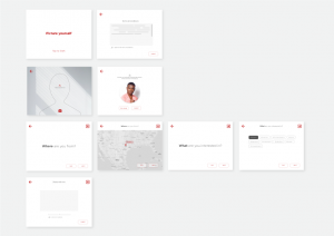
Also, we have developed an overview of the possible screens that visitors will see through the experience.

Talks with Anthony Daniels and John Dessler:

Anthony Daniels gave us some wonderful advice on lighting design and on some of the interactive elements we could have going forward.

On lighting, he suggested that we put gel filters behind the lamps that are in the space.  These gel filters would not change the color of the lights, but they would dim them down, giving them a light grey color, and thus making them less harsh for visitors taking photos.

Then, with regards to the pillar, he suggested to put a plastic, or felt, collar onto the pillar.  This collar could be CMU-themed and wouldn’t really hurt the pillar structurally.  Then, we could hang a rotatable arm/wire across the space between the pillar and the wall to allow for as many directions from freedom as possible for camera movement, making the installation accessible for those with disabilities.  This is something that we will discuss with our client next week.

An alternative to this suggestion would be developing a stand, with adjustable height, that would stand in front of the pillar, facing the side wall, and hold the camera.

Speaking of the photography device, Anthony suggested that we stick with one means of taking photos – be that the tablet, a camera, or a webcam.  Once we start adding more devices to the installation, it requires more maintenance and runs the risk of confusing less technologically savvy visitors.  Having only one device also encourages people to take photos in collaboration with friends, which is a demographic that we noticed as persistent in our space (see “Field Research at Tepper”)

On the Projectors vs. Flat Screens debate, Anthony suggested using projectors, because “We’re so used to seeing flat screens.  They look very much like product placement.  Projectors will look more original.”  If we do use projectors, we will probably end up repainting the wall of our space, and Anthony suggested that we paint it so that the original color (which would be maintained on the left side of the wall with the pictures already left) “melts” in with our new color.

Finally, with regards to our issue of consent and inappropriate photos, he suggested that we have a sign or carving in the space already, so that it doesn’t interrupt the visitor experience, but is clearly visible.  A sign that says, for instance, “Filming here; you consent to this photography and appropriate photos.  Appropriate ones will be removed.”

We also discussed the issue of inappropriate photos with John Dessler.  He said that the simplest way is to have a person watch them (possibly from the nearby kiosk).  The bottom line is that we shouldn’t redesign everything to work around it.  John also supported the idea of using the pillar as a controller of some kind (i.e. using different backdrops or frames on it).

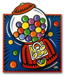
We also discussed about the Burton Morris project done at the ETC (an example of Burton Morris’s work can be seen below).  In the project, there was a bubblegum machine in which the bubbles popped, but then they would stop when you got closer to it.  And you would take pictures of yourself, and then see yourself in the backdrop of the image if got close enough to the exhibit.

The key aspects of this project were that people wouldn’t use it without seeing other people using it, the flash got people’s attention, and the placement of the exhibit made a difference.

This led to our discussion about what can we do to in the idle state of the exhibit to get people into the experience.  John said that once they’re in the experience, it shouldn’t be a problem, but that the initial engagement is the key to everything.

He suggested it to be more ingenious than a simple “screensaver thing on the wall.”  Contrast works, as well as interactivity.  John gave the example of an interactive display where water was coming down to the floor; and then when you walk towards, the water changes when you step on it.  Similar to the Burton Morris project, this initial interactivity is more engaging than a simple screensaver.  The key: having something react to something the visitor is doing.

An alternative would be to showcase photos on the wall, showing someone doing something cool and artistic, to then engage people.  People would try to recognize people they know, and this would be particularly true with famous alumni.

Finally, we discussed what we would like our deliverable to look like, internally at the ETC.  John said that, with a project like this, we need to show proof of something and sell the idea.  He suggested to test our documentation with sample vendors and make sure that the design, and maintenance aspects that might be needed, is clear.

Field Research at Tepper:

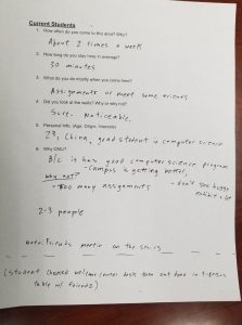
Lastly, we spent some time in the Tepper Building this week, asking some students questions about how they use the space, and conducting observational data on people using the space.  A sample sheet of one of these questionnaires we handed it can be found below:

From this research, a few things became clear: students mainly use the space as a quiet spot to study, and they only sometimes glance over to the space we’re working with.  Most students think that our space is for prospective students only and therefore don’t hang out there a whole lot, instead preferring to sit at the tables by the window, or by the stairs.  Most of the students we talked to discussed spending time in the space with friends.

We also spent some time observing prospective students on Friday, during the busiest parts of the tour week.  Students came with their families and sat all around the space while waiting for the tour.  It became clear, by the amount of head-fidgeting, how nervous these prospective students are, and that if we give them something to capture their attention, it will.  Parents seem more interested in talking to the ambassadors and people giving the tour, but a few of them (especially the dads) were seen glancing around and observing the space.  Side note: one of the moms asked a tour guide “do you feel like you’re really in the city here in Pittsburgh?” which might be something we want to look into further with regards to questions.

Once the tour started, there wasn’t a whole lot of time lingering in the space, so the moments when these guests will use our installation will most likely come when they are waiting for the tour to begin.

A few of us will spend some time next week actually going on one of these tours to find out more information.

Next Week:

For our client meeting, we are preparing a presentation that will have a measured floorplan layout of the space, as well as a rough budget plan, to ask for feedback on in addition to the work already done.

We will also start preparing for 1/2 presentations, which will be held the week after next.

Lastly, we hope to have our prototype workable enough by next week so that we can playtest it, roughly, with fellow ETC students and gather more data going forward into 1/2 presentations.