
Team ArchiTek presented what they have done in 1/2 presentation, and gave out a future plan for the following weeks.
Before the presentation, ArchiTek has combined their story with the map design process. We iterated our story with our client and instructor.
The final version is:
In 2060, the earth is in energy crisis. To solve this problem, the government has established a team called the Future Energy Division (FED). As the leader of FED, your goal is to find new energy sources to replace coal, wood and gas.
One day, the water pipe in front of Heinz College at CMU bursts again. While fixing the pipe, a plumber discovers a diary with a piece of stone on its cover. . The stone is so magical that it shines when people come close and doesn’t shine if people walk away. He considers this phenomenon might be related to unknown energy and might be useful for your team, so he hands it in to you.
The stone looks so strange that you speculate it may lead to new discovery. The diary says that the stone was made accidentally during iron making. After analyzing it, researchers tell you that there are two main elements in the stone, Fe and Vx. Vx is a rare element on the earth. Although people discovered it in 2026, they had never found Vx’s ability to shine like that. They thought Vx is useless at that time. But researchers think the light energy it produces may be a potential energy source. They wonder if the shining happens because of the combination of Fe and Vx. It is possible that in the iron-making process, Vx combines with iron and forms this kind of stone with a special ability to shine (map1-the geographical distribution of Vx). However, due to shortage of energy, you cannot gather enough energy to melt that much iron and Vx. As a result, you come up with an idea about gathering energy from a combination of both domestic and public solar energy systems (map2-public solar stations and areas with domestic solar system).
After building the factory, those stones you created don’t shine at all. It makes you and your team frustrated. One day, while you are testing to see if some factors make it shiny, you accidentally walk past a hospital. Suddenly, the stones are shining brightly! Exploring in the hospital, you find out that it is the newborn babies in the maternity ward that make them shine. Finally, you figure out that this kind of stone generates light energy around strong life power. Baby has the strongest life power. So to generate needed power, this stone should be placed in those cities with a high birth rate that also have an urgent energy crisis (map3-energy distribution and birth rate).
What problems are the players trying to solve? How can map design help them solve this problem?
Map1: Players will be given a map about the distribution of Vx. Players can choose the scale and color combinations for data on the map so that they can design good map with clear and clean visualized data. Making this map is to find some right places to get more Vx by building related mineral and element extraction facilities.
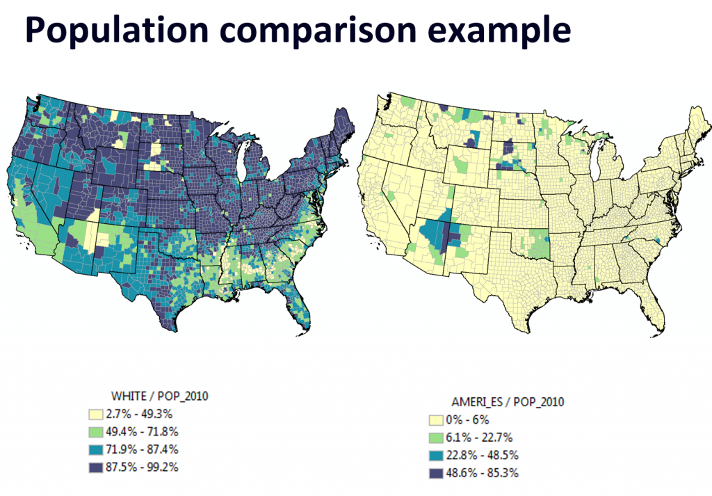
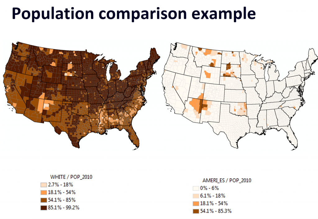
Map2: This map provides players two kinds of data, which are distributions of public power stations and domestic solar power generators. Players need to choose scale and colors for these two kinds of data, which are shown on the same map. The goal of making this map is choosing an ideal place to gather solar energy for producing the stones. Players’ map will help the FED team decide where to go next. The maps we use are two polygon maps, on which students need to choose to right scale and colors to show data clearly. Take two maps below as examples, the green comparison is good because readers can directly know that the relationship between white population and native American population. The light yellow gives us a clear indication that native American population is small in most parts of the country. By using the same color combination with different classification scale, the two green maps depict the huge difference between the population successfully. However, in the brown comparison, the map may mislead readers due to choosing transparent color for classification scale 0% to 6%. With different color combinations and classification scale, readers cannot clearly clarify what the exact different is between the two population.
Map3: This map is about energy and birth rate. After visualizing energy factory distribution data to find cities that need energy and adding birth rate data, the energy division will build new facilities in those cities to produce energy according to your map.
Generally, the main goal is reviewing map design principles and practicing making maps. Players don’t have to decide the “correct location” for the FED team. But if they make a bad map, we will provide them an ending in which the project is delayed because the team fails to get correct information. If players succeed on all 3 maps, then they get the “good” ending. We are also making stories for Map1 failure, Map2 failure, Map3 failure. Example which of course we can change, for failure on map 1: It is now a year later, and your FED team has failed to find enough Vx. You are being replaced by new management who have turned their attention to a long shot of mining on Mars. Vx was a better solution, but you did not communicate well enough with maps to keep Vx as the top priority.
Inserting three maps in the story, ArchiTek hopes that students who participate in this practice will get better understanding of concepts about map design. However, thanks to Mike, we know that Vx is already a name of a nerve agent, so we are coming up with a new name of our element.