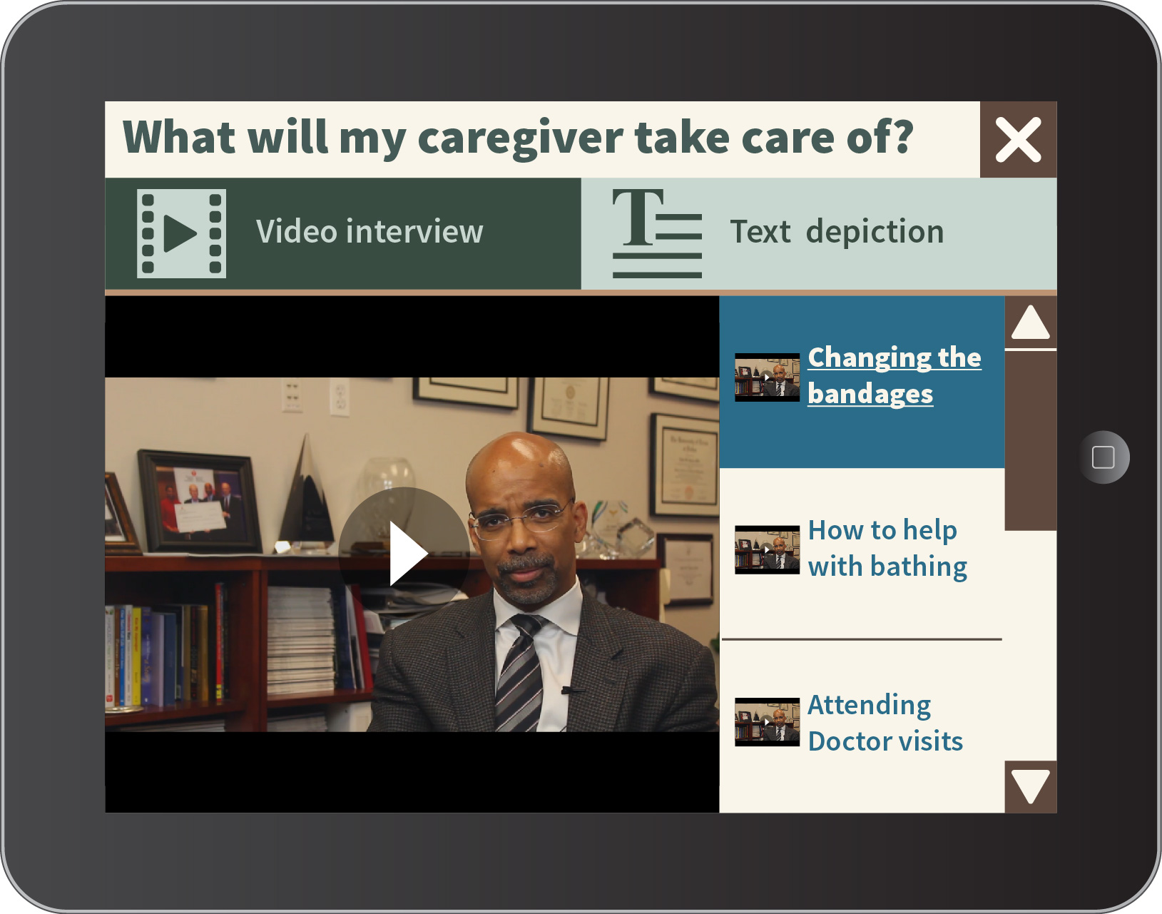
The hypertext FAQ code and UI design is pretty much finished by this point. The last things that need to be worked on before overlaying the two together are color schemes and font styles. Those, Aly will be working on finalizing while Sarah and Boyao put in the layout and work on the app’s other functions. In the design of the UI, content was taken from provided materials and LVAD decision aids already in existence to serve as filler. They were not generated by Code Blue.
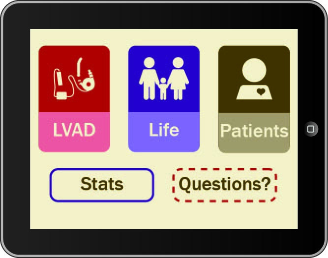
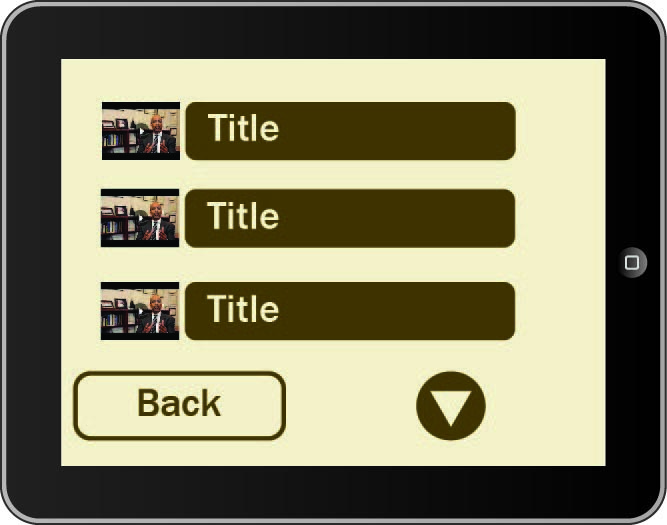
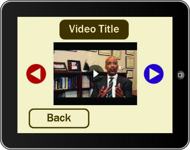
The first version of the layout was quickly scrapped and thrown into the trash bin. The buttons weren’t specific enough in describing where they led, the navigation wasn’t straight-forward, and early playtests showed that users couldn’t tell where they were within the app or on what video they were currently watching.
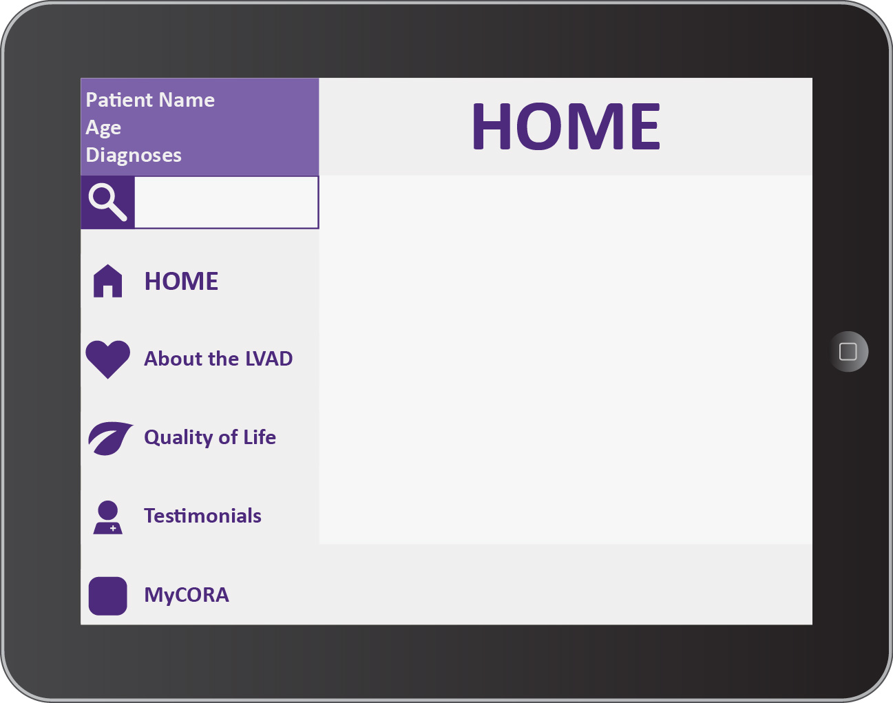
Going back to the drawing board, Aly decided to take inspiration in the layouts of popular video programs with seniors: Skype, and Youtube. Both had a simple constant interface, a menu that held every option and told where you were within the app, and recognized who the user was once logged in. Seniors could connect with people and information while also feeling like the interface recognized them; an important feature.
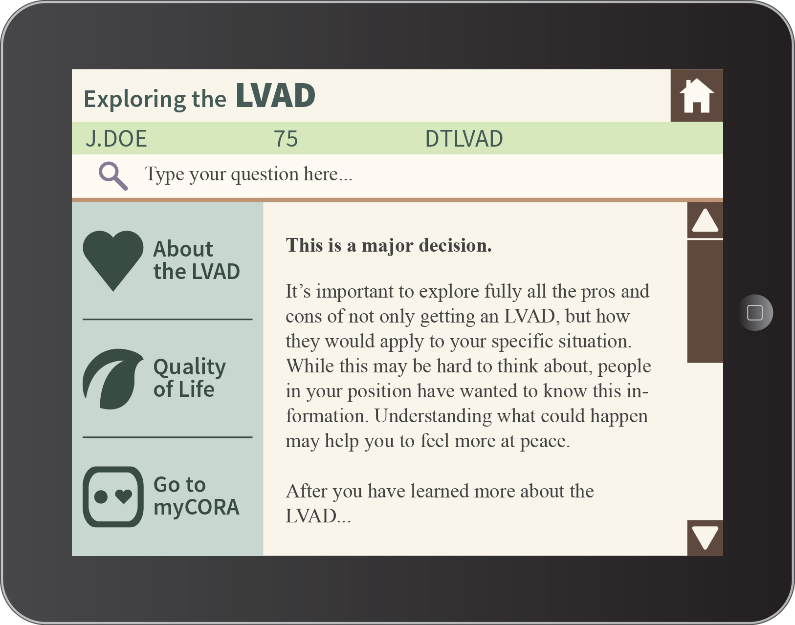
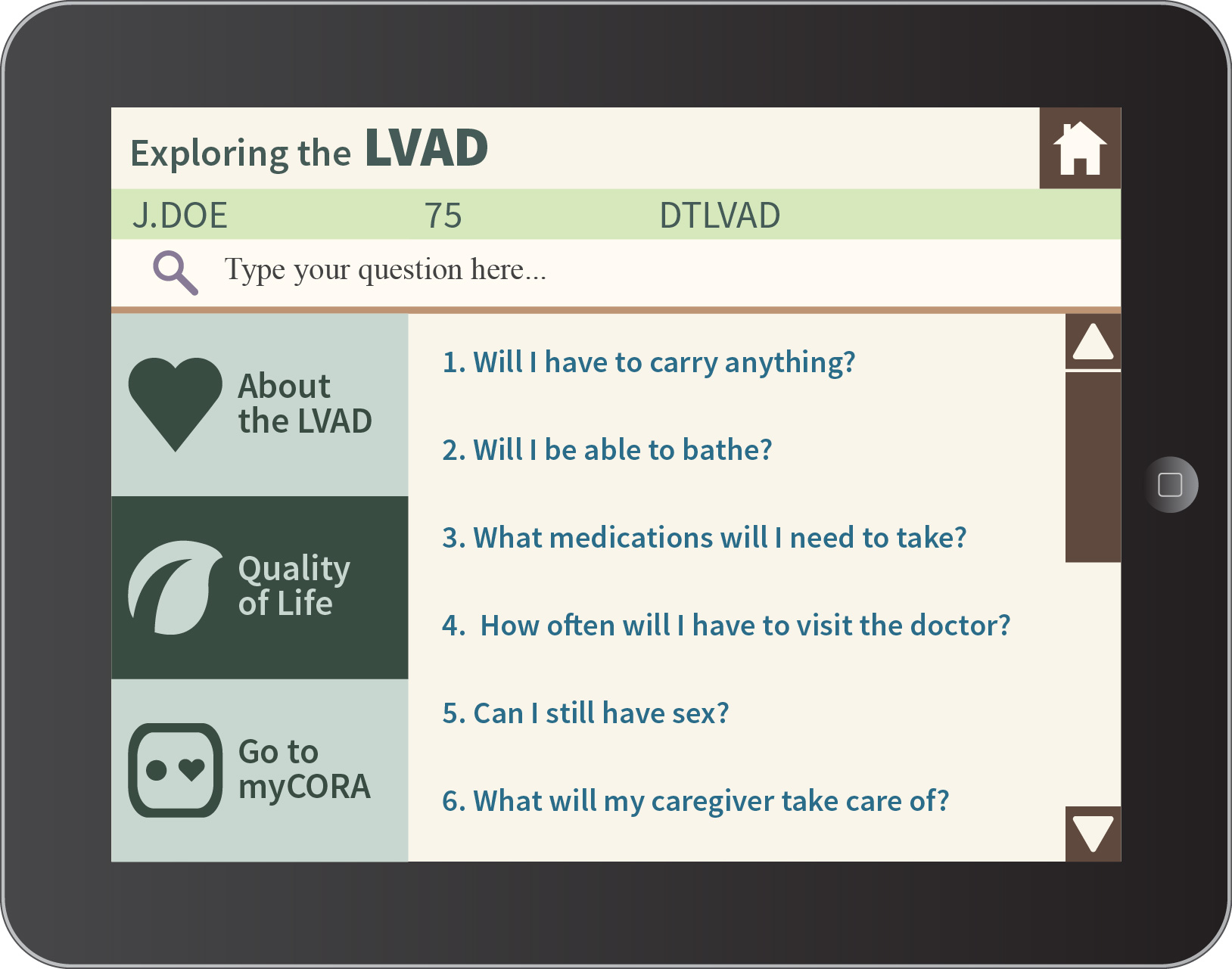
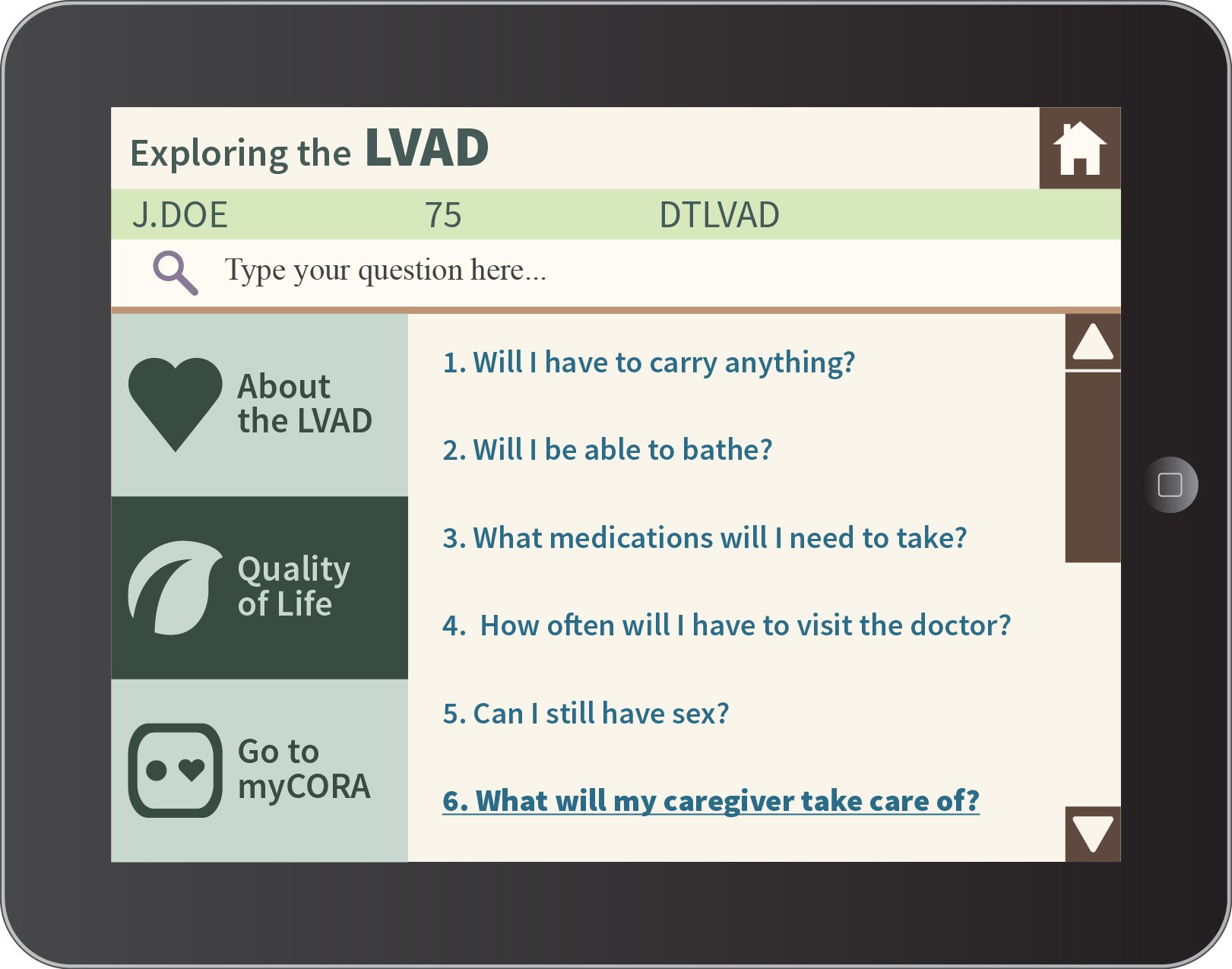
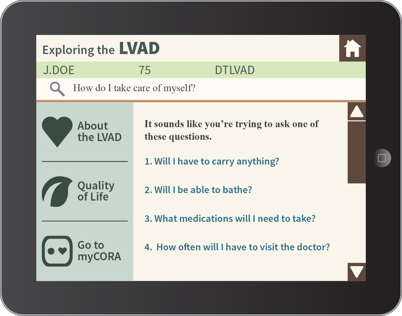
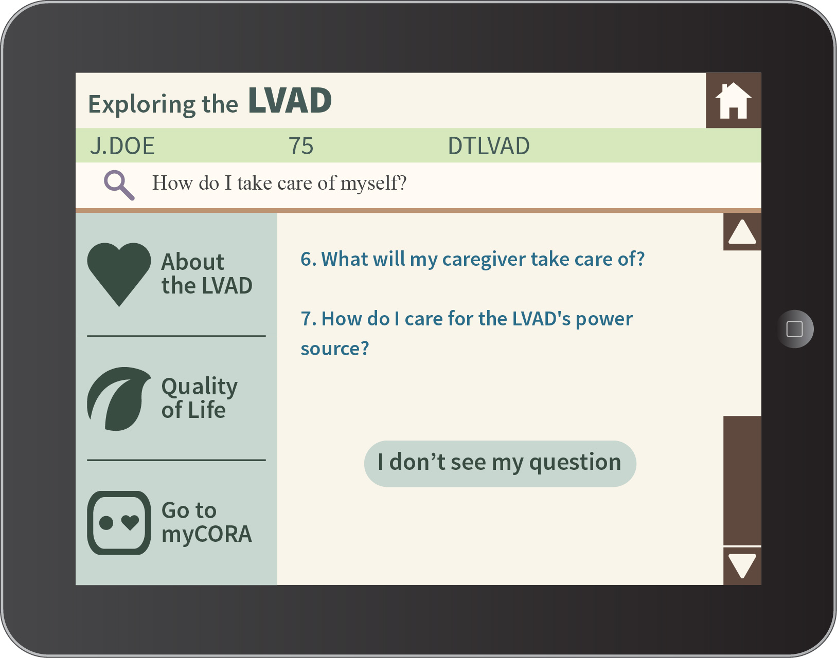
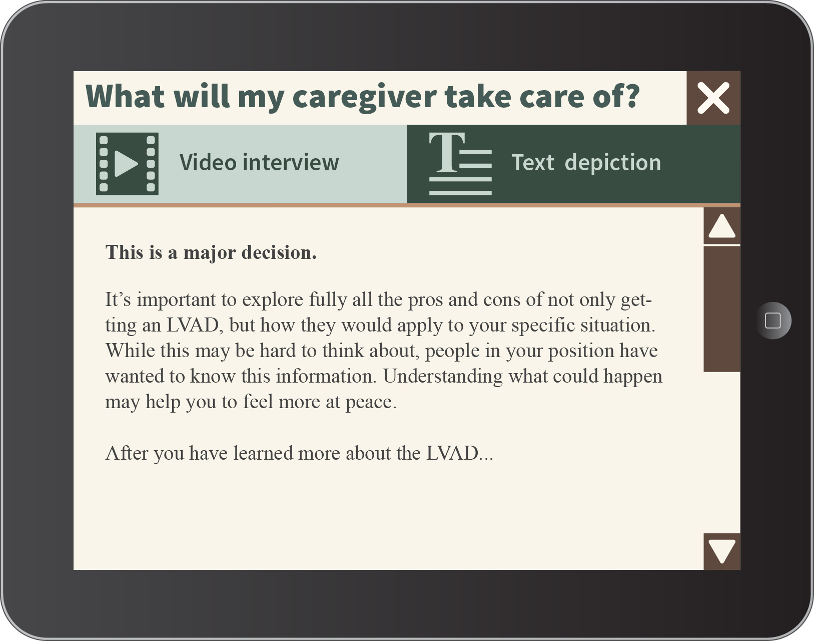
The new layout was formatted to have a vertical menu on the left size that would change color based on location with the app and a text screen on the right that would hold content. An info box that would hold the patient’s name, age, and medical diagnosis to personalize the app for each user. A lot of the more popular websites for senior citizens (like AARP) had a color scheme of one pop color paired with various off whites. Purple was chosen because it combines both the “calmness” of blue with the “energy” of red while not being too harsh.
This interface was more favorable received but still needed more work. General reactions ranged 50/50 in whether or not someone loved it or hated it. Our client liked how it displayed information in a clear, concise way; but while the layout was good, details like font, color, and size of icons needed work on. Everything felt squeezed into the limited screen space we were working with. The search function wasn’t making it clear that is was there so that users could type in a question they had instead of looking for clarification on how to use the app. Overall, the design needed to be both more simple and more detailed while conveying a sense of warmth.
Making small changes in size, width, and location, our third iteration was even better received. Patient information and the search function are more prominent, and buttons get more space to be in, which allows for those with mobility impairments to easily navigate in pressing them; there’s less a chance in choosing the right one. Information is better displayed and there’s a consistent design. While the layout has generally been approved and can now be put over the code, we expect more adjustments to be made as we continue to playtest. Remember, color is still something that’ being worked on.

Programming wise, all the main features are present and working. All that’s left to do is to integrate the UI over it – making it look pretty!
Recent Comments