Week 8: Moving Forward and Prepping for Halves

This week, we started by laying out a full, beginning-to-end walk-through of our current design. Here is an abridged version of that walk-through:

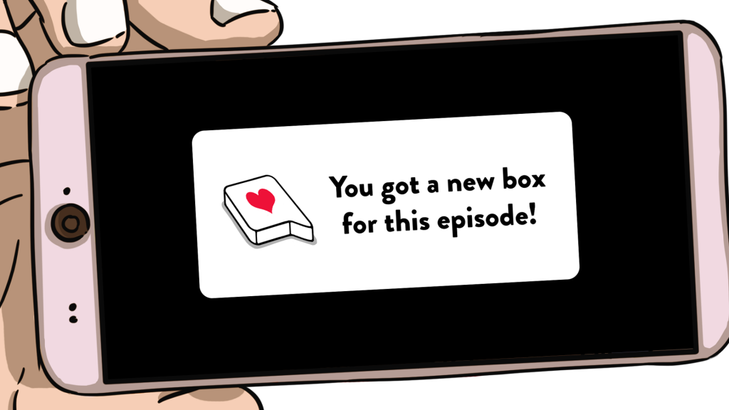
First, when the user finishes watching an episode of Relationship Status, the following notification will pop up

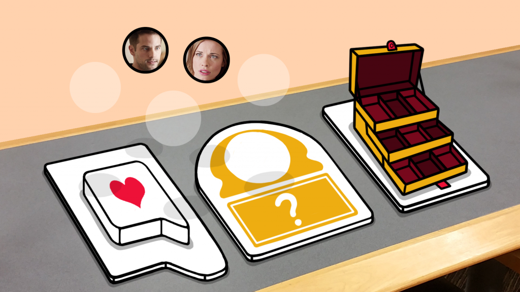
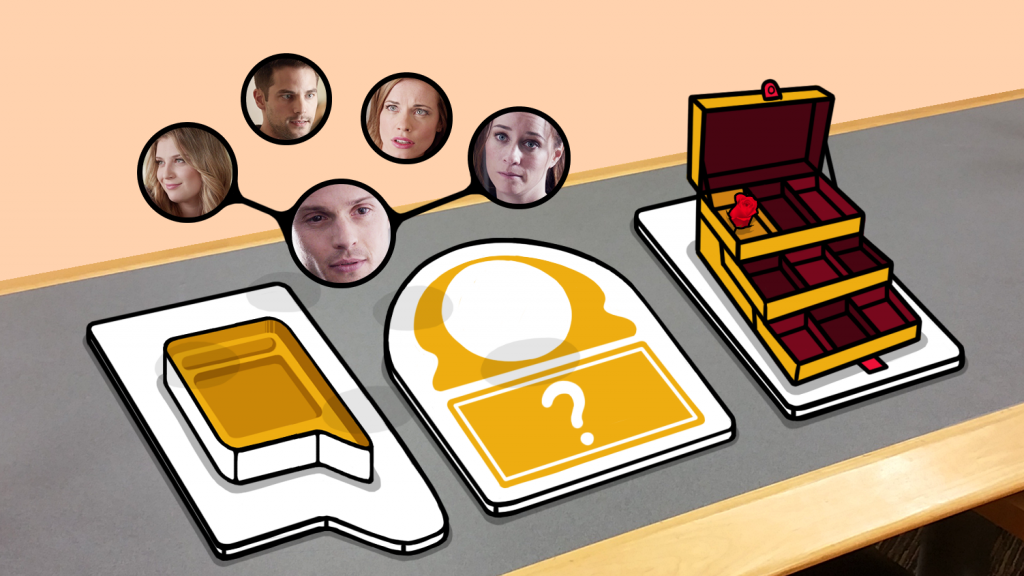
When the user clicks on this notification, the user will be taken to our AR experience. The user’s first task will be to find a flat surface for the AR experience to center around. Once a flat surface is found, three panels will appear. The panel on the right is for the user’s inventory, which is built to look like a makeup box. The panel on the left is where the new episode’s “loot box” will appear, and the panel in the middle is what we call the “interaction panel.” In addition to these three panels, an incomplete group of characters will appear above the surface. This group of characters represents the characters that to which the user had already been introduced before the new episode. The blank spaces represent the characters that were introduced in the new episode.

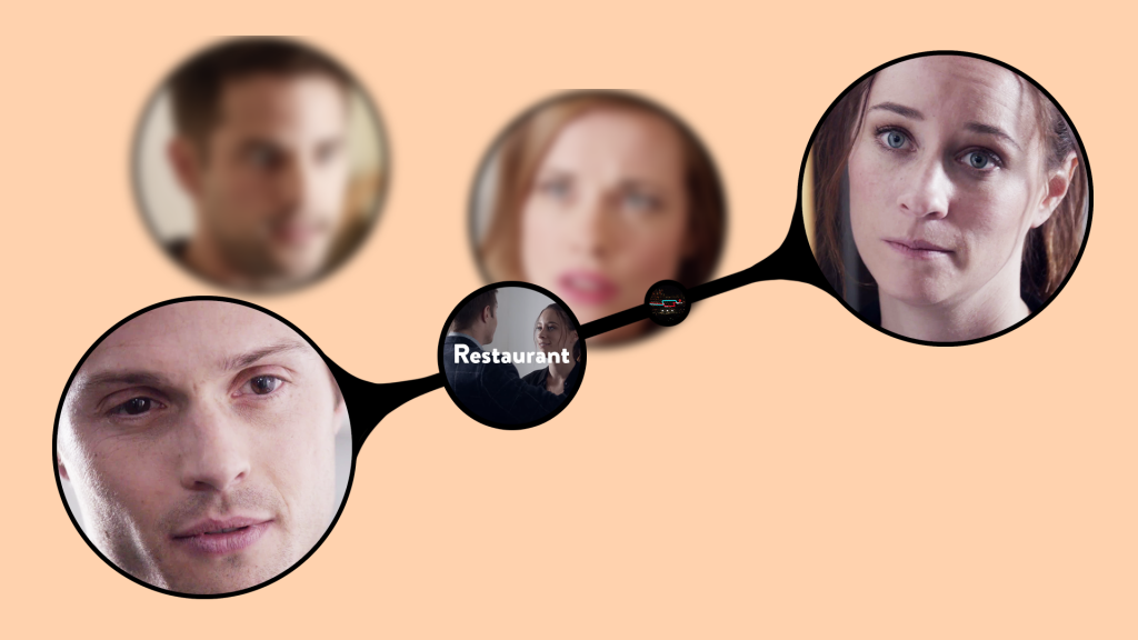
When the loot box opens, the user will see orbs representing the new characters, which will automatically fly up and take their places in the floating character group. Additionally, links will form between the new characters that show how each of them are related. If the user inspects a link closely, the user will see important events in the relationship, and be able to watch show clips associated with those events.

In addition to the character orbs, the loot box will also contain one or more objects that were significant in the new episode. By tapping on the object, the user will move it to the interaction panel. Once it is there, the user will be given a question that relates what happened with the object in the episode to the user’s actual life. In the episode we are using for this example, one character bought his girlfriend roses in the hopes that the girlfriend would ignore the fact that he was clearly flirting with their waitress. Thus, a question we might ask for the rose is “The last time your SO got you a present, was it because you were mad?” (The question is not represented in this concept art.)

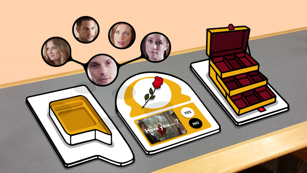
Once the user selects “Yes” or “No,” they will be able to see how other users have voted on the same question. In addition, they will be able to leave a comment if they wish. Other users’ comments will appear as they are submitted, so the user will be able to write a comment that responds to other user answers if they wish. Then, the rose will go to the user’s inventory.

A week after the episode airs, if the user goes back to the inventory and selects the rose again, they will be able to see some of the top comments that answered the question associated with the rose. We hope that the “top comment” mechanic will encourage more people to leave a comment than would otherwise, as this mechanic is used by various successful YouTube personalities to encourage their viewers to leave a comment.


After agreeing that this walk-through represents a good base for our experience, our programmers and artists set to work prototyping as much of the functionality as possible. While this prototype is not complete, it does represent a major jump forward from last week.

Finally, we also spent some of this week prepping for our halves presentation, which is next week. During the presentation, we will show our faculty members what we have accomplished so far, and get feedback as to where we should go next. Wish us luck!

Week 7: Quick Prototypes and Consulting Experts

This week, we made progress on both the technology front and the design front.

Technology

For technology, we made several prototypes of ways that characters and their associated relationship maps could be displayed in augmented reality. Two of the prototypes were designed to determine how users preferred to see augmented reality react to their movements. We called these prototypes “Sprite” and “Pill.” In the “Sprite” prototype, each of the character’s faces was always oriented towards the user, no matter where the user moved. In the “Pill” prototype, the characters were placed in a set orientation, and did not move when the users did. Thus, a user could go around the character, and see that the character’s face was attached to an object shaped like a pill. We wondered if allowing the users to talk around a 3D object (the pill) would help them understand where the objects were located in AR space.

Sprite Prototype:

Pill Prototype:

We tested these two prototypes with 11 fellow ETC students. The results showed that while most people preferred the Sprite prototype, people felt that the characters who were looking straight at the camera were creepy, because it seemed that the characters were constantly looking at them. Therefore, going forward, we will ensure that character images are always oriented towards the user, but will select images in which the character is not looking directly at the camera.

The third prototype we created is called the “Galaxy” prototype. This prototype is a proposed way of displaying many characters at once. At first we hoped that we could display the total relationship map of the show via an interconnected web of characters, but when we tried to lay it out in Maya, we quickly realized that the numerous characters and connections made it messy and confusing.

This map isn’t even complete – it’s missing several characters and connections, but it’s already a mess.

Therefore, we decided to try showing the characters in a floating “Galaxy” around the user, and only displaying a certain character’s relationship map when the user selected that character. Knowing that we will eventually want to display videos as well, the programmers also used this prototype to experiment with the number of videos that can be placed in an AR space.

Galaxy Prototype:

Initial reaction to this prototype has been positive, but the way characters are arranged in space will continue to evolve as the design of the experience evolves, and we determine which mechanics are most important.

Design

We talked to multiple industry professionals this week to get ideas about how to design an engaging experience.

First, we talked to Brenda Harger, the ETC’s improv teacher. Brenda pointed out that people who watch soap operas love to make judgments about the choices that the characters make. This supported our hypothesis from last week, that users would enjoy an experience that would let them weigh in on the morality of the characters’ decisions.

Later in the week, we were lucky enough to get a meeting with Susan Dansby and David McKenna, both successful television writers. Susan and David told us that in addition to judging the morality of character decisions, soap opera viewers also enjoy relating the situations that the characters are in to their own lives. Thus, when we design the decision-judging portion of the experience, we will frame our questions to users in ways that will make the users reflect on how they have dealt with relationships in the past.

Jessica Hammer, an ETC faculty member who specializes in HCI, talked to us about how to leverage 3D space to organize our relationship maps. She suggested possibly organizing relationships spatially to show how characters feel about one another – for example, if a user selects a central character to investigate, all characters to the left of the central character could be those that a central character dislikes, and all characters to the right could be those that the central character likes. We will begin to play more with the spatial organization of our relationship maps.

Week 6: Getting Into Relationship Status

Because Relationship Status has a large cast of characters, each of which has several connections to the other characters in the show, it’s sometimes hard to keep track of who knows who. Therefore, we decided that before we designed any content for this show, it was important to write out exactly how the characters were interconnected. The resulting relationship map would hopefully prevent us from creating auxiliary content that incorrectly portrayed the characters’ relationships.

(If you’re interested, here’s the relationship map in Word doc form.)

After we compiled the map, we realized that while the text-based map was a useful tool for us as designers, a graphical relationship map could serve as the base of our user experience. Since the main focus of the show is how the relationships between characters change and evolve, it makes sense to allow our users to interact with the show by presenting the users with a visual depiction of the relationships and allowing them to “zoom in” on any relationship they find particularly interesting. We discussed this concept with one of the show’s producers during the client meeting, and he agreed this was a good starting point.

Because the map will be complex, it makes sense to put it in 3D space – so we decided to experiment by using AR to form the map in the familiar 3D space of the real world.

Additionally, we hypothesized that part of what draws viewers into the Relationship Status show is the moral grey-area in which many of the characters make choices, and that viewers would enjoy discussing the morality of the characters’ decisions. To test this hypothesis, we brought in several of our classmates to watch a particularly morally-ambiguous episode – “The Lucky One” – and surveyed them about it.

Week 5: A Slight Change…

This week is Quarters week. We were excited to showcase our design, research and tech demos for the ETC faculty.

We talked about our initial design approach in last week’s blog post. Besides that, we showed three early tech demos for the experiences we were prototyping.

VR Demo

AR Demo

MR (Mixed Reality) Demo

Then, there was a twist!
Our client suggested that we work with a new show “Relationship Status”.

“An interweaving cast of 20- and 30-somethings navigate the complexities of dating and relationships in the modern age of social media.”

We were surprised and delighted by this new direction. Previously we had been struggling find engaging experiences for QB1. However, we find ourselves so much more engaged with the new show, and this makes it easier to design for.

We also had to redesign our branding materials, but it was not too much of a hassle. Can you spot the differences?

NEW

OLD

See you next week!