While the first main character’s animation was being implemented, we briefly turned our focus onto the world design. Our largest and most visually striking elements will be the portals, and we needed to make sure we could follow through with implementing them. As was mentioned in previous blog posts, we had already implemented a placeholder portal to test out wall attachment, and we have demonstrated artistic directions that we were considering. Ultimately we decided to proceed with style No. 3 for the Hell Portal. No. 1 would have required us to create a much larger world, and No. 4 would have required a lot more animation for the little ghosts inside. Both of these tasks would take up time that we don’t have to spare. There was a number of overlaps between No. 2 and No. 3, but No. 3 was the most visually striking of the two, and would not need any “mouth” animations. The teeth on the floor were aimed inwards to prevent any ghost from escaping, and the eyes on top were extensions of the Manager, to further add security. Since these items do not have much movement attached to them, we believe it is feasible to reach a timely level of polish. If we have additional time, we threw around some ideas such as adding a tongue as the pathway for the ghosts when they enter.
On implementation, we initially ran into the issue of occlusion, or lack thereof. While the portal attached successfully to the wall, the insides were visible from all areas of the room. We needed to implement a masking agent, so that the portal entrance behaved more like a window. After some color tweaks for clarity, below is what were able to come up with.
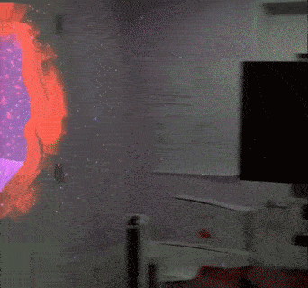
It is certainly a great start, and now allows us to have an
anchor point for the character movement animations that we will be working on
in the coming weeks.