
Week 3: Playtesting, Client Confirmation, And Faculty Expert Input
So, this week we were at a funny juncture in terms of deciding project pillars, scope, and focus, while simultaneously digitally prototyping an experience into existence. It’s chopping down a forest while occasionally climbing a tree and asking whether we’re even going in the right direction. We asked ourselves that question, our clients that question, and a lot of faculty that question.
We knew needed to test how the paper prototype was translating into a tablet interface, but that could take a million different forms. We also needed to answer these big questions that we were really worried about. Risk analysis is fun, because it’s the moment where you step away from blue-sky design and say: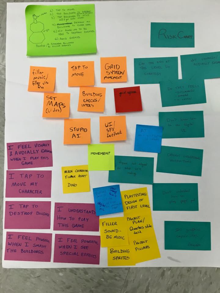
Risk chart, on right in blue: a.k.a., Our Worst Nightmares
“If everything caught fire and fell apart tomorrow, how would it happen? What’s going to ruin us? What are we most afraid of?”
Fun stuff.
At the end of the previous week, we’d made a risk analysis of such questions. I think it really came through how little we knew what to expect of our audience.
What if they barely knew how to use the tablets? What if the games they played didn’t include any strategy whatsoever? What if we accidentally made a game with an aesthetic they hated?
What is our main client really trying to do, here?
And how does faculty respond to what we have so far, given that they are all experts in different arenas?
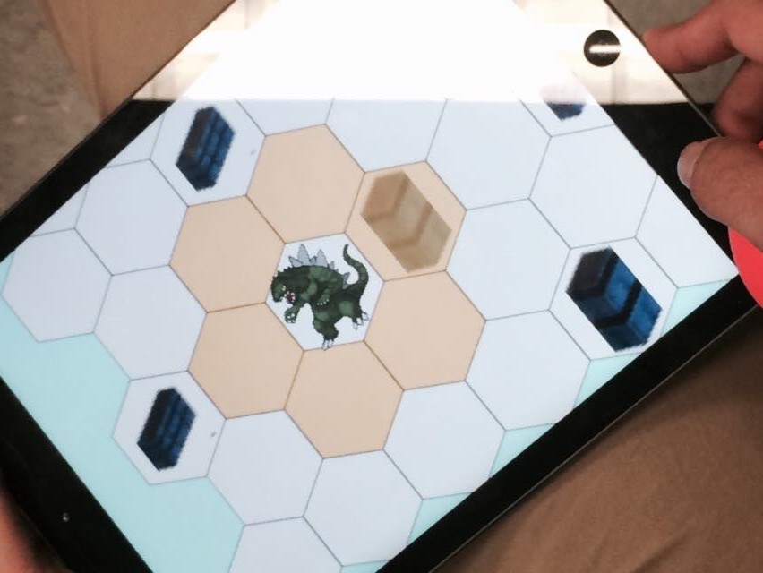
All of these questions enabled us to design our first playtest and prototype in order to quash as many possible on the first go—and see what was unquashable; what needed to be fixed the most. The playtest was a mix of A/B testing (for art style), observation (to get a sense for whether our hypothesis about control and power was correct, what UI was intuitive for the kids, and any other patterns of behavior), interview (brief, about game choices and what they did and did not like about our game), paper prototype playtesting, and usability testing the digital interface.
A lot for one session! But we got five lovely kiddos in from the larger class and an hour later had a lot of questions answered that we didn’t have initially.
The big one was a sense of gratitude that we didn’t “design down” when ideating—that we tried to make a game that was fun for us. Because the kids picked the board game up right away, and even ended up combo-ing us multiple times. Any preconceived notions about what it means to be in a social-emotional therapeutic program and on an IEP quickly vanished.
Our kids don’t button mash, they strategize.
Our kids have no patience for shoddy design work, and have some insightful things to share in terms of what mechanics are working and not working, and why.
Our kids understand that flashing elements on a tablet means interactivity.
So, that risk assessment was put to rest.
Now, here’s what’s not working: we had a risk assessment that basically said, “what if kids don’t feel powerful or a sense of control when playing this game?” For the board game, they did feel powerful, often making sound effects and marching the dinosaur across the page to simulate stomping. But the tablet UI was a totally different story. It felt flat, they didn’t react at all, and the sound effects totally vanished.
We unpacked as a team why this might be happening, and came up with a new risk assessment focus for the following week. With some very helpful faculty feedback, we shifted our design pillar from “juicy”—which really, for the time being, belongs under the much more important goal of feeling powerful, regardless of how we get there (we’re looking at self-determination theory to see if there are other aspects to this we may have missed, thanks to Dave Culyba).
Our chosen art style, decided by a mix of A/B testing and team capability as a tiebreaker
Instead, we tried “stickiness/replayability” on for size as a pillar. But, after a conversation with the client, it became clear that our game’s goal was not necessarily to remain ONLY sticky. The kids have access to the entire app store during free choice time, including games with companies and corporations that out-scope us in terms of how sticky and replayable their games are. We would be competing with all hundreds of thousands of them. And part of the appeal of free choice is this frenetic choosing, this buffet/smorgasboard of options. We will be lucky if kids play our game for ten minutes a week for more than a month.
But we want to see kids playing ours for increasing amounts of time as our project progresses, and we don’t want to see them switching from ours to an inappropriate game such as zombies or killing.
Our more direct goal is to compete to scratch the same itch as some of the more violent games the kids download, especially blood-and-guts shooters. So we’ve changed a pillar to “More Sticky than the Shooters,” to see if we can serve as this alternative.
We got more helpful faculty feedback, as well. Brenda Harger encouraged us to think about the broader picture, which is part of what prompted the phone call with our client to clarify a deeper reason for making the game. Problem-solving is something that has come up as a strong secondary goal to minimizing the desire to play violent games.
Chris Klug advised us in ways to fold in story elements into a game for an audience that doesn’t play games with a lot of traditional game narrative (it has to do with success revealing themed elements that show more about the world over time).
Mike Christel advised on play testing as well as game mechanics and why perhaps the tablet was not translating the board game as well as we hoped.
All in all, a fantastic week for feedback and reflection before moving on to explain our reasoning at quarters.