This week we managed to complete two minimal viable prototypes, more detailed design documents and art assets for publishing. On Wednesday, we visited Occipital and got valuable feedback from them. Thanks Dustin! We deeply appreciate your help.
– Tech –
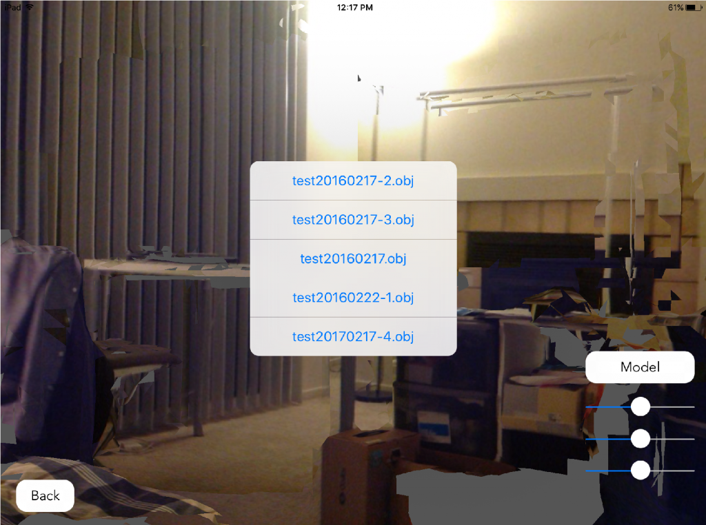
One of the core feature is room mapping. In Jack’s prototype, we can reload a fully textured scanned room with the same scale of the real environment from our gallery. Our next step is to define the floor and match it with the real world. In Occipital’s sample code, they already made the bounding box align to the floor. With their sample code, it should be hard if we can define the floor of the scanned room. As for how to define the floor of the virtual room, Dustin suggested two approaches: 1. calculate and find the floor by ourselves, it will cost a lot time but offer best user experience; 2. let users start to scan with looking at the floor so we can define it, it’s a easier way for us but we can’t guarantee if users could follow the instructions properly.
Also Qing was researching on positional tracking function, once we solve the “landing room on the floor” issue she will start to implement “walking around to observe” function.
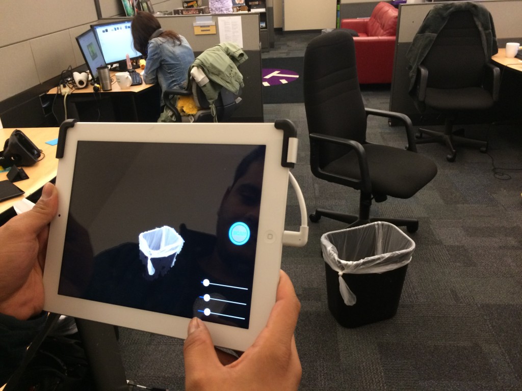
In Atit’s prototype, we can isolate a real furniture from camera feed with two different approaches: 1. manually select the visible space, 2. rendering inside the bounding box. It was great for observing from a static point of view but not for observation while moving around. According to Dustin, the virtual room will drift a little bit in the real world as users walk around. So it will be more stable if we scan the furniture and then put the virtual room to wrap it up. The “scanning” we talked about actually include 3 parts: tracking; mapping and saving. For the furniture scanning process, we need at least tracing and maybe add mapping as well in the future.
– Design –
As for design, Wei made a one-page design of our App and got some feedback from advisors and Occipital meeting. The explanation of interactions were not clear enough, the next step is to visualize them rather than using words. Storyboard may help to explain the user story clearer.
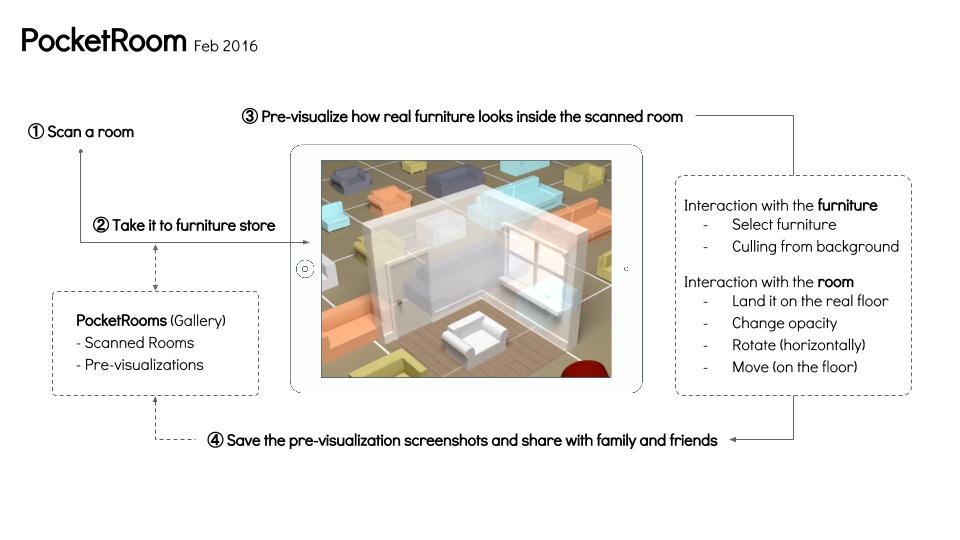
Sophia made a detailed digital version of user flow based on what we discussed last week.
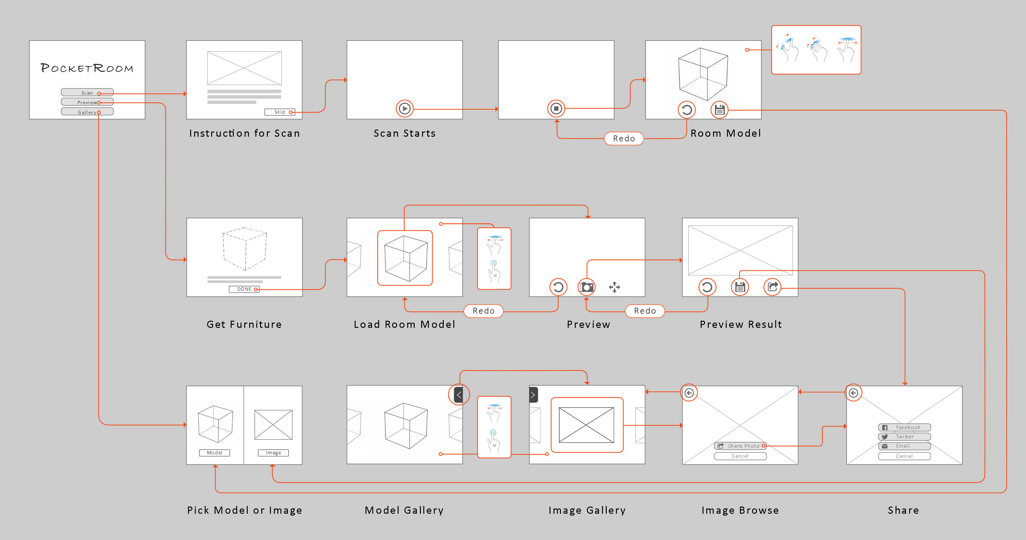
Based on what we learned from Occipital meeting, we will tweak the flow to provide better user experience. For example, we learned that you should always keep the furniture you selected in the screen, otherwise the system will lost track. In the previous plan, the next step of the selecting furniture is choosing scanned room from the gallery. There is good chance for users to get lost of track during this phase. So we need to redesign some of the steps afterwards.
– Art –
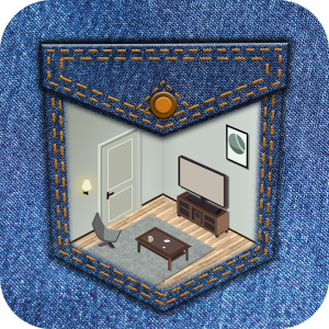
As for art, Sophia designed a logo for App. Her next step is to modify the perspective issue and make the artstyle of the pocket and room to be more consistent.
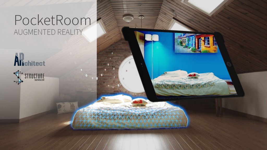
Wei made a splash screen for publishing and future promotion use.
Next week we will started integration and deliver a minimum viable product ready to publish. Also we are going to meet Modsy, a startup working on interior App in town, to get some feedback about our project. Last but not least, we will finish the rough version of the 1/2s presentation before Spring break and GDC week.