This week is a brainstorming week! The team worked on coming up with a lot of ideas about the app and the experience, let’s take a look!
Art concept
We came up with 4 different art concepts, for our client to choose which one they prefer.
The first is a spaced themed idea, it’s interactive, we want to match the space theme with the booth recommendation functionality.

The second idea is also space-themed, but we want to make it easier for users to navigate, more flat and plain.

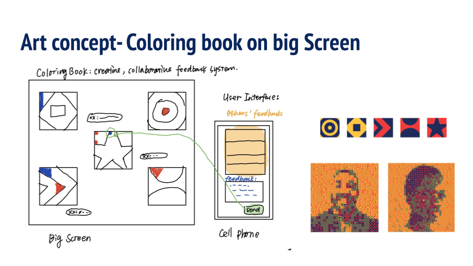
The next idea is a color book idea, we are thinking about getting a big screen in the conference, and it will show the progress of how many feedback we collected, the more feedback we get, the more color it will show on the screen. It’s a visual way for the attendee to see the progress.

The last idea is to just make the app look like a “normal app” because there will be people who are not familiar with tech or games, we don’t know if we design the app to be too gamey or interactive it would make them feel overwhelmed.

Signup/login
For the signup/login function, we came up with a “scanning” idea, that the user can just scan a QR code generated for each individual, and they will be automatically logged in to the app. because, in our first meeting, our client mentioned that we don’t want to put too much work on our users. We think that scanning a QR code is easy enough for people to log in. but also we think we should still keep the traditional email and password sign in a way because if people register at the event we might not have a QR code for them in advance. We need to discuss this with client about this in our next meeting.
Survey
For the survey, we think we can divide the survey into two parts: core-questions and non-core questions. The user must answer the core-questions to get in but can skip the non-core questions if they want.
For non-core questions, we thought about two styles of questions: one is more formal and related to the conference, like what industry do you come from, what’s your occupation, etc. And the other is a more relaxed, informal and fun style, like choosing between two pictures, are you a dog person or cat person, what would you bring to an island, something like that. We need to discuss with our clients to find out their preferences.
Recommendation
The recommendation is very impro0tant to our app.
The first idea we have about recommendation is related to the planet-theme art concept. A rocket shows up and brings you to the planet, your birthplace is your core interests, and we recommend travel plan, which is our recommended booths, if you hit the planet it will show the booths’ info. The pros of the idea are that the space theme is related to the conference theme, it recommends in a general way, and it’s super cool and fun. The con is that might be hard for people to understand.

The second idea is related to the second space-themed art concept. It’s a “light star” idea. There are stars in the dark space, they are simply a representation of the booth we recommend. We highlight the recommended stars and different colors are different themes. The pros of this idea are it’s easier for people to understand and easier to use. The con is might not be that engaging.

Another idea we have about the recommendation is that we let the users choose the booths we recommend. We recommend 3 booths at a time, and they can choose which booth they like, and go to that booth. After that, we recommend other booths. So they can go to the booth they prefer and not having to do exactly what we tell them to do.

Navigation
Next, we thought about how to help the user navigate the booth. We thought about using a static map and an interactive map. If we use a static map, it’s easier for the team to do, and good enough for most people to use. The con is it’s not that interactive. If we use an interactive map in the app, it might be more useful, but it would take the team a lot of time to do this.
Booth interaction
Next, we need to find a way to check if the users have gone to the booth we recommended and had some interaction with the booths.
We had two ideas, one is using QR code. You need to scan a QR code at the booth to confirm that you visited this booth.
The second is that Instead of scan QR code, we have some questions for each booth (provided by booth), only if you answer them correctly you can light up the star or something. The pros of this idea are that it can check whether the guest get the general idea of the booth and make sure they visited this booth and had some interaction with the booth. The con is that it needs the companies’ support to do this and provide questions.
About the question idea, we came up with two ways to show the questions to the user.
One is that they access questions in a general tab, we don’t tell them which questions are mapped to which booth, let them find out, like a scavenger hunt. the pros are it’s interesting and the questions encourage guests to explore the booths. The cons are that A list of questions can be intimidating and some might lose interests.

The other is that the will access questions through each booth in the app. It encourages guests to explore a booth with a purpose.
Rewards
Next, we thought about the ideas of the reward we should give to users after they visited the recommended booth.
First, we thought about when we should give them rewards.
The first idea is simple when they visited all the recommended booths, it’s easier to understand and easy to achieve, but not that fun and has no level system or milestones.
The second idea is we give rewards by level/category. You can reach different levels and get badges for different themes in the conference and get different rewards. It’s fun and cool, but might be a little too complicated for some people.
Feedback
Feedback is also an important part of our app.
We thought about different types of feedback we can collect: feedback for the whole conference, feedback for each theme, feedback for each booth, we can ask our clients which ones they want in our next meeting.
And we thought about the idea of “like” feedback , you can “like” or “agree” with someone else’s feedback. We thought that might be cool.
Also visually, if you give one feedback, you can land one rocket/footprint on the planet/star. You can hit the rocket and footprints to see the content.

Also on the big screen, there will be a color book, guests send their feedback from their phones, then their feedbacks on how up on the big screen as a color block, they can also see other people’s feedback and give likes. We think strong visual feedback encourages guests to do such activity.

Offline activities
We also thought about some offline activists that people can participate in. Like they can do a group drawing using our theme icons, they can use a whiteboard at the conference if they don’t want to do it in our app.
That’s a lot of ideas! We want to come up with many options for our clients to choose from. Looking forward to next week’s meeting with them and we can find out their preferences.
Comments are closed