This week we had our first playtesting at ETC. 9 people participated, and we got a lot very useful feedback!
Questionnaire
Before the playtest, we designed a questionnaire and asked important questions that we are curious about. Like:
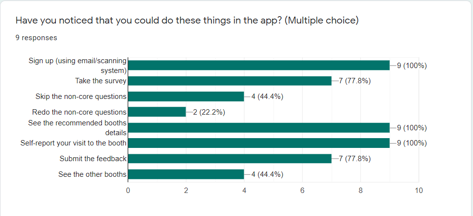
- Have you noticed that you could do these things in the app?
- Do you prefer using a scanning system or email to sign up?
- Rate from 1 to 5
- I found the layout is easy to understand
- I found navigating around this web app is easy
- I found visiting the recommended booth is easy
- I found finding the specific booth (eg. Theme XX boothXX) is easy
- I found sending feedback is easy and clear
- Do you have any confusion about any part of this web app? If any list them below.
- If you have a magic wand, what do you want to change?
We think the answer to those questions would be helpful for our design.
The playtest
When we sent out the playtest invitation, only 2 people signed up. We were worried that not enough people will come. But one hour before the playtest, people started to fill out the signup sheet. And at last, we had more people than we expected, which is wonderful!

During the playtest, we first did a little introduction to our project and our app, then they will playtest the demo in the mock-up view. We look closely of their actions and take notes, and answer any questions they might have. After they finish the experience, they will fill out the questionnaire.
The result
We had a lot of very useful feedback and data from this playtest!
We found that:
- All of them knows how to scan a QR code
- All of them prefer using QR code than using email/password login
- Some of them mentioned that they want the option to change the answer to the survey, “back” button
- One person mentioned that they want to skip after they’ve seen the question, instead of skipping without seeing them
- Some of them thought the “visited” button is a label
- Want the option to revert the “visited”, like “mark unread”
- Some of them didn’t realize the stars are interactive
- Most of them confused about what the stars mean, don’t know it’s the map
- Some mentioned it’s a little bit hard to find the place to write feedback, too deep
- People want to search the booth instead of looking for them in the map
- Most people can’t relate the themes to the five stars and don’t realize each of them represent a theme’s map
- A few of them mentioned they would never do anything that needs typing
- Choosing from provided options makes it much easier for user


What we learned
Most of them found it was easy to sign in and visit the recommended explorations, and they felt the visual design was fun and engaging. However, they also pointed out that they confused about the stars and didn’t realize the stars were interactive. And there was a learning curve when they first use this web app.

The team will reflect on the feedback, and discuss them with our client in our next meeting.
Comments are closed