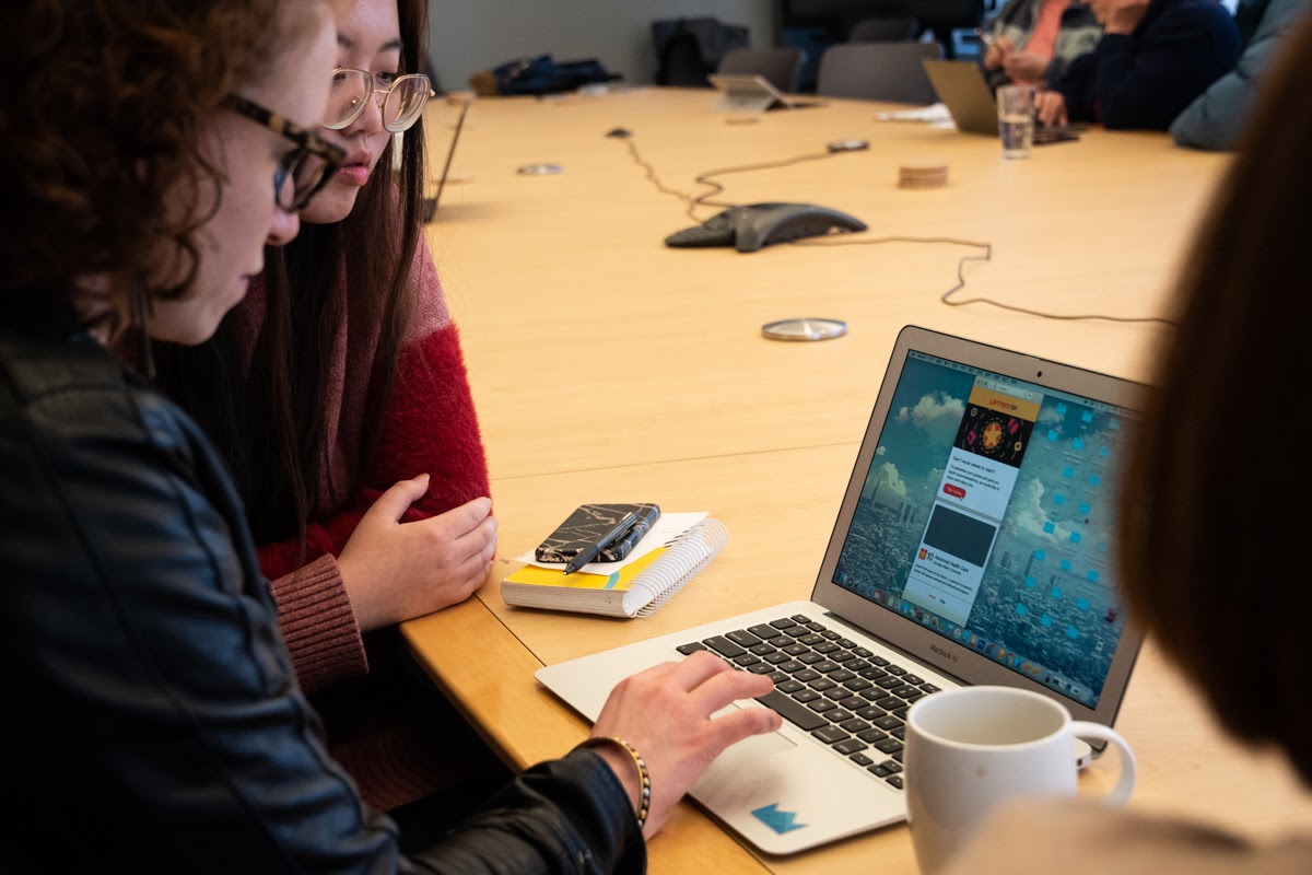
This week we had our second playtest! This time we did it at our client’s office – Jewish Health Foundation. And tested it with their wonderful employees.
Design Update
Before talking about the playtest, we would like to share with you our design updates. We retired our design with last week’s feedback.
Based on the feedback, we made the following changes: We separated the map from the home page and made it clear for users to interact. To help the users better understand what this web app can do well, we added a tutorial page for onboarding before users first getting to the page. We also changed the layout of the pages and UI for a better user experience.

Playtest
We did our second playtest at our client’s office and tested with 8 people.
We first talked through the process with them, like we did last week, and then they played around the app on the mock-up view. After they finished the experience, we asked questions and they filled out our questionnaire.


The result
Our playtesters responded really well. Here are our notes:
- All of them prefer using QR code, but some people did not know how to scan QR code, need to provide guidance
- Some people don’t know the introduction part is an introduction, trying to click on them
- Most people said they will write feedback
- Some people confused about the order of displaying, don’t know how we ordered the recommendations, or is it just random
- For the map: one person mentioned that they would like the option to flip between two different styles: one artistic, and the other more informative
- One person mentioned they want to option to “refresh the recommendation”, like when they finished all the booth they want more recommendation, or if they feel they don’t like the recommendation, they want a different set
- Some people don’t understand the tutorial at the beginning.
- Some people have trouble going back to the home page.
- All of them used the bottom navigation.
- A person mentioned that there is a learning curve for our web app.
- Three out of five people mentioned that they want to see the status change when they visited a booth.

They all felt this iteration was visually interesting and fun, UI was clear for users to navigate around. However, our playtesters still mentioned that choices of the color need careful consideration and the tutorial at the beginning should be more like a tutorial to the users.
Iteration
Then, we made another iteration based on the feedback. We carefully refined the UI to match to the theme of the conference.

Comments are closed