Playtest day is a tradition at ETC. Every semester we will invite some people to our building, and they will try out different team projects and give feedback for them to improve. It’s a great way for teams to get different perspectives from a diverse group of people.
This semester, because of COVID-19, we canceled playtest day. But because our app can be played by anyone who has a smartphone. We sent our invitation for faculty, staff, and alumni from ETC to playtest our web app. And send them a questionnaire to fill out after.
Onboarding
To help our playtesters get started, we made an onboarding doc, telling them a little about our web app and the conference, what they can expect. And we included some known issues and disclaimers because it’s still under development.

Questionnaire
Next, we made a questionnaire for them to fill out after they use our app. We designed some questions and asked them to write any issues, or things they think can be improved.

Result
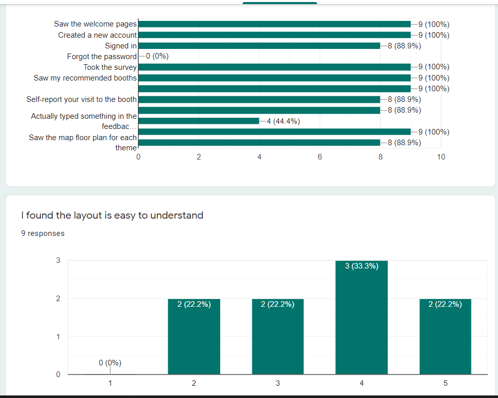
At the end of the week, 9 people tried our web app and sent us their feedback.

Here are our takes on the feedback they gave:
Summary
- Most people found and used all the functions of the app (except forgot password)
- Half of them actually “typed something” for booth feedback
- Most people found visiting the recommended booth easy to understand
- But visiting a specific booth from the interactive is hard to understand for some people
- Many people confused about the interactive map
- People want more booth (they didn’t read the disclaimer)
- Didn’t find any serious resolution/UI problem
- Most people get what the emoji means (we added text for each emoji)
- Most people find sending feedback is easy
- One person still thought the welcome pages are real pages and tried to click on it
- People like the color and the UI, very clear and easy – some think maybe it’s too easy?
Interesting Quotes
- The webpage initially gave me 3 screens explaining the features, but I thought those screens were navigation so I kept trying to click on them.
- In general it was straightforward but possible too much so
- I didn’t know the interactive map was interactive at first because it was the same image as the image in the header page to start the experience. Maybe put text that says to touch one of the shapes.
- Since the phone’s back button closed the browser on my phone, I would suggest making the app back button a bit more obvious. Also there was no back button on the interactive map and I did not think that Home would take me back to my suggestions – I thought it would return me to the login page or something more top level.
- The feedback doesn’t then do anything towards prompting you where to go you have to actually back out to the list. Could it say if you liked that you may like this or the next closest booth to you from your recommended list is..
- There should also be somewhere to review visited booths and sort them by rank or something. Possibly on feedback a radio for remember this or important or relevant so when I leave I can review things I wanted to remember. A place to put notes on a booth for myself not just feedback to the booth would be good as well.
Comments are closed