Week 12: Iteration and Playtest #2

Based on the feedback we have on Monday, we iterated on the webapp and made several changes:

  1. We fixed a lot of bugs, such as video popping up too many times when the user hovers over several dots, and the label feature breaking after several selections.
  2. We also polished the UI according to feedback by having a label bar that can be hidden and headings for each section.


After the changes, we held another playtest session today. We invited 2 guests who work at EA to playtest our game. Both of them are analysts. We received lots of feedback from the playtest, and will highlight some of them here:

  1. The hover view looks nice, but it’s difficult to navigate out of the big circle to view the other small dots.
  2. Wasn’t sure how the label was sorted at the top, possible to sort the labels in a meaningful way.
  3.  VIsual animations of the dots were not meaningful when switching the axes.
  4.  Is it possible to extract data from this interface for other analytics purposes?

A lot of the feedback was on feature improvements that we are looking into. Hence, this solidifies the direction that we should go in.

Here’s one of the playtesters for our product:

The current version of our live website is the one we used for playtest: tada.etc.cmu.edu.

Next week, we’ll consolidate the feedback and begin working on implementing critical improvements/features.


Week 11: Playtest

Hi everyone, we didn’t do a post last week because thought it would be more meaningful if we post after today — our playtest day.

We iterated our UI and interactions multiple times since our Halves prototype. During our playtest, we showed them our current version. Unfortunately, our playtesters couldn’t make it today so we playtested it with the other team internally. Most of the feedback we obtained is targeted on what each section of the UI represents and how we can better display it.

From this picture, we can see how the axes can be sorted (below), how the label heatmaps are displayed (top-left) and how the view count/view-like ratio is displayed as well.

We then asked them several questions based on our target UI mockup. Currently, we are prioritizing the data/video exploration experience over the pinpoint accuracy of data. The label heatmaps show the recency and relevance of labels in the past 30 days. At the bottom, only videos at the top of the assigned Y-axis metric (e.g. popularity) are displayed across the days. The other videos are collapsed and expandable by clicking the bottom circle for each column.


Next, we’ll look to implement further improvements for the prototype.

Week 10: Youtube statistics, meta-labels, React migration & UI changes.


Halves Feedback

A lot of feedback was given to us for Halves. A lot of them is directed towards the usefulness of the product. Users who attended our showcase wanted to see more information with regards to the videos and see more information with regards to the axes on the prototype, such as view count and a zoomable time bar. We also received feedback to be more creative in terms of our visualization, and also ensure that our product is highly functional and usable by our target users – community managers. Currently, it is a huge challenge for us to have a product be highly innovative in terms of visuals without compromising certain functionalities.


This week, we progressed well on several fronts.
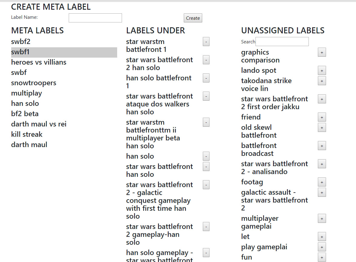
Meta-labels

The meta-label feature is designed to categorize collected terms that have the same semantic meaning in the game’s context. For example, “SWBF” has the same meaning as “Star Wars Battlefront” and thus will be categorized under the same meta-label “SWBF”. The stemming process (mentioned one of our previous posts) automatically categorizes English words, and the meta-label is done after stemming to categorize game specific terms with the same meaning together.

Youtube statistics

In preparation for grouping videos according to different criteria, we also looked into parsing Youtube statistics to obtain information such as like counts and view counts.

Twitter mentions

We also implemented twitter parsing to update the latest mentions (One of our Y-axis criteria) of Youtube videos. This gives us more community information on the latest relevant videos despite its upload date.

Front-end

On the front-end, we have spent time migrating it to React to facilitate future developments.

UI

Perhaps our most challenging hurdle to overcome. We have explored and iterated our UI numerously according to feedback. This current UI is our take on the balance between functionality and creativity.


Right now, we’re processing feedback for this interface based on instructors and nailing down components to playtest next week.