Based on the feedback we have on Monday, we iterated on the webapp and made several changes:
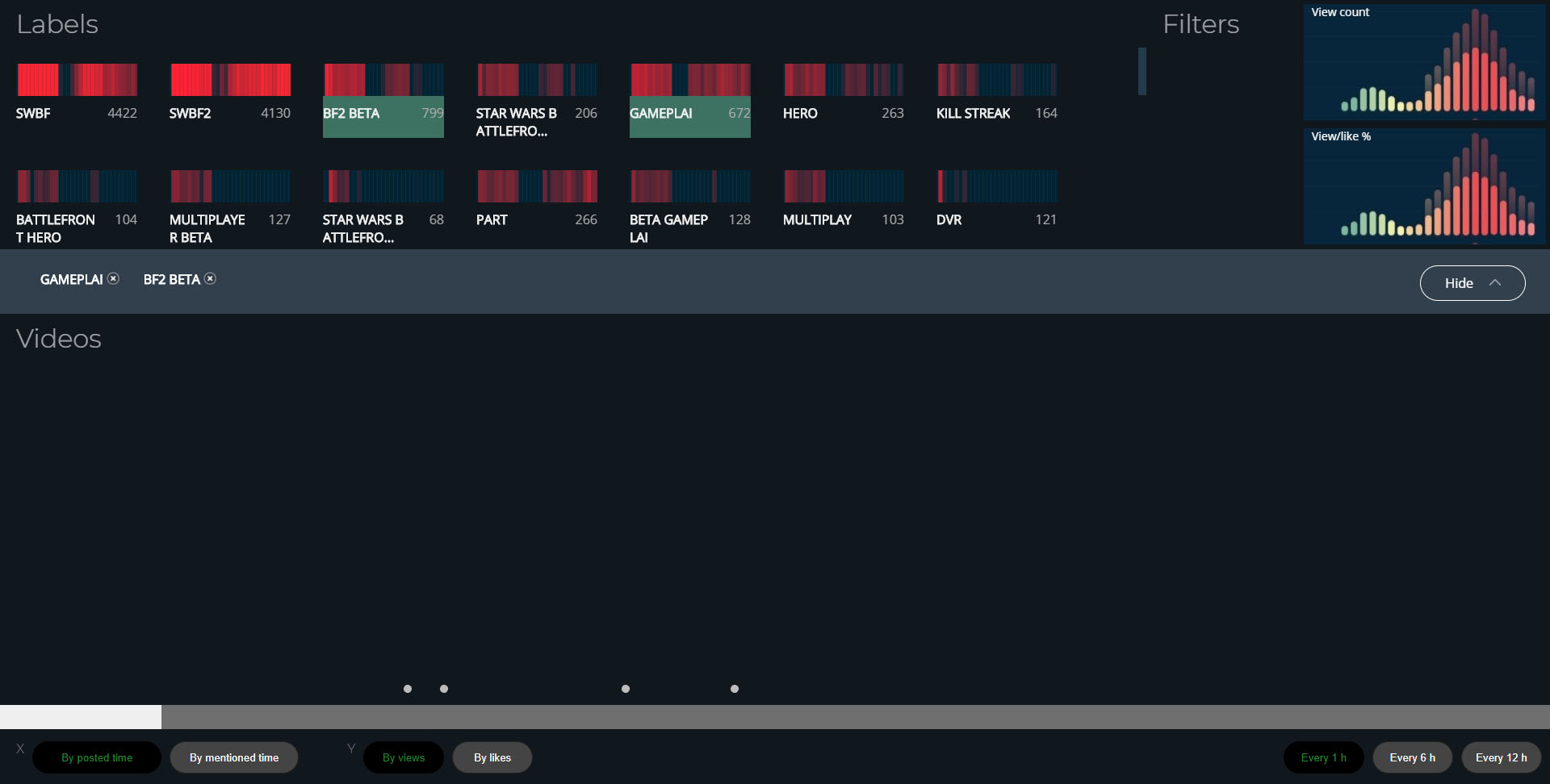
- We fixed a lot of bugs, such as video popping up too many times when the user hovers over several dots, and the label feature breaking after several selections.
- We also polished the UI according to feedback by having a label bar that can be hidden and headings for each section.
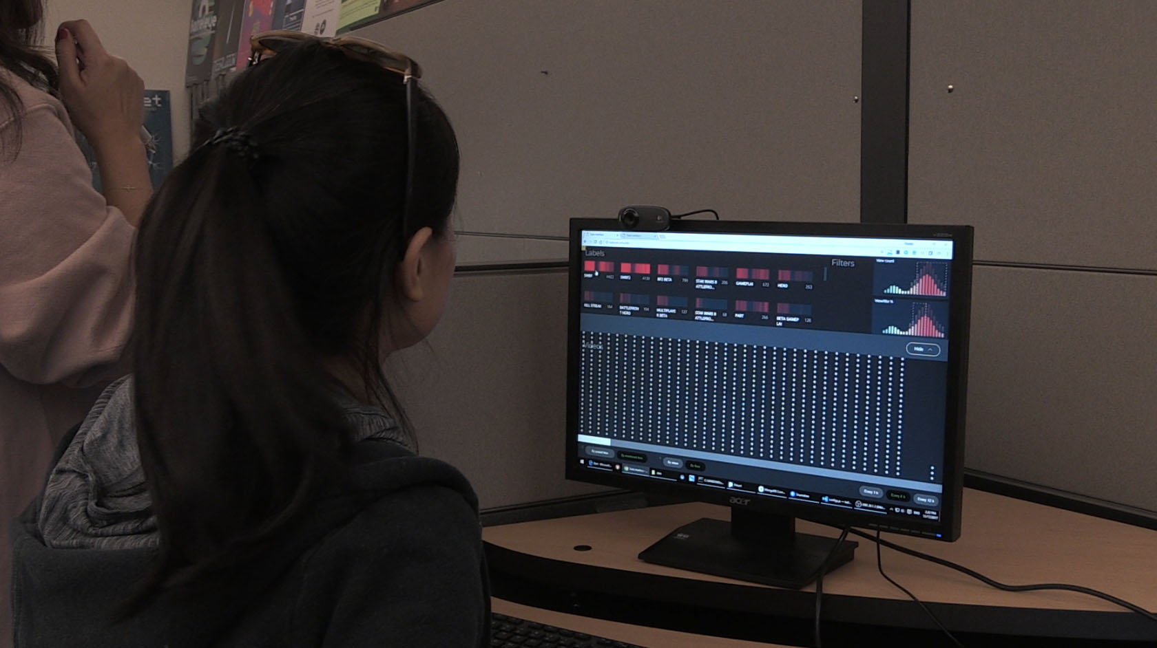
After the changes, we held another playtest session today. We invited 2 guests who work at EA to playtest our game. Both of them are analysts. We received lots of feedback from the playtest, and will highlight some of them here:
- The hover view looks nice, but it’s difficult to navigate out of the big circle to view the other small dots.
- Wasn’t sure how the label was sorted at the top, possible to sort the labels in a meaningful way.
- VIsual animations of the dots were not meaningful when switching the axes.
- Is it possible to extract data from this interface for other analytics purposes?
A lot of the feedback was on feature improvements that we are looking into. Hence, this solidifies the direction that we should go in.
Here’s one of the playtesters for our product:
The current version of our live website is the one we used for playtest: tada.etc.cmu.edu.
Next week, we’ll consolidate the feedback and begin working on implementing critical improvements/features.