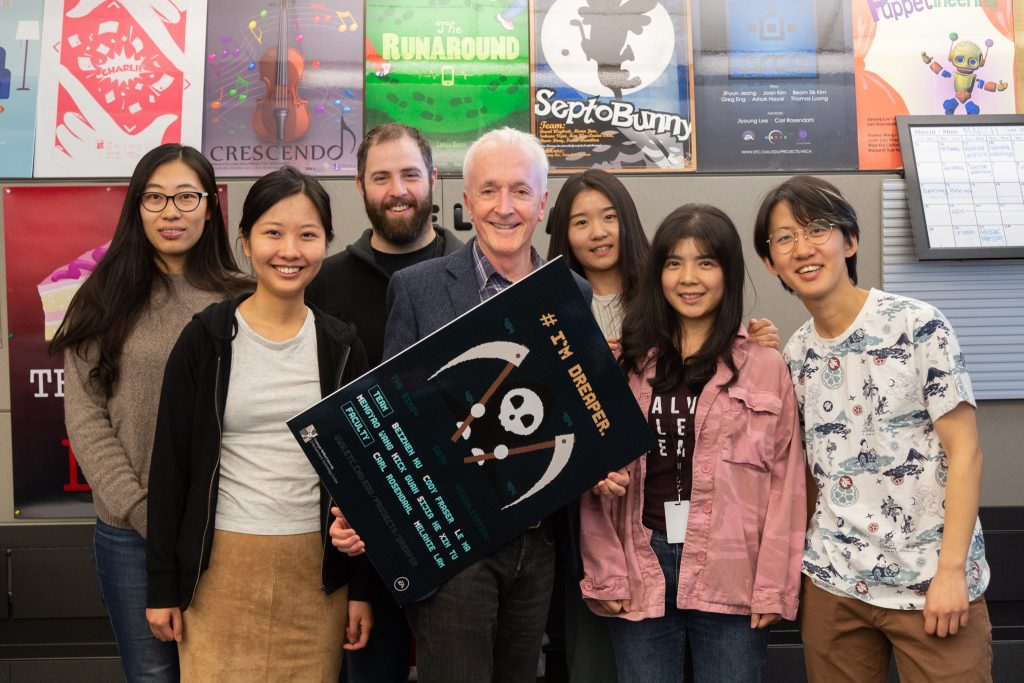
Our client had to cancel our playtest session because of work. We decided to have another round of inner playtest, within team and also with faculty, in order to move forward. We were also glad that Anthony Daniels was here and we also had the luck to playtest with him.
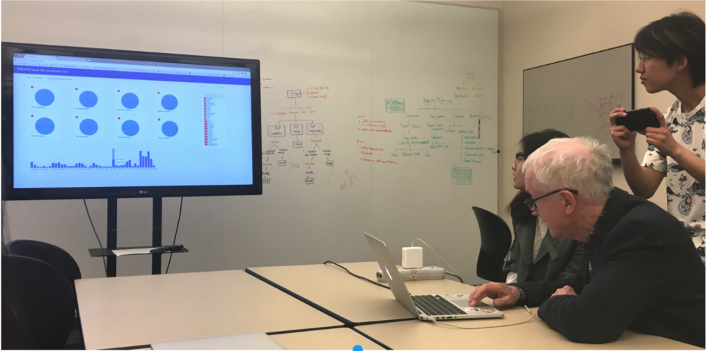
We got a lot of useful feedback about how the tool should response to user interaction. For example, our timeline was not clickable, but when you hover onto it, the bar will be highlighted as shown below. This created a confusion that this bar may be clickable.
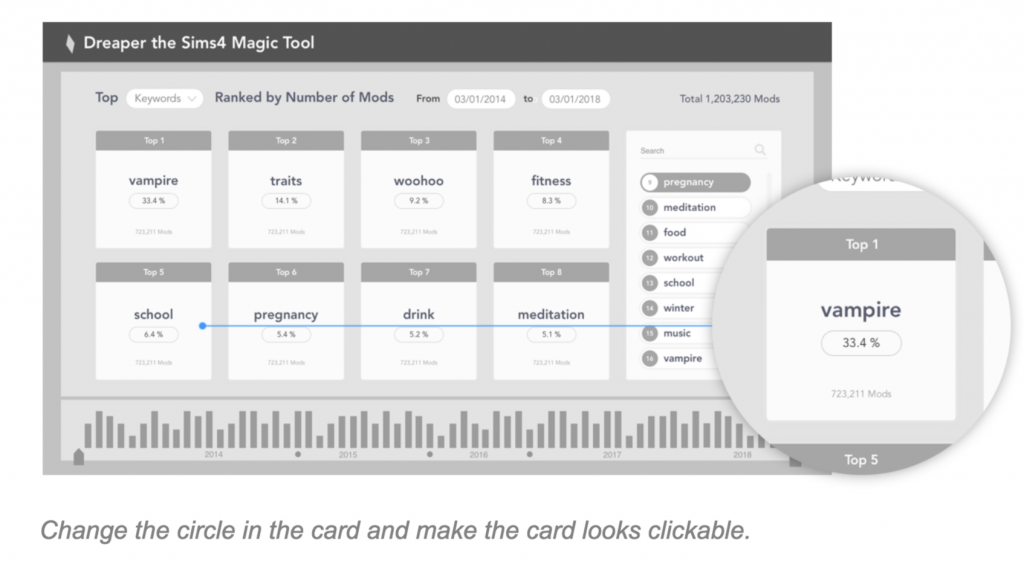
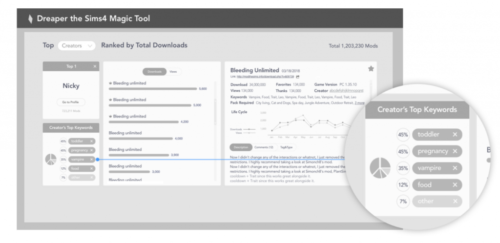
At this time, since we used clickable prototype, it’s more clear to see some problems when user click through. Mostly the feedback focused on the visual component. The circle on each card created confusion for the users since it does not have meanings. We used this circle component because we wanted to create pie chart around it, and we wanted to keep this consistency across different pages.
We made several changes according to the feedback we got. We re-designed the cards and now it looks very clean. We also redesigned the keyword breakdown on the creator page.