Model
Version One
Version Two
Archetype Illustrations


Observable Learning Practice Illustrations


A Statement from Junghee “Ashley” Koo
Through the illustration art work for the principles of practice card deck, I tried to embrace the culture of the MAKESHOP and core value of Learning Practices of Making as a learning process in MAKESHOP, Children’s Museum of Pittsburgh (CMP). Each illustration shows the most effective visual expression of each Learning Practice description with the unique idea sketches and meaningful color choices. I am really glad that many teaching artists of the MAKESHOP expressed their preferences towards the card illustrations.
Makerbox Web Mock Up


A Statement from Alejandra “Aly” Soto
This was more about offering suggestions then actual design. Our client asked how would a web page (using their template) look like should they display the Makerbox on their domain. Using screen shots of their web pages, I inserted graphics and suggestions about what information to display into the proper areas. I kept the focus on the display of the cards and supporting video to demonstrate their usefulness for viewers.
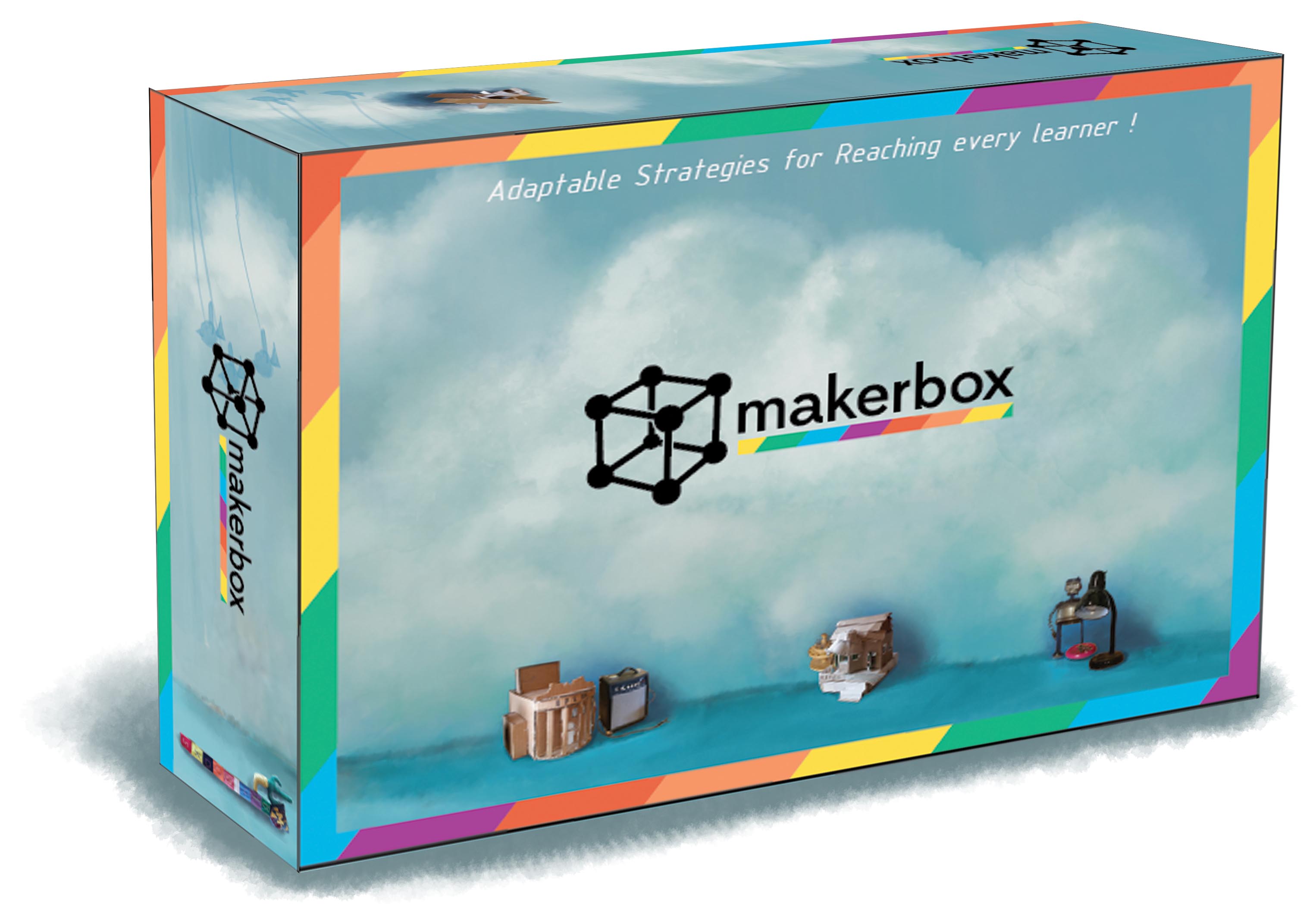
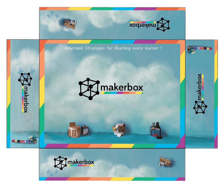
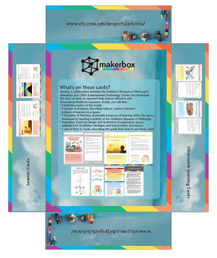
Makerbox Packaging


A Statement from Junghee “Ashley” Koo
The most obvious objective of the package design for the card deck box is to display consistent branding image as much as the card deck design. The main expression of the card design is to show MAKESHOP’s creative learning, and making culture. I used the same MAKERBOX logo and rainbow frame that we implemented on half-card’s back side which give the sense of the same branding image. For the general background, I used Aristeia’s concept image that includes clouds and MAKESHOP space props that aimed for creative expressions of their culture.