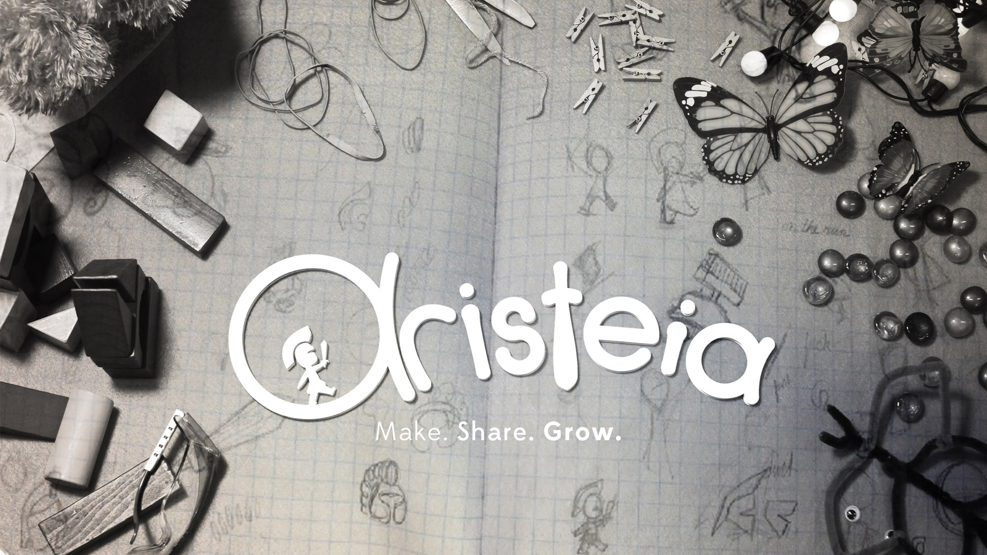
Dave and I worked together to create our team’s branding. The meaning of our team name (‘Aristeia’) embraces “excellence” and the word itself was originated from Ancient Greek. I myself defined the abstract expression of words for our team name as “joyful”, “lively”, and “brave”. From this thought process, I created the logo letterhead. Dave created the little greak soldier. And we combined it. We made the scale comparison between a soldier and the letter which is shown as the soldier is walking on the letter. This image totally gives us the sense of joy and bravery.
For the poster branding, we decided to make a lively poster which meant that we collected all possible props that were related to the MAKESHOP of the museum and photographed them so that the poster looks more animatedly and MAKESHOP look-like. The result was great. Every team member and other ETC people love our poster and they believe that this poster is very unique and shows the MAKESHOP’s culture and principles in an effective and unique way.